| Image |
Comment |
| 04/01/2010 12:02:47 PM |
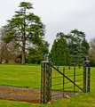
Please Shut The Gateby philocamComment: Good exposure for the overcast sky. You showed the available diffuse light really well. Interesting angle shot. This has good humor in that the gate isn't really keeping anyone from entering! It's somewhat lacking in color being only green and grey... nothing really pops, but the green color shown is nice and rich due to your good exposure. |
 Photographer found comment helpful. Photographer found comment helpful. |
| 04/01/2010 11:42:04 AM |
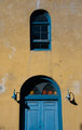
Door + Windowby BweekesComment: UPDATE: I don't know what the deal was but this particular picture did not appear well on my work monitor. Of all the pictures that I looked at earlier today, this one definitely looks different at home, therefore I will update my comment and vote...
Comment: Great color and shadows! It does still look a tad under sharpened but the lighting is good. |
| 04/01/2010 11:41:15 AM |
Scratchesby jsonneveltComment: I think a little more contrast might have helped this become an above average photo by adding a little more depth to the image. The scratches are highlighted well with the post processing, but I think everything is blended in to a mid-tone without so much highlight or shadow. |
| 04/01/2010 11:36:51 AM |
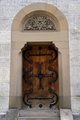
I C U - Doors to the shop. (CW)by tehbenComment: I am a fan of blur so I like this shot. I like the color gradient from tan to darker brown like a finely tanned piece of leather. I love the sweeping textured strokes of the camera's movement recorded nicely like the light was delicately stroked on with a brush. I am not sure what the CW means in the title, if you are trying to communicate something about how you took the picture or something about the subject so that is sort of puzzling. The shot looks like a set of double doors blurred so I am going to say it meets the challenge. |
| Photographer found comment helpful. |
| 03/31/2010 07:35:07 PM |
|
| Photographer found comment helpful. |
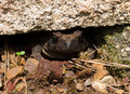
| 03/31/2010 07:30:17 PM |
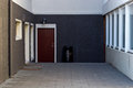
Doorby odinndagurComment: The red door stands out well against the neutral colors. I would suggest getting closer to the door as that is the subject. |
| Photographer found comment helpful. |
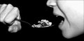
| 03/31/2010 07:29:00 PM |
Don't think about the exitby idlemanbn86Comment: I will try not to think about the exit... especially bcause you are eating bran with more fiber! Here, the lighting on the skin is pretty uneven. It seems wierd not to see an arm connected to the hand, almost as if it's disconnected. |
| 03/31/2010 07:27:22 PM |
Ring my bell...by pjotre7Comment: It;s a good fit for the challenge. I think it is somewhat oversaturated and over sharpened for my taste. |
| Photographer found comment helpful. |
| 03/31/2010 07:25:12 PM |
|
| Photographer found comment helpful. |
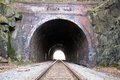
| 03/31/2010 07:23:44 PM |
In The End of the....by navegante76Comment: Very good concept here... the light at the end of the tunnel gives a metaphorical meaning to this that I like. A few comments about the photo given to suggest some things I would improve upon if this were my photo. The top edge of the tunnel shows that this needs to be straighened a bit. A degree or two of rotation would help that. Also the shot either isn't sharp or isn't quite focused enough. I think that it isn't sharp and may suffer from camera shake. I would try playing with the contrast a bit to get more contrast and maybe trying a black and white conversion to see what looks better. The arch is a great shape and it does have good depth down the tunnel and texture with the rock face. The rails serve as good leading lines. |
| Photographer found comment helpful. |
Home -
Challenges -
Community -
League -
Photos -
Cameras -
Lenses -
Learn -
Help -
Terms of Use -
Privacy -
Top ^
DPChallenge, and website content and design, Copyright © 2001-2025 Challenging Technologies, LLC.
All digital photo copyrights belong to the photographers and may not be used without permission.
Current Server Time: 06/28/2025 03:05:49 AM EDT.