| Image |
Comment |
| 04/14/2010 08:30:39 AM |
Tick tock ..tick tockby kprasad9375Comment: Nice attempt here. Just wanted to revisit this because I liked it and wanted to see your exif data... f32 @ 15 seconds iso 200... I wonder if you could have gotten a better result using iso 100 and bulb mode for 15 seconds with a somewhat bigger aperture?? Anyway something to try. I hope you had fun shooting. |
 Photographer found comment helpful. Photographer found comment helpful. |
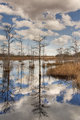
| 04/13/2010 07:26:33 PM |
Week 14 - Grassy Waters Preserveby TammsterComment: What a great reflection! The vertical lines really make this. Only improvement or change I would take a look at is to crop off the sky at the tree top and have it all showing up in the reflection. This is gorgeous as it is though and what I said was only a suggested alternate! |
| Photographer found comment helpful. |
| 04/13/2010 07:23:52 PM |
|
| Photographer found comment helpful. |
| 04/12/2010 08:41:29 PM |
Hey, Where'd This Come From?by Art RoflmaoComment: Here is a good use of humor to onvey something that is not ordinary. This is a good use of centered composition. What does it need to make it above average for me? Good question... Perhaps being a hair closer and maybe using some saturated colors would add some punch. |
| Photographer found comment helpful. |
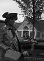
| 04/12/2010 08:39:26 PM |
It's For Youby MinsoPhotoComment: This is a fun shot. It could use some fill lighting in the foreground and there appears to be a problem with the rotation as the tree and the house is tilted. |
| Photographer found comment helpful. |
| 04/12/2010 08:38:20 PM |
DEW dew DEW DEWby mbrutus2009Comment: Nice use of repetition and varied size of object to creat a rhythm. Color is good. Background needs something to help this stand out as the small can is lost in the product box in the background. |
| Photographer found comment helpful. |
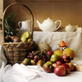
| 04/12/2010 08:36:48 PM |
Still Life with Potatoby LonniComment: Good use of natural light here. I would maybe try to get in a little closer. It looks like you have tried to show too much here for context that is not needed. |
| Photographer found comment helpful. |
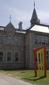
| 04/12/2010 08:35:23 PM |
Come on In, The Door's Openby McCarlieComment: I would pump up the contrast a bit to get rid of the greyish look to this. The small sun flare doesn't add anything to the shot as it is not leading you in to the subject or anything like that. |
| Photographer found comment helpful. |
| 04/12/2010 08:33:47 PM |
Ambulance ?by JuliBocComment: I think there is a little too much clutter in the photo. Nothing stands out as it all blends in together. |
| Photographer found comment helpful. |
| 04/12/2010 08:32:55 PM |
|
Home -
Challenges -
Community -
League -
Photos -
Cameras -
Lenses -
Learn -
Help -
Terms of Use -
Privacy -
Top ^
DPChallenge, and website content and design, Copyright © 2001-2025 Challenging Technologies, LLC.
All digital photo copyrights belong to the photographers and may not be used without permission.
Current Server Time: 06/27/2025 03:08:02 PM EDT.