| Image |
Comment |
| 07/14/2002 11:09:00 PM |
|
| 07/01/2002 05:12:00 PM |
Liberty And Justice by jmsetzlerComment: I love this, but I think the whites have too much of a blue/cyan tint to them -- as if this was taken on an overcast day. There's an easy way to tweak this (legally, I think) in PS -- but I don't know if you have that program. If you're not sure what I mean, let me know and I can tweak a copy for you for comparison. |
| 07/01/2002 04:55:00 PM |
Gummyby JenguinComment: I think this one is being "hurt" by having a white background behind it. The colors look a little bit more flat than they really are. (Took it into PS to see if upping the saturation would help. As soon as I did, and saw it on a grey background, I realized it was fine.) Very fun abstract. |
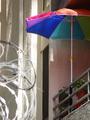
| 06/30/2002 05:23:00 PM |
shaded balconyby malapropamComment: I think you would have had something really cool here, but I have to admit, the jaggies in this are so bad that I can't think of a reason you'd want to do it and have to assume your camera is REALLY low end. I like the relativelty mute colors except for the bright splash of the umbrella -- also like the fun colors versus the sharp barbed wire in the foreground. Like I said, good composition, but not the best quality. |
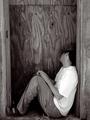
| 07/01/2002 01:36:00 AM |
Drunk in the Alleyby AleciaComment: While I wasn't the only one to think it was staged, nevertheless, I still have to say my bad. :-) I like knowing the backstory. It makes me regret the comments I made because it is a good photojournalist style shot -- I just had my mind set on a completely different stereo-type. |
 Photographer found comment helpful. Photographer found comment helpful. |
| 06/30/2002 07:15:00 PM |
Drunk in the Alleyby AleciaComment: Technically a nice picture -- maybe a tad flat, but still pretty nice. However, I have a hard time believing this isn't a set picture. Whether or not the guy is a drunk, he just doesn't look like he would have fallen asleep in a place like that. His clothes are too clean, the hat, the sandals, even his beard stubble looks to have been shaved around his neck. It's just not believable to me. Because it has the look of something "photojournalistic" but because I don't believe it's a real shot, it loses the impact it might otherwise have. |
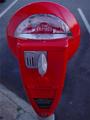
| 06/30/2002 05:01:00 PM |
Pay Upby ShiiizzzamComment: I like this composition a lot but the colors seem a little dim -- not as vibrant as they could be and even a little blue. I'd love to see that meter as teh bright candy apple red color it appears to be. |
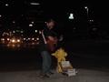
| 06/30/2002 03:55:00 PM |
Makin' A Livingby mtngoatComment: Decent idea, but it's too dark and too empty. I think the darkness aspect speaks for itself. As for the empty space, I think this is the kind of image that would have been much better off framed vertically with the man taking up most of the space top to bottom and at the left hand edge of the photo. This closer shot would also let you read the signs he has asking for change a little better. |
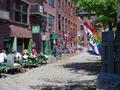
| 06/30/2002 07:02:00 PM |
The Old Port of Portlandby csbComment: I see what would have been two great shots -- but I don't think they work that well together. I love the contrast of green fixtures and grass and red brick of the tavern/bar/restaurant as much as I love all the bright colors of the kite shop. I think you would have had a much more intriguing shot if you'd focus on one business or the other instead of trying to include both of them. |
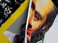
| 06/30/2002 05:13:00 PM |
Transitionby sanandanComment: Like the way this gives the feel of a colorized black and white. Not that you have any control over it, but I wish you could see a little bit more of the face on the older advert. Interesting composition with nice lines. I can't really say I like it, but I can appreciate it -- if that makes sense. |
Home -
Challenges -
Community -
League -
Photos -
Cameras -
Lenses -
Learn -
Help -
Terms of Use -
Privacy -
Top ^
DPChallenge, and website content and design, Copyright © 2001-2025 Challenging Technologies, LLC.
All digital photo copyrights belong to the photographers and may not be used without permission.
Current Server Time: 08/18/2025 06:16:56 AM EDT.