| Image |
Comment |
| 10/06/2003 12:28:00 AM |
|
 Photographer found comment helpful. Photographer found comment helpful. |
| 10/06/2003 12:27:08 AM |
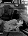
Tied to the Tracks!!!!!!!!!by boyte1Comment: Nice idea, works well with nightmare, like that it is in black and white. Her face is a bit blurred, (as is her hand but in the hand it does not bother me) |
| Photographer found comment helpful. |
| 10/06/2003 12:24:40 AM |
|
| Photographer found comment helpful. |
| 10/01/2003 12:51:48 PM |
|
| Photographer found comment helpful. |
| 10/01/2003 10:36:15 AM |
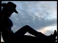
Cowgirl at Sunset by Firstrich1Comment: Excellent composition, excellent clean outline. Nice framing. The one think I wonder about is the top left line seems to be a bit thicker then the bottom of that line. Wish it was mine! |
| Photographer found comment helpful. |
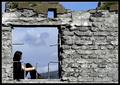
| 09/30/2003 06:19:23 PM |
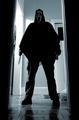
Broken Homeby NazgulComment: This is my favorite of the pictures in your portfolio, there is a richness of the colors. (I tend to find a lot of your images dark, and my personal preference is a range of colors) |
| Photographer found comment helpful. |
| 09/30/2003 03:58:39 PM |
|
| 09/18/2003 11:15:45 PM |
Live Onby ImagineerComment: I like the idea of the hands, but the faces particularly the one in the middle, looking up, almost has a look of dispair to me, in contrast with the title of the picture. To me almost a feeling of darkness and weight like the people were burried in a tomb. |
| Photographer found comment helpful. |
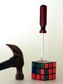
| 09/18/2003 03:53:49 PM |
The Other 30 Second Solutionby C-FoxComment: Amazing how many people remembered those days, although some did not get it as following the theme. I knew when I entered that it would have a nostalgic feel only to people from a certain age/personaility/countries (I am not sure how big the cube was world-wide).
The picture was straight but to get the screwdriver to stand up it leaned slightly, since that is the longest line in the photo makes it look unballanced. What I should have done is made the screwdriver straight. (lesson 1 learned).
I know I need to work on lightening techniques, (lesson to be learned) plus I should have played with the color levels a bit to see if I could not get the colors to POP a bit more. (another lesson still to be learned)
This is an original cube and later editions had more color contrast. Plus the cube is wounded so I had limited choices of what side to show. |
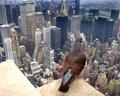
| 09/16/2003 01:58:04 PM |
Birds Eye View of Manhattanby MarkS224Comment: If it were mine (I wish) I would also change the cropping on the left hand side so that the the line of the building meets the same hight the point does where the pigeon is standing. (the left hand side of the metlife building) Actually if it truelly was mine I would make sure the color of the pigeon's feet where still correct as well, and the line I would choose would be the corner towards us of the metlife building. I do find the light color of the ledge to be distracting and the bird has more room behind then in front. (normally in wild-life shots have the animal looking into the larger space) I think the cropping on the left would give the impression of ^^^^ continuing triangles so the mind would just fill in what it could not see of the ledge.
I really like that it is in color. I really like the angle of the shot looking down on both the bird and the buildings. (rather then eye level to the bird I don't think you would get the same feeling).
I really like the concept as well. Message edited by author 2003-09-16 13:59:56. |
| Photographer found comment helpful. |
Home -
Challenges -
Community -
League -
Photos -
Cameras -
Lenses -
Learn -
Help -
Terms of Use -
Privacy -
Top ^
DPChallenge, and website content and design, Copyright © 2001-2025 Challenging Technologies, LLC.
All digital photo copyrights belong to the photographers and may not be used without permission.
Current Server Time: 08/24/2025 07:05:35 PM EDT.