| Image |
Comment |
| 09/13/2006 01:18:01 AM |
|
| 09/13/2006 01:17:55 AM |
New idea!by DjabordjaborComment: I'm not a great fan your concept, but the image is good. Great backlighting to create the halo, specially needed at the back of his head, well done. The composition works and it's easy to understand the image. Sharpness colours and lighting all comes to gether to make a strong image. |
 Photographer found comment helpful. Photographer found comment helpful. |
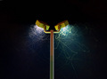
| 09/13/2006 01:17:39 AM |
Brewing up a twisterby lambie83Comment: Great idea, and it looks like it really could be a twister, it looks like it's huge !
It's a bit dark thoug and might need some more contrast to it. |
| Photographer found comment helpful. |
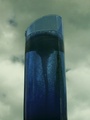
| 09/13/2006 01:17:32 AM |
Thin filmsby ralphComment: I don't get it, but I sure like it. Hope this will end up in the top then, I simply love the colours against the black background. |
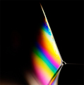
| 09/13/2006 01:17:27 AM |
Fluorescence: The Rainbow of Chemistryby md8speedComment: Nice lighting, this sure stands out.
Ligting, colours, contrast, sharpnes and other technical stuff os really good. The composition and interestingness of the photo on the other hand is not that good. |
| Photographer found comment helpful. |
| 09/13/2006 01:17:16 AM |
|
| Photographer found comment helpful. |
| 09/13/2006 01:17:05 AM |
the drunken masterby bashiComment: Chemistry ?
Well, it looks like you ware drunk when you made this, out of focus and strange :) |
| 09/13/2006 01:16:54 AM |
2 KNO3 + S + 3C = KABOOM!!!!by santiago9erComment: Great title !
The idea is pretty good, but laying it like this on the white background is a bit dull. It's not the quality of the image that needs improvement, its rather the idea that needs to bee completed. |
| Photographer found comment helpful. |
| 09/13/2006 01:16:42 AM |
Photographer's Chemistryby jdotakuComment: Whats with the white corners and small size, not a strong move !
The idea is good and the colour is also pretty good but you can't see any details due to the size. |
| 09/13/2006 01:16:38 AM |
Experimentationby JeniYComment: Nice props !!! I wish I would have found props like that for this challenge. The yellow thing looks awesome, with the bubble and stuff.
The composition isn't really good though. The frame looks busy and lacks a subject, there are too many things that the eyes just jump between. Perhaps you should have somehow made the person stand out a bit more to be the main subject.
I think the bottom line is that the image is to complicated and busy. |
| Photographer found comment helpful. |
Home -
Challenges -
Community -
League -
Photos -
Cameras -
Lenses -
Learn -
Help -
Terms of Use -
Privacy -
Top ^
DPChallenge, and website content and design, Copyright © 2001-2025 Challenging Technologies, LLC.
All digital photo copyrights belong to the photographers and may not be used without permission.
Current Server Time: 08/19/2025 10:58:05 PM EDT.