|
|
|
Showing 241 - 250 of ~1045 |
| Image |
Comment |
| 10/24/2005 03:12:37 AM | |  Photographer found comment helpful. Photographer found comment helpful. |
| 10/24/2005 03:11:01 AM | | | Photographer found comment helpful. |
| 10/24/2005 03:09:29 AM | | | Photographer found comment helpful. |
| 10/24/2005 03:08:20 AM | | | Photographer found comment helpful. |
| 10/24/2005 03:07:50 AM | | | Photographer found comment helpful. |
| 10/24/2005 03:05:57 AM | | | Photographer found comment helpful. |
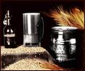
| 10/19/2005 02:32:28 PM | To life!by InnaNComment: Greetings from the Critique Club
First off, let me say that I like the general concept of this shot, but I feel there are certainly some things that could be do differently to make this a stronger shot.
I think the warm tone of the lighting is great and works well to set the mood. The exposure seems to be accurate the lighting is generally well done and the model fits with the overall tone of the shot.
The most noticable thing that strikes me as unappealing, and you received several comments about this during the challenge, is the up-the-nose angle of the shot. shooting from eye level or slightly higher would really help here.
Of less concern to me, but still important is a lack of contrast. The image just doesn't "pop" and it really should. It doesn't need much, but to me, it's really noticable.
The only other thing, and this is really not a major concern, is that the wine looks black. If there were some way to light it a bit from behind, give it a reddish glow, it would add quite a bit to the image.
As far as the challenge goes, this certainly fits and wine can be a celebration in itself.
Keep up the good work! | | Photographer found comment helpful. |
| 10/05/2005 09:40:48 PM | Have A Nice Dayby librodoComment: Greetings from the Critique Club
Wow, I'm not sure I can find much to improve on here, but I'll just give you whatever I have.
Generally, I find your work to be wonderful and full of emotion though usually it seems a bit more melancholy than the image here.
As for this particular image, I think it's a wonderful, bright and happy shot. The pose, the colors, the hat and everything add to the cheery mood. It's evident that the model is enjoying her work and I would imagine the photographer is too. She's a lovely girl and that really comes through here. Well done.
I have a few suggestions. Please keep in mind that they are only minor and you may have deliberately chosen otherwise, but I have my opinions. I love her smiling expression, but I think I'd like to see a version with her looking right at the camera, engaging the viewer. Her face seems just a bit bright, especially on her forehead, maybe a bit more diffusion of the light would have helped there. Also, I'm guessing that you composed it with all the space on the right side for some text, but I think I'd like it a lot more as a vertical without all that space.
I enjoy seeing your work, keep it up! | | Photographer found comment helpful. |
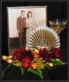
| 10/05/2005 02:33:08 PM | To 50 more years, Happy Anniversaryby Buckeye_FanComment: Greetings from the Critique Club
I want to discuss some aspects of this shot that I think are good, some areas that I think could be improved and a bit about how the shot fits into the challenge.
First the good: I like the selection of pbjects you've chosen here, especially the wedding photo. Old photographs are wonderful little windows to the past and here the photograph is certainly the central object. The cake topper with the "50" on it makes it clear that these two were together 50 years and the flowers and stemware indicate a celebration. Even without reading your comments, your emotional connection to the subjects is clear.
Technically, the exposure seems accurate, you have a nice black background and the blown out areas are not too excessive. I also like the soft focus effect, I think you used it well and certainly didn't go overboard with it.
I'm assuming that with a shutter speed of 1/20 you used a tripod. I'm not terribly familiar with your camera, but I noticed that you used f3.5, which I'm assuming is wide open, or nearly so. I also noticed a bit of purple fringing around the brightest areas of your picture. I'd suggest that you stop down to f5.6 or so and use a longer exposure time. This picture could also benefit from some diffusion over the light source(s), that would also help with the really bright reflections and blown out areas.
The arrangement of the objects seems OK, but you might also experiment with different arrangements of the objects, maybe adding another glass (if possible). Shots like this are, almost by definition, going to appear set-up, there's not really any point in trying to avoid it, but perhaps an alternate arrangement that did not cover up the bride so much and did cover some of the empty part of the photo on the groom's side might be an improvement. She seems to be hiding behind the fan part of the cake topper and he seems to have a lot of extra space. This is really just minor and some suggestions of possibilities on my part.
As far as how this fits the challenge, I'm a bit divided. I like the image and think it would make a wonderful card/gift to the couple pictured in the photograph. That personal touch also means that it might not mean so much to another couple. Still, regardless of what the picture means to others, I can tell you have created something that has great personal meaning to you, and that's what really matters in this case.
Keep up the good work! |
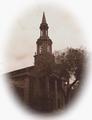
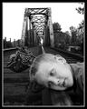
| 09/21/2005 08:28:07 PM | Train is a comin'...by DrAchooComment: Sheesh.........
From some of the lame comments, you would think people had never heard of listening to the rails.........
| | Photographer found comment helpful. |
|
Showing 241 - 250 of ~1045 |
Home -
Challenges -
Community -
League -
Photos -
Cameras -
Lenses -
Learn -
Help -
Terms of Use -
Privacy -
Top ^
DPChallenge, and website content and design, Copyright © 2001-2025 Challenging Technologies, LLC.
All digital photo copyrights belong to the photographers and may not be used without permission.
Current Server Time: 08/27/2025 02:19:13 PM EDT.
|