| Image |
Comment |
| 02/02/2010 03:03:11 AM |
My Cloudsby angkokwengComment: Greetings from the Critique Club!
Processing on this is quite nice. Position of the church is good, the bottom border created by the hedge is perfect, and those clouds look amazing! You received a high score from commenters and even a favourite! I think the only reason you didn't receive a higher score was because some people don't enjoy HDR/Topaz Adjust style editing. Definitely deserved higher, but don't be disappointed by your score, it's higher than anything I've received ;)
If you have any questions click here to message me!
Senay |
 Photographer found comment helpful. Photographer found comment helpful. |
| 02/02/2010 02:57:09 AM |
Trimming a Tree at Seaby ElisiumComment: Greetings from the Critique Club!
The message you were trying to get across was a little confusing, having read your description it is much funnier! A more obvious humour entry was what most people expected I believe. The main thing that you can do to enhance your images would be to increase the contrast, it seems a little flat.
If you have any questions click here to message me!
Senay |
| 02/02/2010 02:48:06 AM |
Winter Rainby Luci11eComment: Just wanted to drop by to tell you that you got robbed on this one! I gave you a 7, I really liked the focus and bokeh |
| Photographer found comment helpful. |
| 02/01/2010 02:38:28 PM |
Macro and Bursting With Color!by SquishyBComment: Greetings from the Critique Club!
The other people who commented pretty much covered what could be fixed about this picture. It would have scored better had it not been out of focus. The colour is good but I feel that the very top of the picture is too bright especially when compared with the grey in the lower part of the background. To better light the inside of the flower I suggest holding something up to use as a reflector. Even a blank sheet of paper in front of the flower will light it up so that the details are better seen.
If you have any questions click here to message me!
Senay |
| Photographer found comment helpful. |
| 01/30/2010 08:47:50 PM |
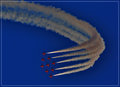
Precisionby kaiser_chiefComment: Greetings from the Critique Club!
Very eye catching photo! During voting I gave this a 7. A little of the left side could be cut off, placing the planes in more of a rule of thirds positioning. The red planes against the blue sky is very nice! The only thing I didn't like about this picture is the smoke trails being a darker grey colour. The only way I see to improve this image would be to have turned the smoke trails a more white colour. I see it's your second highest rated photo, congratulations!
If you have any questions click here to message me!
Senay |
| Photographer found comment helpful. |
| 01/30/2010 02:07:22 PM |
Drinking Fountainby SEGComment: Greetings from the Critique Club!
First Impression: First thought was "NO NOT THE BEER!" then I read your title.
Subject: It seems that people had two feelings towards this picture, some thought it was interesting and others thought it lacked a certain something for the Best of 2009 challenge. Personally I thought it was a pretty cool idea! Being a fan of beer I really liked this shot, I gave it a 7.
Technical: The selective desaturation works well to highlight the beer taps. I'm not a big fan of how the angle, I think it would have worked better straight or fully diagonal.
Final thoughts: Now I'm thirsty, if it wasn't 2:07 here I'd drink a beer.
If you have any questions click here to message me!
Senay |
| Photographer found comment helpful. |
| 01/30/2010 01:46:54 PM |
I Willby JoeyCComment: Greetings from the Critique Club!
First Impression: I felt that it was a very nice portrait of a bride who must have been very happy when she received this!
Composition: Tilted angle works good, I like the line created by the dress and the black background.
Technical: The eyes are awesome! For the lighting maybe some more light could have been on the right side so that the hair does not blend with the background as much, although the lighting is great the way it is just a small detail.
Final thoughts: The only thing that could be done to improve this image would be to include all or more of her head.
If you have any questions click here to message me!
Senay |
| 01/30/2010 01:07:38 PM |
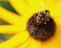
Summer Dragonflyby milspecComment: Greetings from the Critique Club!
First Impression: Very sharp, detail of the wings and body are quite nice! I can't find one to stay still for 2 seconds let alone take a great picture of one
Technical: The background matches the dragonfly perfectly, blue and yellow/brown. Some of the lines on the left lead the focus away from the dragonfly and more to the bokeh.
Final thoughts: The DOF for this is unreal. You finished in the top 25% and this is only your second entry! I look forward to seeing more of your work in the future.
If you have any questions click here to message me!
Senay |
| Photographer found comment helpful. |
| 01/30/2010 12:08:18 PM |
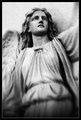
Angelby Marc923Comment: Seems like not everyone agreed with me on this shot, I thought it was very interesting and that the grain added to it. I gave you a 7 :) |
| Photographer found comment helpful. |
| 01/30/2010 12:54:25 AM |
Jauneby mBastinComment: The only glaring problem with this picture is the size, it's only 483x382. If you had sized it down to just under the allowable size it would have done much better. Everything else looks good! |
| Photographer found comment helpful. |
Home -
Challenges -
Community -
League -
Photos -
Cameras -
Lenses -
Learn -
Help -
Terms of Use -
Privacy -
Top ^
DPChallenge, and website content and design, Copyright © 2001-2025 Challenging Technologies, LLC.
All digital photo copyrights belong to the photographers and may not be used without permission.
Current Server Time: 07/18/2025 06:26:52 PM EDT.