| Image |
Comment |
| 11/13/2009 06:59:28 AM |
Two Spiresby Five_SeatComment: Very difficult shot to pull, the dynamic range is too big, the sky is burned, and the foreground is a bit dark. Would be great to do it HDR, but difficult for basic editing. |
 Photographer found comment helpful. Photographer found comment helpful. |
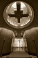
| 11/13/2009 06:57:45 AM |
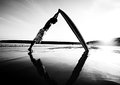
The Endby TomCubisComment: Sorry I can't find the symmetry here. Should do well on another challenge, albeit I would like to see it from a lower perspective. |
| 11/13/2009 06:56:42 AM |
|
| Photographer found comment helpful. |
| 11/13/2009 06:48:32 AM |
Dos Ristraby rajronComment: Sorry, it's a bit crooked (more noticeable in the top two crosses). |
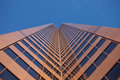
| 11/13/2009 06:47:42 AM |
Copper Towerby silverhawkComment: Unfortunately, a good picture that would be perfect but it is crooked. Straightening should improve this shot a lot. |
| Photographer found comment helpful. |
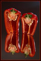
| 11/13/2009 06:46:45 AM |
Reflectionsby briandsdComment: Ah, I almost gave you a 6 because I thought it was a standard reflection, and while reflections are symmetrical, I tended not to rate the as high as the non-reflective ones.
I had to look three times to discover that the reflection below is not from the immediate above tomato. It's from the opposite one!
9 because I'm not being able to discover how you did it :) |
| Photographer found comment helpful. |
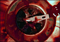
| 11/13/2009 06:39:13 AM |
Tipsyby peterComment: Well, it's difficult to nitpick at this photo, as it is so brilliantly done.
I love the fact that the symmetry is not standard, and the gradients in the photo are ultra appealing, and very smooth.
Could be better if there was no glow, it gives it a dreamy look, but you scored a 10 from me.
Great work! |
| Photographer found comment helpful. |
| 11/12/2009 06:16:40 AM |
Let the Battle Beginby denboteComment: I like the lighting very much on this photo. Can't quite understand how it didn't spill to the rest of the photo, but it's great! 9 |
| Photographer found comment helpful. |
| 11/12/2009 06:11:03 AM |
Full Circleby KLCheripkaComment: Sorry, it's not sharp enough, and not very related to symmetry. Could be more interesting if it was done almost vertically, and sharper. |
| Photographer found comment helpful. |
| 11/12/2009 06:09:46 AM |
Balanceby John WhiteComment: One of my favourites, I really love the contrast of this one!
Also, the fact that you completely burned the shadows and the highlights actually makes it more interesting to me :)
Great job, 10! |
| Photographer found comment helpful. |
Home -
Challenges -
Community -
League -
Photos -
Cameras -
Lenses -
Learn -
Help -
Terms of Use -
Privacy -
Top ^
DPChallenge, and website content and design, Copyright © 2001-2025 Challenging Technologies, LLC.
All digital photo copyrights belong to the photographers and may not be used without permission.
Current Server Time: 08/16/2025 11:29:06 AM EDT.