|
|
|
Showing 161 - 170 of ~670 |
| Image |
Comment |
| 02/19/2010 11:04:20 AM | |  Photographer found comment helpful. Photographer found comment helpful. |
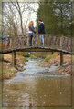
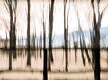
| 02/19/2010 05:30:55 AM | Middle Groundby Luci11eComment: Hi Lorie, how are you doing?
Another critique from me :)
Composition
I have no idea how you got on the middle of the stream...but it's the perfect position for this shot.
The only thing that draws attention out of the subject are the trees in the back, but it just was not possible not to have them. Still, they are distracting, and I think that if you had shot from more to the left, or they were more to the right, they would both be inside the green patch of the tree, making them more visible.
I like very much the angle from below, it makes it a very lovely postcard.
Technique
Since there was no way you could have the bokeh in the trees, making them out of focus, take advantage of it, and stop down your aperture, so you'd get a much slower shutter speed. This way, probably you could have the water with a more silky effect (it would also mean that you need a tripod), but it could help the overall look.
Processing
Very interesting and unusual choice of border, I think it's one of the few that I've saw here like this. If it could be just a tad shorter, nobody would have had any questions about it being there or not. It's a very smart move for a border, to make it part of the surroundings.
I was also interested in seeing this in b&w, maybe you can try it :)
Take care,
Joao
| | Photographer found comment helpful. |
| 02/19/2010 05:07:04 AM | Circa 1863by Ja-9Comment: Hello again Janine, greetings from the Critique Club!
For your photo:
Composition
You targeted a very vintage look with your picture. Although the chair is one of the subjects in the photo, I believe it's not the main one. I see a lot more relevance in the bed than in the chair. The way it was cropped does not leave much room for the chair.
Technique
One of the reasons why the photo has such a vintage feel if because of the low aperture, at f/25 the softness is very intense, and in this photo it worked perfectly, to add to the overall look. Although the chair is a bit underexposed, the shadows are very consisted and well formed.
Processing
Good choice for the sepia, the border adds also a lot to the image. Probably if the corner where the chair is was brightened a bit, it could give more impact to that part.
Overall an almost 6 score photo, that quite nicely fits the challenge.
Take care,
Joao | | Photographer found comment helpful. |
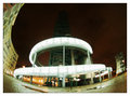
| 02/17/2010 05:34:44 PM | Decomissioned poluter - now landscape Artby duartixComment: Hello Duarte ;)
It looks just like a urban snake, I never thought of having it photographed like this, it's the most unique perspective of this tower!
It's a pity that the top was dark, it would have so much more impact, but still it's a very different approach.
Boa sorte! | | Photographer found comment helpful. |
| 02/15/2010 12:23:07 PM | Sizzlin'by toddw62Comment: Hello again Todd, greetings from the Critique Club!
First of all, I hope you weren't too close to that burner :)
For your shot:
Composition
You've chosen to do an abstract shot. Having said this, please remember that not many people will recognize an electric hob when they see one. It was too cryptic for the viewers to relate to the subject hot.
Still, as abstract goes, the tilt does make it more interesting, and the crop is something of a macro puzzle thing. The white spots (I think it was the water) do appear like dust or flour, so I think it worked against you.
Lighting
Despite the macro ring and the snoot, you got some uneven lighting. The right part has light, but the top and left are a bit dark.
Processing
Nothing to be said here, good contrast and colours, the picture is sharp all around.
Overall
I think you couldn't pass the message to the voters / viewers as to what they were seeing.
It was an obscure perspective, that whilst being hot, didn't "compute" in the minds of the people.
Take care,
Joao | | Photographer found comment helpful. |
| 02/15/2010 12:02:37 PM | |
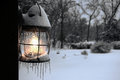
| 02/15/2010 08:25:17 AM | Elusive Warmthby mark082Comment: Hi Mark, greetings from the Critique Club!
Regarding your photo:
Composition
Your sharpness and bokeh is great, we can really feel the cold in the picture just by looking at the ice on the lantern.
I don't think the black bar hurt this photo, in fact it adds a strong balance point for the rest. I just wish there was some more space above or under the lantern, like this in the middle is not the most perfect position for it. Also, a wee tiny bit of the ice was cut from the photo.
Technique / Lighting
Very moody shot, at 1/40 it's amazing the clarity of this photo. Your DOF is brilliant for this photo, the background is just so slightly blurred as to enhance the front element.
Processing
I would probably try to tweak the white balance of the snow, since it's a bit blue instead of white, but since this being basic then it would mean that probably the lantern light would be off. Still, I'd like to see a whiter picture. The contrast is great!
If you have any questions feel free to contact me.
Regards,
Joao |
| 02/15/2010 05:10:05 AM | the wizardby skewsmeComment: Is that you Don?
Jesus, headwear without a head...or a wear...great abstract though :) | | Photographer found comment helpful. |
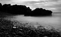
| 02/15/2010 04:18:22 AM | Rocking Chairby posthumousComment: Sorry, I gave it a 7 for a great abstract, this might have contributed for your not-so-low placing...
| | Photographer found comment helpful. |
| 02/15/2010 04:16:33 AM | Driftwoodby InsomniacComment: Now that's some eerie mist :)
We'll have to go there again soon, at least when it's not raining!!
Abraço! | | Photographer found comment helpful. |
|
Showing 161 - 170 of ~670 |
Home -
Challenges -
Community -
League -
Photos -
Cameras -
Lenses -
Learn -
Help -
Terms of Use -
Privacy -
Top ^
DPChallenge, and website content and design, Copyright © 2001-2025 Challenging Technologies, LLC.
All digital photo copyrights belong to the photographers and may not be used without permission.
Current Server Time: 08/17/2025 03:15:41 PM EDT.
|