| Image |
Comment |
| 12/06/2004 12:16:18 AM |
Niagaraby Rando D300Comment: Pretty. Nice perspective! I think I would have liked it a bit better if the camera was shifted up a bit - less of the covered area on bottom and more of the rainbow - that part just seems bluntly cut off. |
 Photographer found comment helpful. Photographer found comment helpful. |
| 12/06/2004 12:13:09 AM |
|
| Photographer found comment helpful. |
| 12/01/2004 08:23:24 PM |
|
| 12/01/2004 07:53:13 PM |
Reflectionsby brockmdComment: Great subject and concept. The photo is just too dark and the focus too soft.
This has a lot of potential! Message edited by author 2004-12-08 01:32:09. |
| Photographer found comment helpful. |
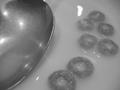
| 12/01/2004 02:17:03 PM |
Seven Skeinsby sibelingComment: Good subject - but the lighting is harsh and there are several distracting hot spots and blown details on the bottom of the shot. I think this would benefit from different subject placement and improved lighting. |
| Photographer found comment helpful. |
| 12/01/2004 02:15:12 PM |
Laura Ingalls Wilder by Candlelightby TooCoolComment: Interesting concept. Reasonable lighting, focus and composition. However, I am not fond of this perspective and the awkward and unnatural positioning of the candles. |
| Photographer found comment helpful. |
| 12/01/2004 12:13:27 AM |
sketch a rainbowby coldaComment: Very cool composition - love how the pencils nest. Focus seems a bit soft, lighting a bit harsh. 7 |
| Photographer found comment helpful. |
| 12/01/2004 12:10:52 AM |
breakfastby srpavoComment: Good concept. But the photo seems a bit dark and could use some more contrast (milk is very grey). Focus is a bit soft. BOL |
| Photographer found comment helpful. |
| 11/30/2004 10:51:18 PM |
weathervaneby byoungComment: Beautiful. Excellent color, clarity and composition. I like this very much!! |
| Photographer found comment helpful. |
| 11/30/2004 10:48:42 PM |
Low Tech Transportby JohannesFrankComment: Focus is a bit soft and I think I would have liked to have seen the horses full face. It just seems an awkward crop. Colors are pretty and background blur looks good. I also like the way the hair sweeps to one side on the head. |
Home -
Challenges -
Community -
League -
Photos -
Cameras -
Lenses -
Learn -
Help -
Terms of Use -
Privacy -
Top ^
DPChallenge, and website content and design, Copyright © 2001-2025 Challenging Technologies, LLC.
All digital photo copyrights belong to the photographers and may not be used without permission.
Current Server Time: 08/04/2025 11:40:20 PM EDT.