| Image |
Comment |
| 12/09/2003 12:55:53 AM |
The Roofby christyrackComment by ChrisW123: Too much useless space in this: ie. The sky and trees. Since the subject is the "shape" of the building, try zooming in on it. |
 Photographer found comment helpful. Photographer found comment helpful. |
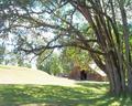
| 12/09/2003 12:19:01 AM |
The Roofby christyrackComment by train: Good shapes, but I think it would be better cropped closer (less sky)
Nice and clear |
| Photographer found comment helpful. |
| 12/08/2003 09:34:12 AM |
|
| Photographer found comment helpful. |
| 11/20/2003 09:05:13 AM |
Blacker than the ace of spadesby christyrackComment by moodville: The card seems slightly tilted, not sure if that was your intention of not. It's very minimalistic, conveys the phrase well, and the card isnt blown out, although there seems to be uneven color tones if you look at the lower left compared to around the A. It's good, just doesnt have much wow factor for me. |
| 11/17/2003 02:09:28 AM |
|
| Photographer found comment helpful. |
| 11/17/2003 01:09:51 AM |
|
| Photographer found comment helpful. |
| 11/17/2003 01:06:11 AM |
|
| 11/16/2003 11:55:43 PM |
Home Sweet Homeby christyrackComment by Neuferland: This is a lovely overall shot but the colors seem a bit dull ovearll at the same time. A bit more contrast and little less brightness would really make this shot jump out at me. I like the crop and the overall feel, started at a 5, moving to a 7 |
| 11/16/2003 09:45:11 PM |
Home Sweet Homeby christyrackComment by TooCool: I really wish that this shot was taken during a different time of day (when the lighting wasn't so harsh) because it looks like a beautiful scene! The only thing I would change would be the lighting...
TC |
| 11/16/2003 02:43:50 PM |
|
Home -
Challenges -
Community -
League -
Photos -
Cameras -
Lenses -
Learn -
Prints! -
Help -
Terms of Use -
Privacy -
Top ^
DPChallenge, and website content and design, Copyright © 2001-2024 Challenging Technologies, LLC.
All digital photo copyrights belong to the photographers and may not be used without permission.
Current Server Time: 04/29/2024 05:43:36 AM EDT.