|
|
| Image |
Comment |
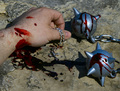
| 04/21/2007 12:17:14 PM | Blood on the Crossby djtiekComment: Greetings from the Critique Club.
I need to start with a disclaimer: the photo doesn't convey a lot of meaning to me, and I don't know what your intention was so can't comment on how well your creative decisions contributed to the overall goal.
My first impression of this photo is that it looks staged. That isn't necessarily bad if that's the intent, but it brings up a lot of questions: Why is there so much blood on the balls and very little on the spikes? (That flail obviously didn't draw the blood!) Why is blood smeared on the back of the hand? What is the connection between the chain in his hand and the chain on the flail? And where is the "blood on the cross" from the title? Now, it's great for photos to raise questions, but to be effective those questions need to be answerable either from the photo itself or by an allusion to something else. And I wasn't able to find any answers, thus making this photo unsatisfying.
Although lacking emotionally, the composition works well technically. There is a clear focal point (the upper ball), with a lot of lines that point to it (the curved line of the upper hand, the thumb, the chain on the right, etc.). It is well balanced and there are some nice diagonal lines that lend some excitement. Lighting is harsh, but not overly so, and probably suitable for the subject. The blood helps tone down the strong reflections in the balls, although they are still somewhat distracting.
To me, the photo lacks contrast, is a bit dark, and too soft. You used curves and unsharp mask, so this might be intentional, although I don't understand the reasons. But maybe you tried and discovered that increasing the brightness and contrast makes the saturated colors downright garish. The color saturation is fine as the photo is now, but some saturation adjustment is needed along with curves to keep the right balance. It's often easiest to go back an forth between hue/saturation and curves, making small tweaks to each until further changes don't improve the photo. And reducing the size generally reduces sharpness as well; try doing unsharp mask after image size instead of before to have better control over the final product.
Actually, I think this photo would work a lot better in black and white, where you can really boost the contrast and take full advantage of the strong lighting. A completely different alternative would be a low key treatment, where the overall darkness might better convey the mood you are trying to create. But that would require a reshoot; harsh light doesn't work well for low key. So that's really an option to keep in mind for future work, not something to do with this photo. |
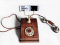
| 04/15/2007 11:25:27 PM | New Technologyby FirenzescaComment: Greetings from the Critique Club.
Very well done. Exposure and processing are perfect. Lighting is good, but not great. There is no distracting glare and the shadows are just right. But the photo is a bit flat; the lighting doesn't reveal the 3-dimensional form very well.
I like the nice, simple composition. The white background works well (and the cell phone shows against it, quite a technical feat!). I do think the photo could use some more space at the top.
This is a clever idea for the challenge, and though it probably won't have much interest outside that context, it meets the challenge perfectly. Good job! |
| 04/14/2007 12:15:22 PM | Shadow Romanceby librodoComment: Greetings from the Critique Club.
This is a wonderful photo, full of emotion and intrigue. The model is beautiful and her expression is perfect. The low key and warm colors set the mood. And the composition draws you in. This is much more than a snapshot; you are there, with the girl, feeling what she is feeling (even if you don't exactly know what that is!).
The composition is brilliant. The negative space on the right is essential, and is just the right size. And while plain blackness might have worked, the unfocused veil is a lot more interesting. The very subtle diagonal lines in the veil, the tilt of her head and the slightly upward direction of her gaze give this photo a lot of excitement. The earring plays a subtle but important role: it grounds the photo in reality by providing a true vertical reference (her head is really tilted; it wasn't just the camera) and, along with the whites of her eyes, a true white reference so the warm skin color can be accurately perceived.
I do have one complaint: The lighting on her left cheek is too bright. It washes out that part of the face and detracts from the low key feeling. Worse, it attracts attention and becomes an inappropriate focal point. The texture from the veil's shadow is great, but I wish it was more like that by her eye, darker and colored, rather than bright and white.
But even with that flaw, this is an outstanding photo. Nice work. |  Photographer found comment helpful. Photographer found comment helpful. |
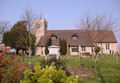
| 04/11/2007 11:10:35 PM | sereneby GrandadComment: Greetings from the Critique Club.
My first impression here is what a magnificent building this is, and how it really needs a larger format (like a 16x20 print) to properly convey it's majesty. Aside from that, there's a lot going on, which I personally like, but busy photos don't tend to score well on DPChallenge, where most voters prefer simplicity.
Good composition. There is a clear focal point in the marker or whatever it is in front of the building which is a bit brighter than the rest of the photo so draws the eye. It provides an anchor for exploring the other great details throughout the photo. The horizontal format and mostly horizontal and vertical lines convey the sense of serenity that is suggested by the title. A few diagonal lines add interest without distracting from the calm feeling.
The foreground bushes and midground trees give a sense of depth. But the building appears very flat since the light comes from directly behind so doesn't reveal its depth. The quality of light is very nice; it's just its direction that isn't very interesting. Certainly that's out of your control for the challenge, but try shooting this same scene at different times of the year when the sunlight will come from different directions.
The main technical problem with this photo is the lack of focus. This is partly because of your wide-open aperture; I think shooting at f/7 or f/8 with a slower shutter speed would have made a sharper photo. But there's also what looks like jpeg compression artifacts; a lot more than I would have expected for the size of your file. Did you save with a low or medium quality somewhere during your processing? Or perhaps did a lot of load/modify/save cycles (each of which reduces the quality)? However it happened, it really kills the crispness.
The photo is also a bit washed out; it needs to be darker and have the contrast boosted a bit. In Levels, move the midtone slider to the right a bit (and perhaps the black slider too to emphasize the shadows a bit), and in Brightness/Contrast, move the contrast slider just a bit to the right. Try it; it really makes the photo pop!
Actually, since you shot this in raw, I suggest starting over again from the raw conversion. Make your levels and contrast adjustments there along with the color. And if saving as jpeg, be sure the highest quality is selected. (Ideally, use tiff as the intermediate file format to avoid the lossy compression altogether.) And assuming your crop wasn't too extensive, you'll have the pixels and the quality to make a nice large print!
One last suggestion is to convert this to black and white. Getting the tones just right is an art itself! But b&w tends to emphasize the forms and textures more and has a lot of potential for this photo.
| | Photographer found comment helpful. |
| 04/09/2007 10:59:36 PM | Pinwheelby pipersdComment: Greetings from the Critique Club
I like this on several different levels. First, it's beautiful and the black background gives it a lot of impact. Next is the contrast between the formal, staid vase with its classic form and the frenetic spinning pinwheel; a child's toy juxtaposed with something children are generally forbidden to touch. But the pinwheel isn't really spinning; this is a still photo and any sense of spinning is pure illusion. Which leads to the next level: the still image of the pinwheel looks a lot like what is normally placed in a vase: a flower. It isn't alive, yet the sense of spinning makes it "lively", and the green color is a symbol of life. Of course, a photo of a real flower isn't any more "real" than this photo is; photos are just pixels on a screen or ink on paper. So there's some depth of meaning behind this simple photo. I have no idea whether you were thinking of all this when you made the photo, but that's the beauty of art: it doesn't really matter.
Good composition here; very simple and nicely balanced. And good use of color. Great focus and processing. Sharpness in particular is just right.
A couple of things I don't like: The glare on the pinwheel is overwhelming. Difficult to avoid, certainly, but still distracting. And while I really like the light shape reflected in the vase that helps define its form, I really wish it went all the way to the edge of the vase. Stopping so close to the edge kind of makes the vase look translucent right there. That or it was shaking during the exposure. I know it wasn't, but that illusion doesn't really fit with the rest of the photo.
Overall, an outstanding photo. I've really enjoyed studying it. | | Photographer found comment helpful. |
| 04/08/2007 07:27:30 PM | Disco & Nightlifeby SimpaComment: Greetings from the Critique Club.
The overall feel of this photo is certainly suggestive of disco and nightlife, albeit the relaxed sort where you can have a nice conversation rather than a night on the dance floor. The horizontal format and preponderance of horizontal lines, and warm colors evoke a peaceful feeling. And the overall dark tones work very well, with the dark shadows adding a touch of the mysterious.
The composition is balanced, with the lighter discs on the left complementing the darkness on the right. The light necklace in the middle is a great touch, providing a needed contrast to the overall darkness. There are some diagonal lines to keep it from being completely static, but I think it could use just a few more. Not so many as to overwhelm the relaxing feeling, but perhaps if one of the CD cases was a bit skewed instead of carefully arranged the photo would be a bit more interesting.
But I'm really bothered by the "floating" discs that have no visible means of support. Although they are well positioned compositionally, they seriously detract from the photo's realism.
I am personally not at all bothered by the "busyness" of the photo. Indeed, I like the complexity and interesting textures. The majority of DPC voters seem to prefer simplicity, but I think trying to simplify this photo would undermine the feeling that it conveys so well.
The brightness of the front center CD is very distracting. It draws attention away from the rest of the photo, and just doesn't fit the overall feeling. Tilting it slightly would keep it from reflecting so much light and greatly improve the photo.
I'm torn over the depth of field. The soft focus on the CD cases is nice. But the CD's themselves just look out of focus. So I guess overall I'd prefer more DOF.
Finally, try adding a small amount of noise. I personally think it enhances the feeling, but that's a personal opinion. Give it a try and see what you think. Message edited by author 2007-04-08 19:33:02. | | Photographer found comment helpful. |
| 04/06/2007 11:38:14 PM | Pop Art Slightly Burnedby fotomann_foreverComment: Greetings from the Critique Club.
Great idea. A very creative take on pop culture. But I don't really care for the execution. The composition doesn't seem balanced--it's a bit bottom-heavy. I do like the shape of the background (the negative space), but I think zooming out or moving back would have improved the composition.
The color is interesting. Burning out the blue wall to make it white is fine for the background, but the light it reflects gives a blue outline to the CD's and the lettering that I don't particularly like and a blueish cast to the toaster, which I do like. Except it doesn't really go with the brown spots. I like the texture of the dirty toaster, but not the color.
The other technical aspects (focus, exposure, etc.) are great. I especially like the glare around the metal edges, which nicely define the edges without being so bright to be distracting. And nice color on the CD's. (DVD's??) | | Photographer found comment helpful. |
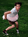
| 04/06/2007 10:13:42 PM | Alllllrighty Then!by escapetoozComment: Greetings from the Critique Club!
I find the photo humorous, bordering on zany. I love the pose, and his expression. I don't have the Pop Culture background for it to connect to me, but it's a fun picture. Great composition, and the high point of view works well. Colors are just right, as is the focus.
It seems a bit dark overall, which doesn't really match the light-heartedness it wants to convey. I'm guessing that's a result of Autolevels trying to compensate for the overexposed areas in the tutu and shirt. Speaking of which, they are a bit distracting, especially the back of the tutu, which competes with his face for the center of attention. | | Photographer found comment helpful. |
| 04/05/2007 06:51:29 PM | Pop Warhol: A Tributeby pipersdComment: Greetings from the Critique Club!
A nice tribute. Certainly fitting for the challenge, although not as interesting outside that context. But a well-done portrait of a can of soup.
As you said in your comments, this is all about execution. And that's great. Color is just right. Lighting works well (a bit of glare on the top that Warhol didn't have to worry about, but it's unobtrusive). About my only complaint is that the white part of the label blends into the background. (Warhol solved that easily by simply drawing lines for the edges, a luxury photographers don't have!) | | Photographer found comment helpful. |
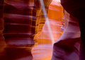
| 04/05/2007 12:41:05 AM | Happy Birthday Langdon! I got you a ray of light. It's not worth much but it's pretty :-)by TJinGuyComment: Greetings from the Critique Club!
Langdon seems to like it, and why not? Photographers always appreciate nice light, and this really is pretty! The color really draws you in to the photo and provides a wonderful backdrop for the subject: the light ray.
I find your choice of a landscape orientation interesting. I would have probably opted for a portrait format to focus attention more squarely on the subject and give the photo a more exciting feel. The dark foreground formations seem unnecessary, and I would have cropped them out, leaving only a bit for contrast and framing. Yet the way you have it does work very well. The foreground is dark enough not to detract from the subject, and gives a more relaxing feel that contrasts nicely with the light ray.
I have two suggestions for postprocessing. Both are based on personal preference, so may or may not suit your taste, but give them a try.
First, bump up the midtone contrast a bit to make the subject stand out more. Curves is the tool of choice for this, but I don't know if PSE5 has that. Alternatively, use the Midtone Contrast slider in the Shadows/Highlights tool.
Second, use a touch of Unsharp Mask. It will bring out the textures in the canyon walls, but you mostly want to add definition to the edges of the light ray.
Overall, this is a beautiful photo. Nice work. |
Home -
Challenges -
Community -
League -
Photos -
Cameras -
Lenses -
Learn -
Help -
Terms of Use -
Privacy -
Top ^
DPChallenge, and website content and design, Copyright © 2001-2025 Challenging Technologies, LLC.
All digital photo copyrights belong to the photographers and may not be used without permission.
Current Server Time: 09/03/2025 01:18:55 PM EDT.
|