|
|
| Image |
Comment |
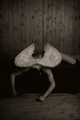
| 05/10/2007 08:04:03 PM | Fallen Angelby lowonenergyComment: Greetings from the Critique Club
This is an expressive photo, underappreciated by the voters. A bit disturbing; I assume that's intended, but it's also one reason for the disappointing score. The low key and sepia color create a somber mood, which is enhanced by the model's position. The composition is simple and effective, especially the negative space at the top that encourages the viewer to consider where the angel was before falling. The lighting is great, nicely showing the form of the body and gently illuminating the wings.
But although the low key is appropriate for this photo, I think it's a bit overdone. The highlights should be just a bit brighter, and I'd like to be able to distinguish the head, which gets lost right now. Perhaps that was intended, but I find it a bit disturbing; he almost looks decapitated.
Overall, great job. The photo conveys a strong feeling, even if it isn't a pleasant one. |  Photographer found comment helpful. Photographer found comment helpful. |
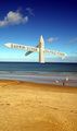
| 05/10/2007 07:04:50 PM | Nautical Directionsby SomeamateurComment: Greetings from the Critique Club
A directional sign out in the ocean is a promising idea that could result in an interesting surreal image. But here, although technically well done, the sign is just so large in proportion to the rest of the photo that it looks like what it is: a photo of a sign pasted on an ocean scene. To me, anyway, it doesn't really convey any special meaning.
Even without that issue, the composition is rather weak. The nearly centered horizon line is rather boring, and the large expanse of beach in the foreground is rather distracting from the idea here. I suggest cropping off the bottom third, putting the horizon on a "rule-of-thirds" line and focusing the viewer's attention more on the sea. The sky isn't bad, but it would be nicer if the clouds were brighter. And I think that this might work better in a horizontal format.
Overall, a worthy experiment for an Expert Editing Free Study. It's not really ribbon quality, but it does certainly show off your creativity, which is a big part of the appeal of DPChallenge. | | Photographer found comment helpful. |
| 05/09/2007 11:20:02 PM | Rorschach 's Babyby Blue MoonComment: Greetings from the Critique Club.
A creative idea, executed quite well. The composition is ambiguous. The melange of hands in the center wants to be the focal point since it's lighter and framed by shadow, but it's out of focus and dead center, so the noses compete with it (and each other) for being the focal point. This leaves the viewer somewhat confused, which would be very bad for most photos but works very well here. The ambiguity gives it the "interesting/disturbing" feeling that caught your attention and makes the photo work.
The very subtle tint and the nice gradations are not what one would expect in an inkblot, which is strictly black and white. But this isn't an inkblot; it's just a photo suggestive of one, and these elements bring it to life. Well done.
I don't think the white top and bottom only frame works very well. At least make it go all the way around, but I'd rather not see a frame at all here. And the sleeve is so bright it's distracting; a light gray would be better, and something with a subtle texture would be a plus.
There is a fuzziness around the eyelashes that looks like jpeg artifacts, although it could be a side effect of one of the other filters you used. It isn't really noticable, and I only bring it up because of your question about what caused the lines on the nose; it may have been the same thing. Ideally, jpeg should only be used by the camera (be sure to use the highest quality) and for the final product; always use a non-lossy format for all intermediate steps, such as transferring to/from neatimage. (And if you're using the free demo version of neatimage, that's probably the problem; it only supports low quality jpeg output.)
But intriguing as this photo is when first exploring it, it doesn't have the appeal to attract viewers again and again (although I can really only speak for myself here). But it was fun to critique it, and I'm glad I had that opportunity. | | Photographer found comment helpful. |
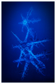
| 05/09/2007 12:21:37 AM | Winter's Last Remarkby shamerComment: Greetings from the Critique Club.
This is a stunning photograph. The details of the snowflakes is astounding, and the arrangement is artful. But it's the color that really sets the mood; it's perfect. And the vignette tops it off nicely.
I love the composition; I doubt you could have arranged the snowflakes better if you'd been able to. Besides the 3 flakes, the oval vignette acts as a subtle fourth element that is gradated and positioned just right to balance the photo. The overall similarities between the flakes unify the photo and the obvious differences and imperfections engage the viewer, inviting closer examination.
The lighting is just right to show off the snowflakes. Exposure and focus are perfect. The soft focus fits the subject well; snowflakes are supposed to be soft! Although a sharper focus would bring out more details, it would detract from the mood and perhaps make the snowflakes look fake.
I wish you had described your postprocessing steps; you did a great job. It has the feel of a duotone, but whether you actually used that technique or not is irrelevant. You've succeeded in bringing out and enhancing the natural beauty here. | | Photographer found comment helpful. |
| 05/05/2007 05:54:06 PM | Biena and the bubbleby BagpussComment: Greetings from the Critique Club.
I like the idea here of a woman absorbed in a simple activity: blowing a bubble. It makes you wonder what she is thinking; perhaps reminiscing on her childhood (the phase of life most commonly associated with bubble-blowing), or reflecting on her life (suggested by the house reflection). The photo does have a nice contemplative feel.
The viewpoint is perfect. A head-on shot wouldn't have shown the bubble well, and a complete profile wouldn't have flattered the model. The partial profile shows both well.
The composition is simple and has a lot of strong points. The background is nicely blurred with great bokeh. The model is an essential element of course, but is nicely placed so she doesn't overpower the image. The bubble is the clear focal point, with diagonal lines in the nose and middle finger pointing to it, and framed nicely by her shoulder. But it's crowded; there needs to be some negative space to the right. I agree with tnun's suggestion to crop just above the eyebrows, but want to go a bit further. This photo would have worked much better in a horizontal format, with Biena's forehead cropped off and some space to the right of the bubble. That would also better match the overall feel of the photo.
The colors work well here; the predominant greens and browns go with the mood, and the splash of complementary purple adds some excitement. (I think the photo could work even better in black and white, but that's really a personal choice.)
Focus and exposure are perfect. But contrast is lacking. Simply increasing the overall contrast greatly improves the photo; using curves would allow more precise adjustment.
Finally, I keep wishing I could see the model's eyes. The apt title is "Biena and the bubble", but Biena doesn't really stand out. Seeing her eyes, and perhaps some makeup would fix this. But then again, that may well change the whole feel of the photo; her lack of expression lets viewers use their imagination, perhaps putting themselves in her place.
Overall, a so-so photo, flat (due to lack of contrast) and compositionally weak. But it has a nice feel and an interesting subject |
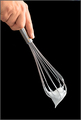
| 05/02/2007 08:26:17 PM | Whisked Awayby eqsiteComment: Greetings from the Critique Club.
A nice photo. The contrast with the black background really catches the eye. I agree with your assessment, not terribly exciting, but technically well done.
Compositionally, I think it needs more space at the bottom; the negative space would add some drama. And I'd also crop off half of the hand; it doesn't really add anything to the photo. I think the tall, narrow format works very well here, as does the strong diagonal and overall simplicity.
| | Photographer found comment helpful. |
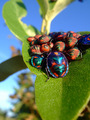
| 04/26/2007 11:01:00 PM | Cotton Harlequinsby JonathanJComment: Greetings from the Critique Club.
Vibrant colors that work well together. Interesting textures that make the photo fun to explore. The large bug in front is a clear focal point that the eye returns to again and again as it explores the contrasting elements around it. A very nice photo.
I do wish that large bug was in focus. A bit larger depth of field would have improved this; depending on wind, perhaps f/8 at 1/100 second.
The point of view works well, but it's a bit unbalanced and the bug at back right is cut off. Pointing the camera a bit to the right would improve the composition. It's centered, but that's fine (and common) for macros. The vertical orientation was the right choice here.
Another minor complaint is the glare reflecting off of some of the bugs. But overall a great photo, especially considering the minimal editing rules. | | Photographer found comment helpful. |
| 04/25/2007 11:23:21 PM | Sunset reflectionsby Rino63Comment: Greetings from the Critique Club.
The first thing I noticed with this photo were the bright, saturated colors. They really catch the eye! Unfortunately, the expectation of a nice abstract (or perhaps surreal) photo isn't fulfulled. After the initial "wow", the subject is recognized and the colors just look unrealistic and oversaturated.
The photo is, paradoxically, both overexposed and too dark. There's just a really high dynamic range here that is very difficult to capture without special techniques.
The composition is great left-to-right. The boats are attractive and the placement of the elements gives a great impression of depth. But top-to-bottom the composition isn't well balanced. The centered horizon that's bright above and dark below just doesn't work for me, although the masts do their best to tie the photo together. I think cropping about a sixth from the top helps a lot. And perhaps a bit less from the bottom to give a panoramic format would suit this photo well.
But getting back to the original idea (or at least my original impression), I think this photo could work by taking a surreal approach: selectively darken the sky and mountains to give a sort of low key effect. Although the bright areas would still be bright, and there's far too much contrast for a true low key photo, I think the effect could be dramatic, and the "unreality" subtle enough to give the viewer the feeling of "something isn't quite right, but this sure is pretty." | | Photographer found comment helpful. |
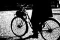
| 04/24/2007 11:42:13 PM | Dramatic framingby Rino63Comment: Greetings from the Critique Club.
This is a wonderful minimalist photo. Most everything except the shape of the bicycle is stripped away, making the subject very clear. It's a very dramatic treatment, as was intended. The cobblestones make a great texture with the high contrast; a whole lot more interesting than a smooth road would be.
The composition is great. It's nicely balanced and really draws the viewer into the scene. The front hub is right on a rule-of-thirds intersection, and lots of lines point to it, making it the clear focal point. Cutting off the top of the rider intensifies the focus on the bicycle. Cutting off parts of the back wheel is unusual, and it works very well.
I am bothered by the "missing" spokes. It really isn't that distracting, and the subject is still clear. It just seems a bit strange to see some spokes but not all of them.
But overall a great photo. I've really enjoyed studying it. | | Photographer found comment helpful. |
| 04/22/2007 08:56:19 PM | Wish I were stronger, I can't seem to break the chainby zoolComment: Greetings from the Critique Club.
This photo conveys a definite message and is technically very well done. The low key treatment is perfect for the photo's purpose, and exposure and focus are perfect. The elements of the photo are nicely arranged. The picture is dominated by the horizontal and vertical lines of the cigarette, ashtray, pack, and chain, which suggests stability. This is in stark contrast to the diagonal arm with clenched fist, which makes the message of "I want to quit" even stronger.
I especially like the tattoo of the scorpion, a symbol of treachery that is certainly appropriate for the idea here. It's just the right size, large enough to be noticable but not so large as to compete with the main elements. Another nice touch is how the smoke connects the cigarette to the chain, which is certainly rife with meaning.
There are two compositional items that could be improved. First, the camera should be tilted up a bit. The negative space at the bottom doesn't do anything for the photo, but it really needs some negative space at the top for better balance. Second, the top half of the cigarette pack is too busy and too light; it detracts from the rest of the photo. I love the red color of the bottom half; a prop pack with that color and clearly labeled "cigarettes" would do a lot for the photo.
Overall lighting is great, especially on the ashtray where the brightness is pleasing and a welcome contrast from the overall darkness. But the bright spots on the hand and behind the pack are distracting. Perhaps a snoot on your rear light would have helped. | | Photographer found comment helpful. |
Home -
Challenges -
Community -
League -
Photos -
Cameras -
Lenses -
Learn -
Help -
Terms of Use -
Privacy -
Top ^
DPChallenge, and website content and design, Copyright © 2001-2025 Challenging Technologies, LLC.
All digital photo copyrights belong to the photographers and may not be used without permission.
Current Server Time: 09/03/2025 03:18:06 PM EDT.
|