|
|
| Image |
Comment |
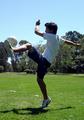
| 05/17/2007 11:56:23 PM | Practice Makes Perfectby meganoComment: Greetings from the Critique Club
The action here is great! It catches the proverbial "decisive moment", freezing the action as only a camera can. The simple composition allows people to project their own imagination on it, making the experience personal to every viewer. The memories and emotions it triggers would be very different for a soccer player, a soccer fan, and a ballet dancer!
As others have pointed out, the main problem here is the extreme dynamic range caused by shooting toward the sun. Cameras may freeze action well, but they can't capture both very bright and very dark areas at the same time. And the shadows are so dark here that they obscure the 3-dimensional form. Shooting with the sun behind you would help (although I have no idea what the background would be like in this case).
You can try bringing out some shadow detail here using the Shadows/Highlights tool, although the extremes are so, well, extreme that the result would probably be somewhat unrealistic.
The composition of this photo is weak. The ball is a natural anchor here. It's what the player is looking at, and the focal point of any soccer game. But it's crowded by the left edge. There needs to be a bit more space to the left so the view isn't cut off when the eye is focusing on it.
One more suggestion: Always use the highest quality you can when using the jpeg format. For DPChallenge, you are allowed up to 150K, and you are only using about a third of that here. The "fuzziness" around his head, left hand, and elsewhere is caused by low quality jpeg compression artifacts. They really aren't that noticable here, but do keep this in mind; this can easily ruin otherwise great photos, and it's easily avoided.
Congratulations on a personal high score! This really is a good photo. Voters here tend to over-emphasize technical quality. Keep shooting; practice makes perfect in photography as well as soccer! |  Photographer found comment helpful. Photographer found comment helpful. |
| 05/16/2007 07:56:02 PM | Little League ~ Mom's Viewby okiesisiComment: Greetings from the Critique Club
I really like this photo. The colors and contrast really grab my attention, the blurred fence makes a nice frame for the player, and the abundance of diagonal lines makes for a very dynamic composition. Somehow I really don't care that it's crooked! Maybe because it's slanted enough that it seems intentional. And it's a unique, interesting perpective (Melethia isn't the only one that got it!).
OK, So it's a snapshot. I like it, and it isn't even my kid. (And I don't even like baseball!) It may not be a ribbon contender, but I'm glad you entered it. (And even more glad I drew it from the pool, since I didn't vote on this challenge and would have otherwise missed it!)
It's hard to be critical of a photo I like so well. I guess there are some distracting elements, like the corner of the roof on the right, but you can't control those in candid shots. And I wish it was just a bit sharper, although that's more a personal preference. Imperfections and all, there's nothing I'd really suggest changing here.
I hope he got a hit!
| | Photographer found comment helpful. |
| 05/16/2007 06:53:39 PM | Applausi (During the presentation of the Micha van Hoecke biography)by Rino63Comment: Greetings from the Critique Club
I think this photo has a story to tell. Obviously the end of a performance. And lots of unanswered questions, like who are these people and why are they barefoot? But no real way to find answers from the photo, and I'm afraid the only message I really get from it is that I missed the interesting part.
The taller podium takes the center of interest with its brightness and placement. The actors, being darker and near the edge, are secondary elements here. If that was intended, I don't get the point. A wider angle with more space to their right would have helped the composition (assuming you did want the actors to be the focal point here). Basic editing rules restrict other possibilities, unfortunately.
The very low lighting has produced a low quality image. Not much you could do about that; you made the best of a poor situation. | | Photographer found comment helpful. |
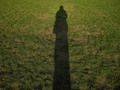
| 05/14/2007 07:22:02 PM | The Shape of Me...by mian3010Comment: Greetings from the Critique Club.
The Dr. Seuss book actually used silhouettes, not shadows, but this is close enough. And the distortion caused by the low angled light does make it rather "Seussesque". So it certainly meets the challenge for me (although voters who never read that book may disagree).
I do wish the shadow was darker, with sharper edges and with advanced editing this would not have been difficult. And I agree with cpanaioti that a vertical format would have been better. I do like the textures and lines in the field. The way they arc around the shadow is very nice, framing the subject rather than distracting from it.
But frankly, the shadow just isn't that interesting. Arms and hands (perhaps from an assistant standing behind you) and distinct legs would have helped. Spiky hair would have been great, but tough to pull off in a shadow. A second person's shadow would also have added interest, although that would have made an entirely different photo.
Overall, a great idea here; it just needs a little more fun! | | Photographer found comment helpful. |
| 05/13/2007 11:53:28 PM | Pi-Positiveby meneleComment: Greetings from the Critique Club
An interesting take on the challenge. The colors work great; they grab attention and work well together. The diagonal lines make it really dynamic. And the depth of field is great; the different levels of focus add interest, and it helps direct attention to the left intersection, making it a good anchor.
Lighting isn't bad, but it isn't that interesting either. The reflections do, I think, contribute to the photo, but I think a round or square light would have been better. Or what would have been really impressive is a pi-shaped gobo, so all the light reflections would have a pi shape!
I'm surprised this photo didn't score better. I rather like it! | | Photographer found comment helpful. |
| 05/13/2007 11:37:46 PM | Bikeby electinaComment: Greetings from the Critique Club
An interesting subject with enough symmetry to meet the challenge, and enough asymmetry to be interesting. The centered composition has the intended effect of emphasizing the symmetry.
Technically, there are good points and bad points. Focus is OK, as are levels and contrast. Colors are realistic. But the horizon isn't level and it's overexposed (burning out a lot of the sky) and oversharpened (putting halos around some of the edges). You didn't mention sharpening as one of your steps; but Neat Image has this feature as well as noise reduction. (And an SLR at ISO 100 should not have had significant noise; I'm not sure why Neat Image would be needed at all.)
But the focal point of this photo, where at least my attention is repeatedly drawn to, is the box in the background. I can see why you want to get rid of it! But without the box, there isn't a real focal point; the viewer's eye still tends to see right through the bike and focus on the background. Part of the problem is that the bike is mostly a silhouette, so it's like looking through a fence or something that we do everyday without thinking about it; that's just how our eyes and brains work. But the distraction of the bright white sky is also a factor.
Three suggestions for improvement. First, crop off the top third or so of the photo, eliminating the white part of the sky. Second, convert to black and white so the colors of the background aren't so attractive. (The bike is pretty much black and white anyway.) Third, shoot this from a lower angle. That's not something you can change on this photo, but putting the chain guard closer to the ocean would help focus attention on the bike. |
| 05/12/2007 10:40:44 PM | Lil Boy Blueby KaralewComment: Greetings from the Critique Club
What a cute kid! A great pose; he looks really natural and happy. I love the way he is peeking out from behind something. It's a delightful portrait.
Unfortunately, the flash is too bright and has washed out his face. There's probably a way to set the intensity, although doing so quickly for a candid shot isn't always feasible. A simple trick is to keep a plain white handkerchief handy to cover the flash when shooting at close range with just a moment's notice. There's probably no easy to recover from this in Photoshop (although you might try the Darken Shadows setting in the Shadows/Highlights tool).
The black background works very well. It would be nicer if it was completely black, something easily done in most any photo editor. I'd also crop a bit off the bottom; there's a bit too much space down there. (I personally think making the proportions 5x7 is about right.)
Still, for a candid shot this turned out really well. I'm sure it's a photo you'll cherish for years. | | Photographer found comment helpful. |
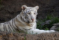
| 05/12/2007 06:39:45 PM | Orissaby izadoodleComment: Greetings from the Critique Club
A beautiful animal in a rather typical pose. Focus and exposure are great, and the photo nicely captures the unique markings and the texture of its fur. But nothing to really give the photo impact.
The main problem, as Ben pointed out, is that the photo is rather flat; the three dimensional form of the tiger isn't apparent here. Form is defined in photographs by shadow, and the light in the shade here is very diffuse; it doesn't cast shadows. Thus the flat appearance. Not a lot can be done about that, but perhaps at a different time of day the light would reflect into the exhibit more strongly from one direction than another and cast some shadows.
Another problem, also pointed out by Ben as well as others, is the centered composition, which is rarely interesting. But if you crop off the left side to eliminate the stick in the background, and also a bit of the top and bottom, you get a lot more interesting photo.
Finally, there is a slight blue color cast here. Objects in shade are lit by indirect light from the blue sky, so appear bluish. Compensating for it will make the overall colors warmer and add some life to the photo. |
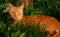
| 05/12/2007 02:37:12 PM | Regalby toskComment: Greetings from the Critique Club
A lot of rich, warm color here! The oranges, greens, and browns complement each other well, and give the photo a relaxing, inviting feel. The landscape format and mostly horizontal and vertical lines enhance this mood. In contrast, the cat itself is on edge, it's body language warning you it doesn't want to be bothered. (This message comes through even without reading your comments!) It's this tension between the seeming relaxing photo of an unrelaxed subject that makes this photo work.
The lighting is great, giving a few subtle shadows (nothing harsh) and putting a catchlight in the cat's eyes. Exposure is perfect (or at least well compensated in the raw conversion). Focus is on the foreground grass rather than the subject, to the detriment of the photo.
I really like the depth of this photo. It has a definite foreground, midground, and background, which gives it a nice 3-dimensional look. This is due in large part to the distinct green/orange/brown colors at the different locations that separate them well. But also to the shallow depth of field; using a smaller aperture (like f/10) would have put the cat in acceptable focus even though the camera picked the grass to focus on, but would have also decreased the depth.
I personally think the composition would be improved by cropping off about 20% off the right side and 10% off the bottom. Seems to me to give the photo better balance. I would also increase the midtone contrast a bit (a standard "S-curve" in curves) to highlight the face more and make the photo "pop".
I'm undecided about the purple flower. It does add a nice splash of contrasting color, but I don't think that color really fits with the rest of the colors. (But then, I'm color blind, so take that opinion for what it's worth!)
My wife just walked by, so I asked her opinion. She loves the purple accent, which is desaturated enough it doesn't clash. She also prefers your crop to my more drastic suggestion! Goes to show you can't please everyone. (Especially with a cat!) | | Photographer found comment helpful. |
| 05/12/2007 12:09:16 PM | One note can spin the world.by brayburnComment: Greetings from the Critique Club.
You can almost hear that note! You've really made this photo come to life. The combination of the strong diagonal of the clarinet and the radial blur make this photo really dynamic. And the overall darkness gives a nice mood. It captures an exciting night life moment.
The exposure is perfect, capturing the subtle contrast between the dark skin and darker instrument and the black background. The lighting plays a big part here, and it works well.
The radial motion blur is exceptionally well done here. There is no blur on the performer's face (good, since that's the focal point here), very subtle blur on the end of the clarinet (gives just a hint that it's moving), and lots of blur on the non-subjects (but not so much that their identies are lost). The more I look at it, the more I am convinced that the shutter speed was really closer to 1/25 instead of 1/125 and the blur was a result of radial panning. So if the radial blur really was added in Photoshop, it's very realistic! Either way, great job with it.
The shallow depth of field augments the motion blur of the background sign and foreground guitarist to focus attention on the subject. Good focus, and the sharpness is just right.
Unfortunately, the composition is a bit weak. First, the white structures right behind the subject are very distracting, both to the subject and to the overall mood. Of course, there isn't anything you can really do about that! This is a street shot, and you don't have the control you'd have in a studio. Perhaps a different position would help, but not likely (and probably not possible). Nevertheless, that's probably a major factor to this photo's mediocre score.
Second, the subject is centered, and that rarely makes for an interesting photo. Cropping off the guitarist would put the performer at the magical rule of thirds position, but would also eliminate most of the cool radial blur, so I don't recommend that. But a less drastic crop, removing the guitarist's back but leaving the arm and head, would shift the subject out of dead center yet retain much of the blur that makes this photo so interesting.
Overall, I think this is a great debut entry, and I've really enjoyed studying it. Again, I think it captures the moment very well. Don't let the disappointing score or lack of comments discourage you! I look forward to seeing more of your photos here on DPChallenge. | | Photographer found comment helpful. |
Home -
Challenges -
Community -
League -
Photos -
Cameras -
Lenses -
Learn -
Help -
Terms of Use -
Privacy -
Top ^
DPChallenge, and website content and design, Copyright © 2001-2025 Challenging Technologies, LLC.
All digital photo copyrights belong to the photographers and may not be used without permission.
Current Server Time: 09/03/2025 03:18:08 PM EDT.
|