| Image |
Comment |
| 02/15/2003 09:25:05 AM |
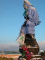
Goddess of Mercy in winter outfitby kenboComment: Neat! Where is this? The composition is masterful. I love the way she looks down over the landscape in the background, from way up in the sky. |
 Photographer found comment helpful. Photographer found comment helpful. |
| 02/15/2003 09:24:00 AM |
You're My Palby welcherComment: This is just really, really cool. I love the colours, the cool distortion of the water, and the composition. 10! |
| Photographer found comment helpful. |
| 02/15/2003 09:23:07 AM |
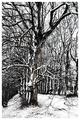
WinterTreesby RemieComment: I love the high contrast in this, and the twigs and branches all interlace into an amazing sense of texture. I'm giving this 10! I love it. |
| 02/15/2003 04:34:57 AM |
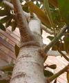
This Could Take All Day...Up Ya Go!by anggComment: I don't get the title. The photo is kind of nice. I like the blurring of the tree trunk bringing my eyes further up towards the branches. Overall, the composition is nice, and the light is decent. The colours are a little washed out. |
| 02/15/2003 04:33:05 AM |
Columbiaby tfarrell23Comment: I really can't find any way to judge this photo with respect to the challenge, but maybe that's a cultural thing? I also don't really like photos that are of something 2 dimensional from a perpendicular camera angle. This seems to break the rule on photographing a work of art in its entirety, although I'm sure it would be DQ'ed by now if others agreed with me.
The composition is striking and thel ighting is good, but that's about all I can say. |
| Photographer found comment helpful. |
| 02/15/2003 04:29:29 AM |
Beware of Dogby ladpupmoeComment: I'm not quite sure how this meets the perspective challenge. We're seeing the world from the dog's perspective? I guess that works. The reflections are a nice touch, but unofortunately there is nothing sharp enough or with a high enough impact to tie the photo together. The sign comes the closest, but it's blurred. If there was more light on the dog or something, it may have worked. |
| Photographer found comment helpful. |
| 02/15/2003 04:26:43 AM |
Standing tallby teachme53Comment: Regardless of how angry I am about world politics at the moment, this is a VERY good photo and right on topic. I can't possibly let anti-war bias get in the way. |
| Photographer found comment helpful. |
| 02/14/2003 04:16:04 AM |
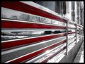
The Silver Dinerby smellyfish1002Comment: This is neat. It's a busy photo, but those red lines really tie it all together and give your eyes something to focus on. Interesting and different and creative. |
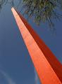
| 02/14/2003 04:14:21 AM |
Commerce Beaconby jenaromComment: The composition of this is awkward. Having something come right from the corner is generally a no-no, unless you have a really good reason to break that rule. The colours seem a bit greyish and the monument is overexposed at the top. There are a lot of photos similar to this one in the challenge, so it's hard not to compare them and see that yours is lacking a little bit in colour and composition. |
| Photographer found comment helpful. |
| 02/14/2003 04:11:51 AM |
Supportby OneSweetSinComment: Cool shot, but it lacks tonal depth. Some work on the contrast or playing with the levels in photoshop would have brought this up really well. My monitor is calibrated to see all the squares on the voting page, so you have to use that full range for me to see depth in a photo and prevent it looking washed out. |
| Photographer found comment helpful. |
Home -
Challenges -
Community -
League -
Photos -
Cameras -
Lenses -
Learn -
Help -
Terms of Use -
Privacy -
Top ^
DPChallenge, and website content and design, Copyright © 2001-2025 Challenging Technologies, LLC.
All digital photo copyrights belong to the photographers and may not be used without permission.
Current Server Time: 08/27/2025 04:06:13 AM EDT.