| Image |
Comment |
| 02/16/2003 11:00:14 AM |
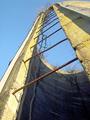
Abandoned Siloby LindaLeeComment: Very effective composition and great textures. Feels a little overexposed though. I don't feel as though I'm seeing all the texture here as well as I could. |
 Photographer found comment helpful. Photographer found comment helpful. |
| 02/16/2003 10:56:27 AM |
Elephant Feetby fsieradzkiComment: Interesting shot, but I'm not sure about the sense of perspective here. The shapes of the icicles are really weird and cool. The image seems tilted though. |
| Photographer found comment helpful. |
| 02/16/2003 10:54:59 AM |
Sleeping Puppyby jnevittComment: There's another dog photo in this challenge that shows how far you can go with perspective in a dog portrait. This one has its charm, but the front lighting flattens it and there isn't quite enough nose to create a strong sense of perpective by itself! |
| Photographer found comment helpful. |
| 02/16/2003 10:53:18 AM |
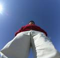
A Bugs Lifeby Fibre OptixComment: This composition is highly centred. In this case it kind of works. I like central composition when it has a purpose. However, I find this photo a little uniniteresting this way. All the negative space around the man is kind of purposeless. A closer crop would be more effective I think.
I like the lens flare though, it really adds to the image :). |
| 02/16/2003 10:48:37 AM |
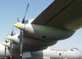
WWII-B36by autoolComment: Seems like a very technically good image, but the subject isn't interesting to me. It's like something from a museum brochure, maybe. Dry and technical, but well done. |
| 02/16/2003 10:44:52 AM |
Different perspectivesby GordonComment: This is cool. It's fun to compare the different groups of people. Unfortunately, they're all so small, I can't really see their body languages as much as I'd like. A tighter crop maybe with just the top 2 levels might have been more effective (if it was possible, and the camera wasn't low end). |
| Photographer found comment helpful. |
| 02/16/2003 10:41:11 AM |
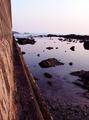
THE WALLby AntithesisComment: I think that the wall is a little too marginalised in this photo. It doesn't feel like it's the subject, more an element that distracts a bit from the breathtaking landscape. |
| Photographer found comment helpful. |
| 02/16/2003 10:39:33 AM |
A Window-cleaner's Nightmareby FranziskaLangComment: Wow, very nice mix of colour with black and white. The composition is very strong. It's pretty much technically perfect, but it's one of those photos where I feel the technique is stronger than the subject choice. On an emotional level it leaves me a bit cold. |
| Photographer found comment helpful. |
| 02/16/2003 10:37:24 AM |
tumbling dominoesby MajorChaosComment: I think this is a great idea, but the composition is very loose and scattered. A tighter shot, or shallow DOF that brings strong focus to some area of the photo would strengthen it. |
| Photographer found comment helpful. |
| 02/16/2003 10:34:26 AM |
Liberty and Justice for All - 2by kevinswopeComment: Oops, earlier I thought there were only 2 American-flag-up-a-pole photos, but there are 4!! As I've said on the other two I've rated, it's hard for me to get over this symbolism, since I'm not American and I'm angry about the looming war. But this is a very strong photo. Of the 4, it's in the top 2 :). |
Home -
Challenges -
Community -
League -
Photos -
Cameras -
Lenses -
Learn -
Help -
Terms of Use -
Privacy -
Top ^
DPChallenge, and website content and design, Copyright © 2001-2025 Challenging Technologies, LLC.
All digital photo copyrights belong to the photographers and may not be used without permission.
Current Server Time: 08/27/2025 02:36:23 AM EDT.