| Image |
Comment |
| 04/06/2005 03:44:30 PM |
|
 Photographer found comment helpful. Photographer found comment helpful. |
| 04/06/2005 03:42:52 PM |
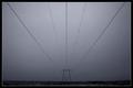
Aceby BrinComment: Good use of negative space |
| Photographer found comment helpful. |
| 04/06/2005 03:39:18 PM |
M... is for Mountain.by babymaderoComment: Unless you have some compelling reason to use such a small image it's a good idea to take advantage of the full 640 pixels that DPC allows in at least one direction.
The "M" is rather out of focus; a deeper DOF and a UV filter to eliminate some of the atmospheric haze would have helped this picture. |
| 04/06/2005 03:37:30 PM |
Aby arnitComment: I like the perspective, but the distance makes the intended subject a bit poorly lit. |
| 04/06/2005 01:25:18 PM |
Wood-yby dahvedComment: The weird white glow around everything makes this look over-processed. |
| Photographer found comment helpful. |
| 04/06/2005 01:22:45 PM |
gby trnqltyComment: A shallower DOF or a different crop might have made the professed subject of the photograph more obvious. As it stands, the background takes too much attention, almost to the exclusion of the "g". |
| Photographer found comment helpful. |
| 04/06/2005 01:20:15 PM |
|
| Photographer found comment helpful. |
| 04/06/2005 01:18:47 PM |
Im Sorry..by RaiNb0wGiRliE2Comment: Well, you certainly got my attention with this picture. To date I don't think any other images here have caused my heart rate to increase dramatically.
Since the challenge is "accidental letters" and these letters seem to be intentional (if unfortunate), I don't really see how this meets the topic. For 'shock art' this is certainly powerful, but probably of rather limited appeal (as are most items in said genre). Due to the polarizing nature of this shot, I'd expect it to do poorly on any challenge, even if it was on topic. If the designated theme was "desperation" or "hopelessness" or something like that I'd probably give this around a 7. The clear view of the girl's face really adds a lot of impact to this shot. Anyway, this is a valiant effort but is unlikely to do well. |
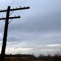
| 04/06/2005 01:02:13 PM |
20 Foot Fby d1mikemComment: The skyline doesn't seem to add much to the image; I probably would have cropped it higher up on the pole. |
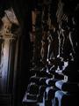
| 04/06/2005 01:00:58 PM |
khajurahoby gogs2000inComment: Unless you have some compelling reason to use such a small image it's a good idea to take advantage of the full 640 pixels that DPC allows in at least one direction.
|
Home -
Challenges -
Community -
League -
Photos -
Cameras -
Lenses -
Learn -
Help -
Terms of Use -
Privacy -
Top ^
DPChallenge, and website content and design, Copyright © 2001-2025 Challenging Technologies, LLC.
All digital photo copyrights belong to the photographers and may not be used without permission.
Current Server Time: 08/20/2025 11:49:47 AM EDT.