| Image |
Comment |
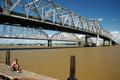
| 05/03/2005 12:46:42 AM |
Fishing in Berwick Bayby photogJamesComment: And I thought that the Missouri river looked murky. A narrower DOF would have made the fisherman a more prominent element of the image. I'm not sure how intentional this was, but both the placement of the horizon and the color palate seems to divide this into two images: the lighter, cooler colors above the midline and the darker, warmer colors below. The rust on the bridge complements the colors in the bottom half of the image, but the lower section doesn't seem to reciprocate. I think that the composition would be stronger if there were traces of blue in the bottom of the image (the man's shorts, for example). |
 Photographer found comment helpful. Photographer found comment helpful. |
| 05/03/2005 12:40:04 AM |
door knobby robadsyComment: Mondrian would be proud. The shadows from the knob are a bit distracting. |
| Photographer found comment helpful. |
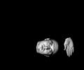
| 05/03/2005 12:39:07 AM |
Symbolismby JPRComment: Very sharp image. I love the high-contrast. I'm interested in knowing what your lighting setup was for this shot. |
| Photographer found comment helpful. |
| 05/03/2005 12:30:44 AM |
Plucked from Lifeby hopelessoptimistComment: The strong shadows and pollen specks are distracting. The gradient along the right edge does a good job of leading my eyes toward the flower. |
| Photographer found comment helpful. |
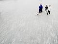
| 05/03/2005 12:27:56 AM |
|
| 05/03/2005 12:26:45 AM |
Turn Twoby LKMoteComment: The focus seems too soft and the hot spots at about 4 o'clock are distracting. Shooting this at a slower speed would have accentuated the motion of the car and made it more of a focal point. |
| Photographer found comment helpful. |
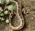
| 05/03/2005 12:23:14 AM |
The lizardby sepplComment: This strikes me as a better example of hyperrealism than minimalism. I really love the textures in this image. What kind of a lizard is this? He seems to be changing colors to blend in with the plants. |
| Photographer found comment helpful. |
| 05/03/2005 12:20:47 AM |
Must... Find... Lampost...by MatthewComment: The texture in the bricks seems to wash out near the back of the image, and the focus gets a bit soft near the people as well. Nice use of negative space. |
| Photographer found comment helpful. |
| 05/03/2005 12:18:47 AM |
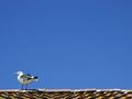
seagull on the roofby photomikeComment: The bird placed at this position in the frame while facing that direction adds visual tension to the image and makes me want to turn to see what's off to the left. Good use of colors and textures. |
| 05/03/2005 12:16:11 AM |
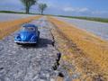
Cruisin, USAby bearbearComment: This is a novel take on the topic. Good DOF. I like the faded, flaking lines of paint and the crack in the road. |
Home -
Challenges -
Community -
League -
Photos -
Cameras -
Lenses -
Learn -
Help -
Terms of Use -
Privacy -
Top ^
DPChallenge, and website content and design, Copyright © 2001-2025 Challenging Technologies, LLC.
All digital photo copyrights belong to the photographers and may not be used without permission.
Current Server Time: 08/24/2025 03:21:09 AM EDT.