| Image |
Comment |
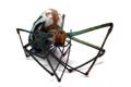
| 09/03/2005 09:35:33 PM |
Dead Legsby hstegComment: I would have preferred to see better definition in the legs on the left side of the image; as it is the shallow DoF and light cause the dark legs and black body to merge together somewhat. This is one of the best executed shots that I've seen in the challenge so far. Hopefully the other voters won't penalize you too much for the subject. |
 Photographer found comment helpful. Photographer found comment helpful. |
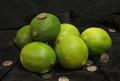
| 09/03/2005 09:30:51 PM |
Dimes & Limesby cornettcagComment: Everything seems to be slightly out of focus, and the wrinkles in the background are a little distracting. Increasing the saturation and contrast would have helped this image. |
| Photographer found comment helpful. |
| 09/03/2005 09:27:32 PM |
Destructive Larvaby woodseyComment: I don't care for the frame. Since this was an advanced editing challenge you probably should have cloned out the specks on the leaves. Dodging the background a little bit behind the caterpillar's antennae would have given them better definition. Good DoF, and overall a nice image. |
| Photographer found comment helpful. |
| 09/03/2005 09:23:27 PM |
Dark and Lightby coffeebellComment: The barrel distortion from the wide angle lens is clearly visible along the horizon. This would be a much stronger composition if the boat in the center had sharper focus. |
| Photographer found comment helpful. |
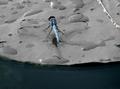
| 09/03/2005 09:20:36 PM |
Don't Lookby CaltropComment: The background is a little too busy. A shallower DoF would have helped this shot. |
| Photographer found comment helpful. |
| 09/03/2005 09:19:21 PM |
|
| 09/03/2005 09:17:44 PM |
|
| Photographer found comment helpful. |
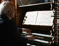
| 09/03/2005 09:16:18 PM |
dolce e legatoby bicrayComment: I have mixed feelings about the knobs on the right edge of the image; overall I think that I'd rather see them either moved a bit further into the frame or cropped out entirely. The light coming over the man's shoulder is a bit strong, causing the music sheet, his hair and a few of the keys to be overexposed. Adding a light source to the side of the man that's closer to the camera would have evened out the light enough that you wouldn't have to sacrifice the highlights. |
| 08/30/2005 03:00:35 AM |
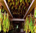
Drying & Leavesby JunieMoonComment: The lines converge on the least interesting part of the photo; recomposing this to have one of the beams direct attention toward the leaves would have improved this shot.
|
| 08/30/2005 02:58:47 AM |
Disturbed and Lewdby parrotheadComment: Wit a little burning to emphasize the mood and a less posed looking expression this would be a ribbon contender. |
| Photographer found comment helpful. |
Home -
Challenges -
Community -
League -
Photos -
Cameras -
Lenses -
Learn -
Help -
Terms of Use -
Privacy -
Top ^
DPChallenge, and website content and design, Copyright © 2001-2025 Challenging Technologies, LLC.
All digital photo copyrights belong to the photographers and may not be used without permission.
Current Server Time: 08/21/2025 03:40:22 PM EDT.