| Image |
Comment |
| 10/10/2010 01:11:19 PM |
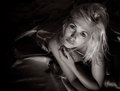
Joy!by tangueraComment: This is one of my top ten images. Great imagination and creativity. The different pin colours give the image a nice balance, and you've captured the title perfectly. The lighting of the face under the hat is spot on. It there is anything critical to say, it's that the two red pins bottom left are in the plane of focus and my eye keeps getting drawn to them. I think it would be perfectly legitimate in advanced editing to blur these two out a bit so that they are not so much of a draw. That said, it still a great shot. |
 Photographer found comment helpful. Photographer found comment helpful. |
| 10/09/2010 12:13:42 PM |
|
| Photographer found comment helpful. |
| 10/09/2010 11:54:47 AM |
00:00by PaulComment: I never got the chance to comment during voting. This was one of my ribbon choices. I gave this a 9. Still a strong finish, so congrats for that. Raphaella is drop-dead gorgeous and you have captured her beautifully. I didn't even notice this was a model you had used before so just went back to check the other entries. Sure enough, all 3 look completely different. I gave the other two a 10 and an 8, so clearly you and her have something good going on! LOL. On reflection though, although I scored this one in the middle, it's my favourite of the 3! |
| Photographer found comment helpful. |
| 10/09/2010 05:47:58 AM |
Sweating For Safetyby Jon_HComment: I think for this sort of shot to be successful, you really need a larger water drop in which to get the reflection. As it stands it's really hard to see the definition reflected in the droplets that you were aiming for. Also, I'm not sure about the crop... I think if you go for a narrow image like this, just sticking a "letterbox" border on it can help flesh it out a bit. Finally, I think the lots of little drops detract the eye from the couple of larger drops in which the reflections are. Maybe instead of using a mister, you could have used an eyedropper or similar? |
| Photographer found comment helpful. |
| 10/09/2010 05:35:10 AM |
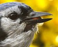
Nuts for Brunchby patchesComment: I'm a bit of a sucker for bird photos, but I feel that this only briefly holds my interest. The reason I think, is that it seems to be a massive cropof an image where the bird is only a small part of a larger image. I'm led to this belief because of the apparent lack of resolution/clarity and a great deal of noise. This shot might fare better in a nasic challenge, but when it's up against people using advanced editing techniques, I think that this image would need degrees of noise reduction and sharpening in order to compete. On the up side, I do like the contrast between the defocussed yellow background and the bird, and the capture of it having the nut in it's beak is spot on. It would be interesting to see the original of this to see how much is cropped. I may be way off. |
| Photographer found comment helpful. |
| 10/09/2010 05:29:02 AM |
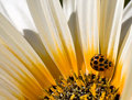
Synthesisby bcenuComment: I gave this an 8, making it one of my top 10 images. I do however think that the flower centre is maybe a tiny bit oversharpened? Hard to say I guess without seeing the original. It seems as though the point of best clarity is on the flower centre in the bottom edge of the frame. I would prefer the ladybug to be the point of best clarity, especially as it sits on the perfect intersection of the horizontal and vertical thirds. |
| Photographer found comment helpful. |
| 10/09/2010 05:21:25 AM |
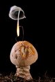
Mushroomsby 4trtoneComment: Intruiging setup. This is where my photography lets me down - I tend to find something to take a photo of, rather than "create" something unique. I gave this a 9 (one of my top 3 images) though I still feel something more could be done with the bottom of the frame. I feel as though the crop is just a bit tight onto the mushroom. Great image overall though. |
| Photographer found comment helpful. |
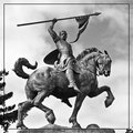
| 10/09/2010 04:00:12 AM |
The Conquerorby ChandiComment: I don't think that the border line adds anything to the image. If anything I would use it as a crop boundary to lose the bottom right corner. |
| Photographer found comment helpful. |
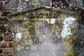
| 10/09/2010 03:55:08 AM |
Sacredby dorseteyeComment: I think this shot would be a bit better with a depth of field which made the headstone appear to stand out more from the wall behind it. |
| 10/09/2010 03:50:07 AM |
|
| Photographer found comment helpful. |
Home -
Challenges -
Community -
League -
Photos -
Cameras -
Lenses -
Learn -
Help -
Terms of Use -
Privacy -
Top ^
DPChallenge, and website content and design, Copyright © 2001-2025 Challenging Technologies, LLC.
All digital photo copyrights belong to the photographers and may not be used without permission.
Current Server Time: 08/08/2025 02:58:41 AM EDT.