| Image |
Comment |
| 05/08/2009 06:44:03 PM |
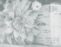
softby teranbComment: Originally posted by cgino:
I really like the combination of the flower and the aged box. NICE!! And I love the bit of blur too! But I have to admit I'm with  tph1 and would like to see more contrast; more specifically, more dark tones. In general the effect of the gradient filter is really nice, but if this were my image I would continue to process it with a levels layer to darken those dark tones. If you don't want more contrast, then either think of using this as a texture layer or cool background as tph1 and would like to see more contrast; more specifically, more dark tones. In general the effect of the gradient filter is really nice, but if this were my image I would continue to process it with a levels layer to darken those dark tones. If you don't want more contrast, then either think of using this as a texture layer or cool background as  KarenNfld suggested, or even add a layer on top of it to grunge it up a bit and add more interest as we do in this thread. Bottom line is I see a lot of good to work with here! KarenNfld suggested, or even add a layer on top of it to grunge it up a bit and add more interest as we do in this thread. Bottom line is I see a lot of good to work with here! |
Great ideas. I really don't understand how to use layers. Still getting familiar with my tech stuff! Maybe I should try that next. |
| 05/08/2009 06:43:10 PM |
softby teranbComment: Originally posted by KarenNfld:
I think it would make a lovely background for a poem or invitation. As a stand alone image I think it's too light, sorry. |
No apology necessary. Thanks for your honest opinion. |
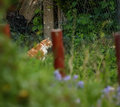
| 05/07/2009 06:13:03 PM |
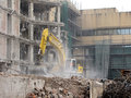
Hospital-Demolition.jpgby jomariComment: This one is kind of cool. It feels dissonant, but not in a bad way. I appreciate the contrast of the live growth against the death of a building. |
 Photographer found comment helpful. Photographer found comment helpful. |
| 05/07/2009 06:11:22 PM |
|
| Photographer found comment helpful. |
| 05/07/2009 06:10:25 PM |
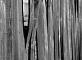
brokenby rachelellenComment: I like the perspective and the hole. For some reason, though, my eye gets stuck on the house in the background and it is not aesthetically pleasing. Not sure how you could fix that. The fence itself is very interesting and well-shot. |
| Photographer found comment helpful. |
| 05/07/2009 06:08:52 PM |
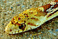
Snake 1.jpgby C4PicturesComment: Ewwwww, hate your subject, but he photo is well-taken. Great detail. I think he would make a great belt! |
| Photographer found comment helpful. |
| 05/06/2009 07:27:09 PM |
Into the Light.jpgby michaelhfComment: I like this. It draws me in. I really love the bonus reflection of light in the foreground. Don't really know what to suggest for improvements. Nice job. |
| Photographer found comment helpful. |
| 05/06/2009 07:25:56 PM |
|
| Photographer found comment helpful. |
| 05/06/2009 07:46:53 AM |
|
| Photographer found comment helpful. |
| 05/06/2009 12:35:53 AM |
|
| Photographer found comment helpful. |
Home -
Challenges -
Community -
League -
Photos -
Cameras -
Lenses -
Learn -
Help -
Terms of Use -
Privacy -
Top ^
DPChallenge, and website content and design, Copyright © 2001-2025 Challenging Technologies, LLC.
All digital photo copyrights belong to the photographers and may not be used without permission.
Current Server Time: 08/21/2025 08:38:11 PM EDT.