| Image |
Comment |
| 04/06/2009 07:30:00 AM |
*Let There Be Light *by GeneralEComment: The image is tilted to the left and the logo doesn't help that any. From a technical standpoint, the image is properly focused, but it's a tad oversharpened - you can see the halo on the right side of the clock tower. However, it is iconic of UC-Berkely and that's what counts. |
 Photographer found comment helpful. Photographer found comment helpful. |
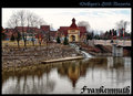
| 04/06/2009 07:25:11 AM |
Willkommen to Frankenmuth, Michiganby HipychikComment: A nice scene, but the image is a little soft on focus which negatively impacts the scene. A Neutral Density filter - a .6 would have helped the sky details and popped the colors of the village out reducing some of the blandness (if that's a word). I'm not crazy about the font either - the problem with the more artistic fonts is that the kerning is never perfect and you acquire issues like the n m and u all running together. Nice image though - very peaceful. |
| Photographer found comment helpful. |
| 04/06/2009 07:19:39 AM |
Oasis In The Desertby C4PicturesComment: A difficult shot and way too much light blue to be truly effective. The white haze blending into the blue sky creates a border within the image that is distracting. You might have done better to crop the bottom off thus making a little tighter shot and a little more impact. The image also isn't level - it tilts up to the right (or down to the left) which creates an uncomfortable feeling on first viewing. A contrasting font color would have worked much better. |
| Photographer found comment helpful. |
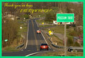
| 04/06/2009 07:10:20 AM |
The Edge of the Earthby mgsmith53Comment: I smiled when I saw this - I think I've been there - Texas? Very evocative of small towns everywhere. From a technical standpoint, it's not a particularly stellar example of what a camera and lens can do - it's not really in focus, but then again, the point is Possum Trot. From a strictly appeal standpoint, it works very well. And it's funny. I like it - nice job. |
| Photographer found comment helpful. |
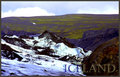
| 04/06/2009 07:00:26 AM |
Glacier Walkby GlanniComment: The image looks a little washed out - maybe a little tighter shot on the hiker in the background would have helped a little. The darker scene and colors made for a difficult shot and the lighting conditions didn't help you any. I like the way you handled the font colors - not a great composition, but it does invoke the nature of Iceland. |
| Photographer found comment helpful. |
| 04/06/2009 06:57:19 AM |
Pittsburgh, PAby alanfreedComment: A very nice generic stock shot with a couple of issues. The tower halo on the left hand side attracted me immediately which is not what you intended. From a framing standpoint, think it would have worked better with the empty sky on the right cropped out - a little tighter composition, a little less exposure and just a tad more focus would have made this a great image. I like the font. Overall a good effort. |
| Photographer found comment helpful. |
| 04/04/2009 07:31:57 PM |
Freedom, The Basis of America by Be-realComment: Ah - well.
Grafitti is a form of expression and to me, this was a 10 and I rated it as such. It was more a question of how the image was composed and how you saw the image with the slight offset which attracted me to it.
Having said that, I think you over reached with the title. Some people view titles as part of the image and this was a political statement that some, not all certainly, might object to it for a myriad number of reasons. I wouldn't even begin to suggest what you should have titled it, but that would be my guess - I thought it was clearly head and shoulders, as an image, over 90% of the images in the Language challenge.
Having said that... :>)
If you look at your vote distritution, it's amost even and you might as well have rounded up and got a 5 - which, after viewing a lot of images over the past two weeks, seems to be acceptable as a score.
Later,
Tom |
| Photographer found comment helpful. |
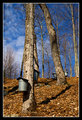
| 04/03/2009 07:38:28 PM |
Spring in the Vermont Sugarbushby DJWoodwardComment: As a documentary image for National Geographic, this would have been accepted without a single dissenting vote of the editors. As a fauna shot, it fails to comply with the intent of the challenge. I'll split the difference in my vote. |
| Photographer found comment helpful. |
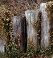
| 04/03/2009 11:47:37 AM |
Clinging To Lifeby HipychikComment: I think this is a great image - just misplaced in the challenge. The subject matter appears to me to be the wood pilings and not the flora surrounding them. The overall color tone is interesting and subtle. However, the net effect isnt positive for me. |
| Photographer found comment helpful. |
| 04/03/2009 11:45:32 AM |
Love in Bloomby JadeComment: Judging and rating an image like this is difficult. There is a dual subject here and I'm not sure its within the "spirit" of the challenge. On the one hand, the offset flowers are well within the scope of the challenge, on the other hand, the couple is a different story within the story of the bouquet. Very similar to an earlier image I had difficulty rating.
Ah the heck with it - well done. |
| Photographer found comment helpful. |
Home -
Challenges -
Community -
League -
Photos -
Cameras -
Lenses -
Learn -
Help -
Terms of Use -
Privacy -
Top ^
DPChallenge, and website content and design, Copyright © 2001-2025 Challenging Technologies, LLC.
All digital photo copyrights belong to the photographers and may not be used without permission.
Current Server Time: 08/08/2025 05:11:14 AM EDT.