| Image |
Comment |
| 04/06/2009 04:22:17 PM |
April in Vailby jimsappComment: Couldn't have asked for a better image - perfect font size and selection - perfect use of drop shadow for effect - tight and cogent phrasing - it's all around a perfect - absoutely perfect, postcard. Well done - congratulations. |
| 04/06/2009 04:20:59 PM |
Arizona Rocksby justineComment: Clearly the author has a sense of humor - this is a great touristy type of post card - the image is acceptable for general purpose use and the font and logo are great - love it. |
 Photographer found comment helpful. Photographer found comment helpful. |
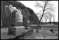
| 04/06/2009 04:19:58 PM |
MSU Landmarkby smudgeSMJComment: Ok - this may sound really strange, but why the vertical image and the vertical text? This would have worked with a smaller size on the font and a shorter drop shadow if it were place in either corner of the white space - with is also a problem. The drop shadow wasn't a great choice either - that just makes your eye water and keep crossing and uncrossing. |
| Photographer found comment helpful. |
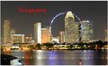
| 04/06/2009 04:16:44 PM |
The Little Red Dot - Singapore by bonjoviComment: I like this, but there are too many distracting elements to make it an effective image for commercial post cards. As a personal note, this would make an interesting image, but the soft focus and the long exposure created a negative effect with the ferris wheel. |
| Photographer found comment helpful. |
| 04/06/2009 12:09:32 PM |
Signed the Reaperby drewhosickComment: Amusing - I like a sense of humor. As an image, it's technically pleasing and while not outstanding, it works. As an out of the box type entry into the challenge, it is delightful. Very clever. |
| Photographer found comment helpful. |
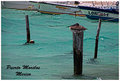
| 04/06/2009 12:06:56 PM |
Puerto Morelosby lifternessjtComment: The motion in the boats creates a very interesting effect, but it doesn't compliment the image. If this has been sharpened, it is right on the edge of being over done. Good font selection and color - if the image had been sharper with less motion on the boats, it would have been a very good representatin of the city. |
| Photographer found comment helpful. |
| 04/06/2009 12:02:15 PM |
Old truck in Ellijayby organicComment: This is another terrific image rich in detail - it gives a great impression, but as a post card, I don't get the connection. |
| 04/06/2009 12:00:54 PM |
See Memphisby dixonp1Comment: As an image, this is outstanding HDR work - it has a 3D quality that is very hard to achieve. The color balance is excellant and the details unrivaled - it is a terrific composition and was processed with incredible skill. Unfortunately, I can't figure out what the connection is to Memphis. I would love to rate this a ten as an image, but I can't. |
| Photographer found comment helpful. |
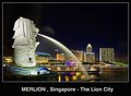
| 04/06/2009 11:56:02 AM |
Merlionby andrewtComment: Simply gorgeous with only minor flaws - gives a sense of being modern. Nicely framed and the font is a good selection. Well done. |
| Photographer found comment helpful. |
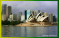
| 04/06/2009 11:54:13 AM |
Super Tackyby LuckyShotComment: It's not as tacky as the author believes - the image is reasonably sharp, the Opera House a symbol of Sydney, the sky is kind of blah, but it does add a dramatic component to the image. The font is acceptable, but I can't think of a reason why the elipses in the front of Sydney. |
| Photographer found comment helpful. |
Home -
Challenges -
Community -
League -
Photos -
Cameras -
Lenses -
Learn -
Help -
Terms of Use -
Privacy -
Top ^
DPChallenge, and website content and design, Copyright © 2001-2025 Challenging Technologies, LLC.
All digital photo copyrights belong to the photographers and may not be used without permission.
Current Server Time: 08/09/2025 02:29:50 AM EDT.