| Image |
Comment |
| 04/06/2009 06:25:09 PM |
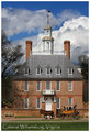
The Governor's Palaceby vawendyComment: Another image that perfectly captures the style and times of Colonial Wiliamsburg. Unfortunately, the font selection and size (maybe the color) has a negative impact on the overall excellance of the photographic compositino. The author might have done better to use the same font in a bolder format or used a different font all together. |
 Photographer found comment helpful. Photographer found comment helpful. |
| 04/06/2009 06:23:25 PM |
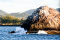
Dead Man's Rock, St. Luciaby aprudhommeComment: The unfortunate haze and odd lighting don't evoke any special feelings for this image as representative of the islands of the Lesser Antilles. |
| Photographer found comment helpful. |
| 04/06/2009 06:16:58 PM |
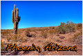
Phoenix, AZby AndyMac24Comment: A great image of Arizona and effective. The font selection and color although it's placement is somewhat offputting - the author has a lot of blank space, why not use it effectively. |
| Photographer found comment helpful. |
| 04/06/2009 06:14:41 PM |
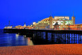
Brightonby marboComment: Very much as I remembered it from a few years ago. Very subtle the way you placed the title within the subject - that was inspired. While very colorfull with subtle shapes and forms. An excellant composition with huge impact. Well done. |
| Photographer found comment helpful. |
| 04/06/2009 06:12:27 PM |
Meadowland Amphitheatherby ladpupmoeComment: Very simple and elegant - the shapes and forms plus the unigue and soft colors are a good selection. The exposure seems a little over done and could have used treatment in curves to bring them out a little more - that was a side effect of the odd lighting angle. Might have been better to change position and angle just a little. |
| Photographer found comment helpful. |
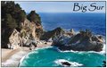
| 04/06/2009 06:10:25 PM |
Big Surby Moose408Comment: Yep - that's the Big Sur alright. Very much an iconic image of the area and works well in evoking thoughts of one of the last while places on Earth. The font and placement in the spare space was a good selection. Well done. |
| Photographer found comment helpful. |
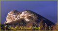
| 04/06/2009 06:08:54 PM |
Buffalo Mountainby Len ScapComment: A clear crisp image which imparts a sense of place effectively. The font placement was an unfortunate selection and would have worked much better in the larger unused blank space above the bluff. |
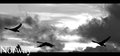
| 04/06/2009 06:06:37 PM |
Norwayby BJokerudComment: A very impressionistic image and evocative of Norway. The font selection is good, but it's placement is problematic and might have worked better higher and in a upper corner. |
| Photographer found comment helpful. |
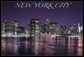
| 04/06/2009 06:01:22 PM |
The City That Never Sleepsby Dano6Comment: The combination of grayscale and color is very clever and in this challenge, out of the box from what I've seen so far. The font selection and placement compliments the linear form of the image and doesn't impose itself on the scene at all. Well done. |
| Photographer found comment helpful. |
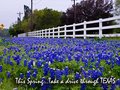
| 04/06/2009 05:45:08 PM |
Drive Texasby jerseyjimComment: Like it - the slight fade in the colors towards the upper left is excellant and the sense of dimension is very complimentary to the image in extant. I like the way the author handled the font placement although it's not the best choice. Well done. |
Home -
Challenges -
Community -
League -
Photos -
Cameras -
Lenses -
Learn -
Help -
Terms of Use -
Privacy -
Top ^
DPChallenge, and website content and design, Copyright © 2001-2025 Challenging Technologies, LLC.
All digital photo copyrights belong to the photographers and may not be used without permission.
Current Server Time: 08/08/2025 03:33:52 PM EDT.