| Image |
Comment |
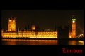
| 04/06/2009 07:09:26 PM |
Londonby PixelstateComment: There is only one thing wrong with this and it's the clock face - the white dot just doesn't work with the rest of the image. Also, the dark area on the right of the building doesn't help the overall postitive effort. The font is good, but the color should have contrasted less with the overall gold tone of the image. |
 Photographer found comment helpful. Photographer found comment helpful. |
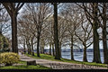
| 04/06/2009 07:07:15 PM |
Welcome to Rivertonby KelliComment: Very effective in that I would very much like to vist a scene like this. the image is soft, but it works to entice. The font isn't as effective as it could be - it's much darker than necessary and a change in color would have a positive impact. |
| Photographer found comment helpful. |
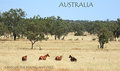
| 04/06/2009 07:05:20 PM |
Land Of The Young And Freeby ButterflyGirlComment: A excellant portrayal of the Land Down Under. The feeling is that the focus is a little soft, but it's not - it's the effect of the grass. Good font selection and placement. |
| Photographer found comment helpful. |
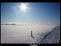
| 04/06/2009 06:40:21 PM |
True Icelandby KrisbyComment: The focus seems a little soft, but the way the light was handled with the minor lens flare is very effective. The little lens flare in the left hand corner is a little distracting and the little flares from the ice crystals detract from the image's overall impact. It is effective in imparting a sense of what Iceland is all about. |
| Photographer found comment helpful. |
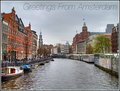
| 04/06/2009 06:38:30 PM |
Greetings From Amsterdamby ThingFishComment: The image has an HDR enhanced feel to it, but it's not HDR - it's just a crisp enjoyable image. The bottom could have a better crop, but the sense of space is very enjoyable and pleasing to the eye. The font is simple and efficient and it's placement is acceptable. |
| Photographer found comment helpful. |
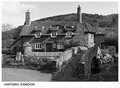
| 04/06/2009 06:36:19 PM |
Packhorse Bridge, Allerfordby tembaComment: Richly detailed. A few minor white blooms on the bridge keep it from being a perfect image, but they are so minor it's a very picky comment. I like the was the frame compliments the image and the font and placement are also complimentary to the image. Well done. |
| Photographer found comment helpful. |
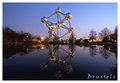
| 04/06/2009 06:34:37 PM |
Brusselsby ELLIPSComment: Perfect lighting, perfect setting, the reflection is well framed and captured and the font and placement compliments the overall effect of the image. Well done. |
| Photographer found comment helpful. |
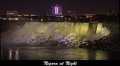
| 04/06/2009 06:33:46 PM |
Niagara at Nightby cdn1Comment: Extremely effective and notable. This is one image where the flowing water meme is efficiently used. The subtle lighting, reclections and right on the edge highlights are very well done. The font and placement are almost an afterthought but work well. Well done. |
| 04/06/2009 06:32:01 PM |
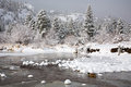
Wilderness... Foreverby hahn23Comment: The whites are slightly over done which effects the entire effect of impending snow fall. This is a problem with winter images as you can never tell where the light is going to do as it can come from and be reflected from anywhere. The mallards are a very nice touch and add some character to the image which is flat and bland. |
| Photographer found comment helpful. |
| 04/06/2009 06:26:31 PM |
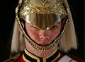
London - The Queen's Guardby PanksComment: Very interesting and effective. The little details are amazing. As an image it works well, but as a post card, I'm not so sure. |
| Photographer found comment helpful. |
Home -
Challenges -
Community -
League -
Photos -
Cameras -
Lenses -
Learn -
Help -
Terms of Use -
Privacy -
Top ^
DPChallenge, and website content and design, Copyright © 2001-2025 Challenging Technologies, LLC.
All digital photo copyrights belong to the photographers and may not be used without permission.
Current Server Time: 08/08/2025 03:33:52 PM EDT.