| Image |
Comment |
| 04/06/2009 10:12:18 PM |
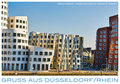
Greetings from Dusseldorfby h2Comment: A modern treatment of a modernist village. Excellant treatment of the unigue nature of this series of buildings. The font and color work very well. |
 Photographer found comment helpful. Photographer found comment helpful. |
| 04/06/2009 10:10:32 PM |
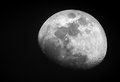
The Mooby Andrew1023Comment: A clever reference to cheese - or not. :>) A great image, but I can't imagine using it as a vacation post card. I'm not sure how it meets the challenge as it seems way outside the central theme. |
| Photographer found comment helpful. |
| 04/06/2009 10:07:57 PM |
Londonby MarikaComment: Another terrific application of grayscale and color. I can't find a flaw that even remotely impacts the image. Perfect font selection and placement. Well done and certainly a top 15 image if not a top ten. |
| Photographer found comment helpful. |
| 04/06/2009 10:06:42 PM |
South Africa by prperoldComment: A very intriguing treatment of space - it's empty, yet the single character seems to fill the void remarkably well. The subtle pastel drop shadow is perfectly executed. A good image to represent a new view of South Africa. Well done. |
| Photographer found comment helpful. |
| 04/06/2009 10:05:19 PM |
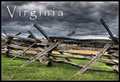
Virginiaby glad2badadComment: Another very different image well thought out, composed and executed. The capture is very efficient in it's imagery and represents the rural nature of most states. The font selection and placement is good. |
| 04/06/2009 10:03:34 PM |
The Best Place On Earthby LonzComment: Another unigue image and very out side the normal images one would associate with a place. A work of art nicely composed and executed. |
| Photographer found comment helpful. |
| 04/06/2009 10:02:34 PM |
|
| Photographer found comment helpful. |
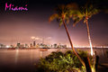
| 04/06/2009 10:01:28 PM |
M i a m iby phloverComment: The whole pastel tone of this is Miami - a perfect representation. The singluar flaw is the white bloom on the palm tree - it draws the eye away from the rest of the image and severely impacts the overall effect. The author might have done better to clone out the white bloom or crop it out entirely. Crockett and Tubbs would have approved of this image. |
| Photographer found comment helpful. |
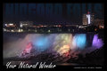
| 04/06/2009 09:59:04 PM |
Your Natural Wonderby david_cComment: There is just one thing wrong with this image and that's the top title - it flaws an other wise spectacular image and good use of other fonts and placement. The top font should stand out just a little more to make it a completely effective and dramatic representation of a natural wonder. |
| Photographer found comment helpful. |
| 04/06/2009 09:57:16 PM |
d a i s yby bnileshComment: A terrific greeting card - it would work for almost anything at any time. Soft, subtle. The font choice and color perfectly compliment the image. A top ten entry in the challenge. |
| Photographer found comment helpful. |
Home -
Challenges -
Community -
League -
Photos -
Cameras -
Lenses -
Learn -
Help -
Terms of Use -
Privacy -
Top ^
DPChallenge, and website content and design, Copyright © 2001-2025 Challenging Technologies, LLC.
All digital photo copyrights belong to the photographers and may not be used without permission.
Current Server Time: 08/09/2025 06:17:54 AM EDT.