| Image |
Comment |
| 04/08/2009 07:25:24 AM |
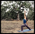
Yoga in the Parkby vladoComment: The author missed a great opportunity to evoke the serenity of doing yoga - with a little tighter crop at the top, a different angle on the model in which the model assumes a similar posture to the tree in the background (curved arm over the head similar to the branch with the lower arm matching the lower tree branch) it would have envoked a feeling of power and strength along with serenity and grace - all the things yoga is about. A good effort. |
 Photographer found comment helpful. Photographer found comment helpful. |
| 04/08/2009 07:21:13 AM |
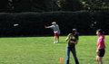
Just Get Out and MOVE!by GeneralEComment: More movement that has purpose would have been better. A little higher shutter speed and tracking the action in the background with a little tighter shot would have helped this a lot. |
| Photographer found comment helpful. |
| 04/08/2009 07:18:31 AM |
Aceby ConnorComment: A good sound macro shot, but a marketing pro might take issue with the position of the ball and the rim of the racquet. It might have worked better as a vertical shot with the ball moving or closer to the sweet spot on the strings. A good effort. |
| 04/08/2009 07:13:06 AM |
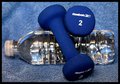
Start your workout nice and easy...by BubbaPixComment: A standard format stock shot, but the DOF is awkward - this might have worked better with a fisheye lens to create a sense of dimension and evoke a positive feeling for the subject. I wonder if a backlit scene would have been better. A good effort. |
| Photographer found comment helpful. |
| 04/06/2009 10:26:18 PM |
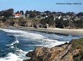
Mendocino Village Post Cardby SnopawComment: A good effective representation of the area. Very subtle use of font to fill in some dead space in the image. It seems that the focus is a little soft, but not terribly noticable. A good overall effort. |
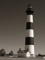
| 04/06/2009 10:24:57 PM |
Bodie Island Light Stationby jmsetzlerComment: This is a wonderful image with one little flaw - the light tower windows looks like streaks and are not defined. Those who are familiar with the light would know what the streaks are, but those who are could count this as an image defect. It might have worked to clone them out or maybe adjust the exposure to add some measure of definition to the windows. Otherwise, it's a wonderful image - very smooth and even tones from white through black. Effective use of lighting. Very well done. |
| Photographer found comment helpful. |
| 04/06/2009 10:22:44 PM |
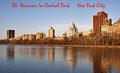
The Reservoir In Central Park---New York Cityby EssAreDubyaComment: The colors are bland and there is a little too much water to be an effective treatment of Central Park. The font is fine, but the color clashes with the overall tone of the city. The little spots on the water don't add to the image at all. |
| 04/06/2009 10:19:59 PM |
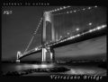
Gateway To Gothamby RulerZigzagComment: Technically excellant with one little white bloom near the center bridge support - good impact on the eye - very pleasing conversion using the light properly to create the ambience. You left a period out of the NYC. I'm not terribly happy about the font mix, but I'm a font Nazi. :>) I might have left out the NYC and just gone with Gotham - everybody knows where Gotham is. Well done. |
| Photographer found comment helpful. |
| 04/06/2009 10:19:56 PM |
San Franciscoby BrennanOBComment: Perfect - iconic imagery, colorful, lights right on the edge and the sky and buildings are complimentary. The transparent frame works on this and the font and font colors are appropaite both for the picture and for the city itself. Great capture and processing. |
| Photographer found comment helpful. |
| 04/06/2009 10:19:53 PM |
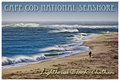
Cape Cod National Seashoreby Bear_MusicComment: Really nice image - excellant composition with the slight angle of the beach - the lonely subject walking the beach is very iconic of Cape Cod and being a surf fisherman who has been at this exact spot, it's perfectly. It works as a post card in a lot of ways. The two fonts selected are very compatiable and the colors are fine. A very nice depiction of a national and regional treasure. Well done. |
| Photographer found comment helpful. |
Home -
Challenges -
Community -
League -
Photos -
Cameras -
Lenses -
Learn -
Help -
Terms of Use -
Privacy -
Top ^
DPChallenge, and website content and design, Copyright © 2001-2025 Challenging Technologies, LLC.
All digital photo copyrights belong to the photographers and may not be used without permission.
Current Server Time: 08/09/2025 11:37:43 AM EDT.