| Image |
Comment |
| 05/04/2009 10:47:20 PM |
Mom in actionby Rino63Comment: Different, but less effective that it should be. A close up view of mac and cheese is slightly off putting - never knew that up close and personal, it can look that unappetising. A little more saturation might have helped the rather unappealing color. |
 Photographer found comment helpful. Photographer found comment helpful. |
| 05/04/2009 10:37:33 PM |
Just So You Knowby spiritualspatulaComment: Simple and effective, a single thought expressed in a uncommon manner. Nothing technically amiss being crisp and sharp. The author's intent is clear and expressed effectively. Not as artistic as it could be, none the less it is a very good entry into the challenge - simple is sometimes the best approach. Well done. |
| Photographer found comment helpful. |
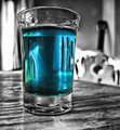
| 05/04/2009 09:44:22 PM |
Blue Moonby keriboiComment: Another black and white with object color image, but this time it is effective in several ways. The subtle color changes in the glass along with the black and white conversion are very complimentary. Sound use of the zone system only compliments the color and the vaguely detailed background demonstrates effective use of bokeh. Well done. |
| Photographer found comment helpful. |
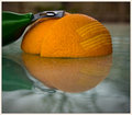
| 05/04/2009 09:39:02 PM |
A zest for lifeby PenelopeKComment: This is what this reviewer has been waiting for - a perfect minimalist construction that combines the minimalist meme with impressionist ideals - the abstract reflection perfectly compliments the solid and properly composed subject with the added feature of zest stripes on the skin of the orange. An excellant composition and still life complimented by pleasing tones and colors set off brilliantly with the zest scraper. An extremely effective image - well done. |
| Photographer found comment helpful. |
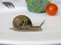
| 05/04/2009 09:34:18 PM |
Honey, I am not a chef, however I think that you should cook the snails before we eat them...by androgeusComment: Despite the fact that nobody in their right mind would eat a snail under any circumstances unless it was borderline starvation, this is laugh out loud funny - the snail is perfectly captured and is properly placed to be the main subject with complimentary shapes and colors in the background. Both a technical and artistic success. Well done.
PS: After eating more than one of these raw in survival school in the mid-60's, I can safely state with no small amount of authority that they aren't my favorite raw sustinance protien - not by a long shot. |
| Photographer found comment helpful. |
| 05/04/2009 09:17:21 PM |
Secret Letterby wei1108Comment: The point singularities in the child's eyes plus the blue cast to her naturally beautiful complexion makes this a less than expert capture and one that could use some more post processing. The central focus is a good idea and ties the whole image together properly, but the blue cast is a negative and something that could have been easily adjusted in post processing without much effort. |
| Photographer found comment helpful. |
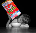
| 05/04/2009 09:14:55 PM |
Monday morning and no cerealby jcarComment: The rather odd eye is a extreme negative and the use of grayscale with object color is becoming much to common a technique to be truly effective in these challenges. Additionally, the lighting is insufficient which probaly caused the rather odd point singularity in the eye of the child and an unfortunate light bloom on the lid of the cereal box. A little more thought while composing would have helped and certainly in post processing, these faults should have been caught. |
| Photographer found comment helpful. |
| 05/04/2009 09:10:19 PM |
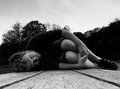
picnic table abstractby skewsmeComment: Abstract imagery is something that this reviewer always appreciates and this image has a significant impact from that standpoint. The narrow focus field seperates the two areas of single and multi color very effectively imparting a sense of space. The use of grain and subtle tones and shades to enhance the ethereal and dream like background is very impressive. While not to the taste of the general viewership, in this reviewers opinion, this is a brilliant concieved and executed abstract image that meets the challenge subject in a unique way. Well done. |
| 05/04/2009 09:06:43 PM |
the poet is servedby posthumousComment: The drama inherent in the subject does not translate well when compared to the rather blank and uninteresting sky. The author's intent here is clear and with a more effective crop at the top of the image, the artistic impact would have been significant. An experiment the author may wish to attempt would be to layer a more dramatic sky into this image and lighten some of the darker areas using the histogram as the guide and the curves control to lighten some of the darker areas. |
| Photographer found comment helpful. |
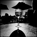
| 05/04/2009 09:04:28 PM |
Shaw + Smith Sauvignon Blanc, the 2006 of courseby dougi555Comment: There are several things right about this image and several things that are wrong. The sun lit glass and shadow are very effective from both a technical and artistic sense. On the other hand, the overly dark figures are uninteresting and do nothing to impact the image in a positive way. Use of the zone system would have helped compose and capture a more effective image along with properly metering the dark areas prior to exposure. |
Home -
Challenges -
Community -
League -
Photos -
Cameras -
Lenses -
Learn -
Help -
Terms of Use -
Privacy -
Top ^
DPChallenge, and website content and design, Copyright © 2001-2025 Challenging Technologies, LLC.
All digital photo copyrights belong to the photographers and may not be used without permission.
Current Server Time: 08/21/2025 01:36:17 AM EDT.