| Image |
Comment |
| 05/05/2009 07:49:01 AM |
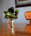
Gherkins Anyoneby CraftyComment: The immediate impression is not a positive one. The highlights, while right on the edge of being edge of being over done, are very distracting and immediately draw the eye to them. This is very unfortunate technical issue because from an artistic sense, this would have been a very good minimalist image with some very interesting artistic aspects - notably, the interesting optical effect at the bottom of the glass and the pickles in the cup of the glass. A little more thought and lighting control would have given this image a high place in the challenge. |
 Photographer found comment helpful. Photographer found comment helpful. |
| 05/05/2009 07:44:12 AM |
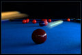
Red Ball in the Corner Pocketby BrianRComment: This is one of those ideas that could have gone horribly wrong or perfectly right. In this case, it's kind of a combination of the two in that the static balls are distracting while at the same time the cue ball is perfectly captured in motion and the highlight present on the other balls which is a negative is a positive on the cue ball enhancing the sense of movement and speed. The one issue that immediately jumped out at this viewer is the cue stick - the double exposure effect just doens't work - it would have been better if it had more linear motion similar to the cue ball. While a different image, a possible solution to controlling all the positive and negative aspects of this image would be to remove the other balls (except the one in the corner) from the table and do the shot excluding the cue stick. In that way, the depth and dimension of the table would have been intact, the sense of power and motion expressed by the cue ball would have been enhanced and overall the entire effect would have been very positive. A very good idea that just falls short of being excellant. All that being said, it's a great idea and should be recognized as such. Well done. |
| Photographer found comment helpful. |
| 05/05/2009 07:35:21 AM |
I'll be right back.by rlmichaelComment: The flat appearance and lack of color saturation do not do this image any favors. A longer look with all details in focus would have been a better approach. Additionally, a little more lighting control would have had significant benefit to this image and created more interest. |
| Photographer found comment helpful. |
| 05/05/2009 07:31:49 AM |
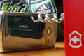
Brandedby SoulComment: A set piece that works on several levels even though it has one minor issue - the OOF Victorinox knife doesn't quite work with the detailed and in focus objects. A very clever concept that is simple, yet not often seen. A different approach to reflection which seems to be a fairly common theme in this challenge is presented in a unique way. A good solid entry into the challenge with a few minor issues such as slightly over done exposure on the shoe and the knife as previously mentioned. |
| Photographer found comment helpful. |
| 05/05/2009 07:25:55 AM |
sign of a cluttered mindby klkitchensComment: The fade effect from front to back is well controlled in this image and demonstrate good knowledge of DOF and how it can affect an image. Unfortunately, the rather flat color and lack of detail as a result of the technique used affect this image negatively - it's just not terribly interesting which is probably the result of the lack of depth and dimension - everything appears to be of the same size. To be truly effective, some dimensionality would help convey the theme. That being said, it does meet the challenge criteria. |
| Photographer found comment helpful. |
| 05/05/2009 07:15:12 AM |
The Biscuit Thiefby ShutterPugComment: Dogs are natural clowns and goof balls and this perfectly frames and presents this concept. Nothing more needs to be said - it's a technically sound image and from an artistic standpoint demonstrates the goof ball present is all dogs. Very well done. |
| Photographer found comment helpful. |
| 05/05/2009 07:12:55 AM |
Cigar Storeby JuliBocComment: A common theme in this challenge (the reflective table), this image appears to be over done in terms of saturation. While it doesn't appear to be over sharpened, it also has that feel to it. The problem may be that there is a rather odd component to the image - the florescent lighting top right is just over the edge while it's reflection on the lower left is perfectly right on the edge of being over done. Looking closer, it would appear that there are green, red and yellow light blooms on the light fixture (ends of the tubes) which can indicate over saturation or non-use neutral lens filter or circular polarizer. Looking at it one more time, the former seems to be the case as the tea tins in the upper right corner are clearly over saturated in comparison to their reflected presence. In either case, the image, while sharp and crisp, has a over done feel to it that impacts it negatively in both technical and artistic ways. |
| Photographer found comment helpful. |
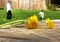
| 05/05/2009 07:03:47 AM |
Flowers for Nana.by goodnewsComment: A sweet child like sentiment that is presented properly with good framing and the use of bokeh to complete the impression. Unfortunate white highlights on the stems of the dandelions are immediately noticable along with the blank white on the middle right table. Still, the point is made and while not outstanding imagery, it certainly meets the challenge criteria and is a very effective image on an emotional level. |
| Photographer found comment helpful. |
| 05/05/2009 07:00:39 AM |
Patiently Waitingby Carlo21Comment: The initial impression is - very clever, a child's hands and a dolls head - then on another look, there is a different opinon - and a third and so on. A terrific composition which makes one wonder how it was done. The linear background shading is so subtle that one doesn't notice it on first viewing, or the second for that matter - it only appears on a third view, but that being said, it affects the image in a positive way - gives a sense of depth and dimension not often seen in grayscale images of this type - a deft touch with brightness and contrast is being demonstrated here. Very well done. Probably not to everyone's taste, it's still worthy of consideration for a high finish. |
| Photographer found comment helpful. |
| 05/04/2009 10:52:58 PM |
JavaBeansby DigiFotoBuddyComment: There are two ways of looking at this image - one, it's not strictly on the table. Alternatively, there is nothing in the challenge specifications that says the camera can't be on an object that is on the table. Taking the later into account, this is a simple and very effective construction and composition. Good color and detail, there is one minor issue with the light fade on the left lower corner which isn't immediately noticable. From an artistic standpoint, it's conveys the sense of pleasure and texture in a nice pleasing image. Well done. |
| Photographer found comment helpful. |
Home -
Challenges -
Community -
League -
Photos -
Cameras -
Lenses -
Learn -
Help -
Terms of Use -
Privacy -
Top ^
DPChallenge, and website content and design, Copyright © 2001-2025 Challenging Technologies, LLC.
All digital photo copyrights belong to the photographers and may not be used without permission.
Current Server Time: 08/21/2025 01:28:43 AM EDT.