| Image |
Comment |
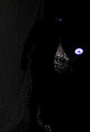
| 05/06/2009 11:22:12 AM |
Black & Lightby iMichelComment: On third review, this image just doesn't quite match expectations. Normally, black light is used with florescent paints to create textured imagery and while this has some elements of that, the over whelming space and black/white details are at odds with the more interesting bag in the background. A possible alternative would have been to take a closer look at the light and bag combination rather than the choice made. |
 Photographer found comment helpful. Photographer found comment helpful. |
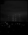
| 05/06/2009 11:17:21 AM |
They come out of the nightby JakerComment: If there were such a genre as scifi noir (which, by the way there is, but it's more a literary genre than visual) this would be a perfect example of it. A very clever and inventive title matches the details of the image perfectly - one can almost feel the tension as the viewer is brought face-to-face with the mechanical giants coming over the horizon. From a technical standpoint, it's competant, but the foreground is a little busier than is necessary. That being said, everything matches from the subjects to the title. While not to everyone's taste, it is a very worthy entry into the challenge. Well done. |
| Photographer found comment helpful. |
| 05/06/2009 11:12:20 AM |
Moonlight's shadowsby carljacquemynComment: Moonlight images are always difficult to capture and this is a very good example of why. Using grayscale, the image appears to be washed out. While very good from an artistic impression standpoint, the shadows aren't deep (black) enough to really create a significant pop to invite the viewer to stay longer and look at the details. After viewing this for a third time, there is a lot to look at, but the image needs much more contrast to be truly effective. Use of the zone system when composing this image and a deft touch in post processing using curves to bring out it's best features would have been a better choice. |
| Photographer found comment helpful. |
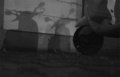
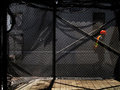
| 05/06/2009 10:51:58 AM |
Darknessby RumpRoastComment: While the author's intent is clear, a little closer look at the computer screen and subject would have improved this image significantly - there is a little too much light on the screen and not enough on the subject in addition to the rather vague focus on the monitor. In images like this, it's always a plus to give the viewer something detailed to look at to compare to the blank space. From an artistic standpoint, there is too much blank space and it would have been better to use a little closer look at the subject. |
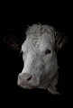
| 05/06/2009 10:48:37 AM |
Lurking in the shadowsby tembaComment: The crisp and sharp image conveys a sense of gentle intelligence in the very expressive face. Set against the dark background, the very slight color cast to the face of the subject is perfect - not under done, not over done. While the image could have been a little more centered in terms of top to bottom, it still is very effective and leaves a powerful artistic impression of simple elegance and grace not normally seen in animal portraits. A potential top ten image and possibly a ribbon winner. Well done. |
| Photographer found comment helpful. |
| 05/06/2009 10:44:51 AM |
golden glowby teranbComment: Far from being an artistic success, this image has several technical issues that needed to be addressed. Besides the over done white bloom, the edges of the ball are squared off - not smooth and round as would normally be expected. It also appears to be over sharpened. Both of these issues might be due to the available lighting or lighting technique used. From an artistic standpoint, there is too much blank space contrasting directly with the over done whites and odd color of the ball. A little less exposure and more lighting control would have been a significant improvement. |
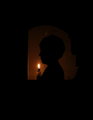
| 05/06/2009 10:38:47 AM |
Contourby jemsComment: A silhouette in the Victorian style this image is just a little too dark to have any significant artistic or technical impact on the viewer. A little less dark highlighting the profile would have improved this image significantly creating a mood piece that would have scored well. No major technical issues are present to affect this image - it's strictly an artistic impression that falls just short of being a top contender or ribbon winner. |
| 05/06/2009 10:34:28 AM |
Open Hands to a Withering Pastby BrianMcGuffogComment: A very good concept and from an artistic standpoint, a very good homage to the impressionist tradition, the image is way too small to be truly effective. Additionally, the frame does not enhance the effectiveness of the image from an artistic standpoint as it draws the eye away from the subject matter. This could have been a truly inspiring image worthy of ribbon contention if more thought about presentation had used. |
| 05/06/2009 10:29:01 AM |
As the darkness sets inby moriadelacroixComment: Over processed presenting an overly dramatic image, this might have worked much better without touching it or even just a very slight touch using curves or bright/contrast controls in the processing software. The color set is very unnatural and gives a feeling of being false or artificial. |
| Photographer found comment helpful. |
| 05/06/2009 10:26:32 AM |
Under Constructionby tvsometimeComment: There's some great detail in this image - very subtle lighting giving a rather different effect even on the third view. Obviously shot from a dark position into the light, it is very effective on both a technical and artistic standpoint. How it meets the challenge is a bit too subtle, but it is a good image. |
| Photographer found comment helpful. |
Home -
Challenges -
Community -
League -
Photos -
Cameras -
Lenses -
Learn -
Help -
Terms of Use -
Privacy -
Top ^
DPChallenge, and website content and design, Copyright © 2001-2025 Challenging Technologies, LLC.
All digital photo copyrights belong to the photographers and may not be used without permission.
Current Server Time: 08/20/2025 03:20:12 PM EDT.