| Image |
Comment |
| 05/12/2009 06:55:17 PM |
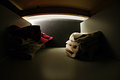
From the Back of the Dresser Drawerby talmyComment: Inventive and a novel look at the challenge subject. With no technical issues to speak of, the clever use of space and subject matter rates a perfect 10 just for being different and out of the ordinary. Well done. |
 Photographer found comment helpful. Photographer found comment helpful. |
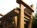
| 05/12/2009 06:53:37 PM |
False Creekby zeuszenComment: While the image is perfectly level, the impression of it being off level and a trapazoid is very strong. While this may, or may not, be an issue to some viewers, it certainly makes the image more interesting. A very simple construction to this composition is impressive and the sense of distance in the back ground wall is rather startling. Pleasing and complimentary colors, simple and effective subject matter, this should score fairly high. |
| Photographer found comment helpful. |
| 05/12/2009 06:49:46 PM |
Lost in Memories by TomsPhotosComment: A little more experimentation with the available light would have helped the image and given it more impact. This image is right on the edge of subtle artistic perfection - the under exposure and rather dull and flat black and white treatment negatively impacts the over all positive impression. |
| 05/12/2009 06:47:03 PM |
Mosaic Tree Shines On Cypress Sunby rodfulkComment: A very intersting drop shadow effect that works well with the rich tones and textures of the background and subject. A lot of very subtle touches in this image that create a very effective and favorable artistic impression. One has to wonder if a diffrent angle would have increased the shadow effect or ruined it - might be worth experimenting with sometime in the future. |
| Photographer found comment helpful. |
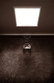
| 05/12/2009 06:43:57 PM |
Feebleby aprudhommeComment: This image relies too much on the emergence from the dark to create tension and drama. A little bit of fill light to reduce the contrasty effect created by the blank window would have helped create a more favorable impression. While the author's intent is clear, it just doesn't feel "right". |
| Photographer found comment helpful. |
| 05/12/2009 06:40:56 PM |
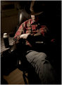
A hard day's nightby GlanniComment: A very effective portrait that would have worked as well in black and white as it did in color. Use of a comfortable chair while relaxing is certainly a good way to enter the challenge. The only issue is the rather abrupt change from total dark to shadow light, but this can be viewed in one of two ways - the postive effect is the one this reviewer prefers in this instance. |
| 05/12/2009 06:38:25 PM |
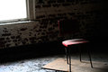
Rocking Benchby dbortoComment: A very interesting angle and would have been effective except for the blank and undetailed sky which fails to provide any sense of depth and dimension. The image appears to be rather flat even given the angle and slight offset in addition to the little details in the bench. |
| 05/12/2009 06:36:18 PM |
awaiting an arrivalby photokariangelComment: Very curious sense of depth and detail - very effective treatment with the blank window space and feature less wall. An odd viewpoint which works well in context with the impression given. A little too tall, the effect of looking down into a V shape isn't as strong as it would be if the dividing line were at exactly half of the image. Still, a very intriguing effect. The monotone treatment is also effective and while that chair highlights are a little over done, the image as a whole works very well. |
| Photographer found comment helpful. |
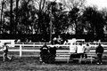
| 05/12/2009 06:32:24 PM |
event accomodationby undieyatchComment: The unfortunate use of direct black and white causes certain features of this image to disappear into the background - there isn't any real graduation of blacks - too much direct contrast between the whites and blacks. |
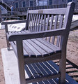
| 05/12/2009 06:29:28 PM |
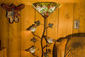
Furnitureby whiterookComment: Sometimes you gotta do what you gotta to. An unfortunate bluish cast to this rather uninteresting and flat image. It might have been better to compose this using some bokeh techniques to obscure the background which, frankly, is more intersting than the bench. |
Home -
Challenges -
Community -
League -
Photos -
Cameras -
Lenses -
Learn -
Help -
Terms of Use -
Privacy -
Top ^
DPChallenge, and website content and design, Copyright © 2001-2025 Challenging Technologies, LLC.
All digital photo copyrights belong to the photographers and may not be used without permission.
Current Server Time: 08/20/2025 01:44:18 AM EDT.