| Image |
Comment |
| 07/05/2009 03:53:22 AM |
Fairy Godmotherby chesireComment: There is too much processing done here. The shot has completely lost any semblance of a natural look and has become almost cartoon / watercolour like. The retouching has left some obvious marks across the face and has made the material look almost plastic in some areas.
Ignoring the processing, your lighting and exposure are good. The composition is a little centered, and while I get what you are doing with all the material, I think it's too much and is taking over the shot. |
 Photographer found comment helpful. Photographer found comment helpful. |
| 07/05/2009 03:22:21 AM |
Nationby bvyComment: Love those t-shirts, well spotted and captured! |
| Photographer found comment helpful. |
| 07/04/2009 11:20:55 PM |
Jewel of the Nileby digifotojoComment: Nice shot with good detail and lighting. Don't particularly like the double line border though, I think the shot stands well on it's own so something simpler would have worked. |
| Photographer found comment helpful. |
| 07/04/2009 11:19:45 PM |
|
| Photographer found comment helpful. |
| 07/04/2009 11:17:25 PM |
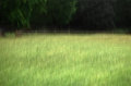
pastoraleby krnodilComment: Interesting almost impressionist style shot. The motion blur gives an every day scene a bit more interest.
I'm torn between whether I like it or not. At a distance it's nice, but close up when I start to see the details more clearly it doesn't quite look so good. Giving this a 6 for now. |
| Photographer found comment helpful. |
| 07/04/2009 11:13:35 PM |
I Gotta Feelingby LVicariComment: Great unusual shot. This looks like something you would see in a high end fashion mag. Love the combination of unusual features.
The contrast is just a tiny bit high for my tastes, but only really noticeable around the model. |
| Photographer found comment helpful. |
| 07/04/2009 11:11:04 PM |
Before the Stormby JeniYComment: This is a little too centered for my linking. You seem to have a vast landscape to work with here, I would have loved to see the isolation, especially given the threatening sky overhead.
Otherwise, good colours and contrast, and I like the depth of the scene. 6. |
| Photographer found comment helpful. |
| 07/04/2009 11:08:42 PM |
Reflectionsby halopesComment: Very nice moody shot. I love the two figures against the brightest part of the background, and the fact that the are sitting between the large dark cloud and it's reflection.
The composition and the tones are all excellent, I don't mind the centered horizon at all here, I think it works for this shot because of all the other elements. 10 from me. |
| Photographer found comment helpful. |
| 07/04/2009 11:06:31 PM |
Bride to Beby SomethingSpecialComment: I never like partial desat shots, and this one falls right in there.
Taking an objective view, the composition is quite nice, but you have made the flowers the main subject by removing the colour from the bride, yet the flowers seem to be slightly out of focus.
The area of the shot which is in B&W seems to have a lot of grain. This might work if it was the whole shot, but because of the coloured flowers it has actually ended up feeling like you have two separate images, one superimposed on top of the other. |
| 07/04/2009 11:01:46 PM |
Tweetby freakin_hilariousComment: Interesting and unusual bird shot. I like what you've done here a lot, but I'm just not sure if there's enough contrast between the bird and the background.
I think the problem might be the white area you have at the top left of the frame, it draws my attention because of the fact that the rest of it is so dark. When I cover that part with my hand the whole shot looks a lot better and the bird stands out much more clearly against the background. |
| Photographer found comment helpful. |
Home -
Challenges -
Community -
League -
Photos -
Cameras -
Lenses -
Learn -
Help -
Terms of Use -
Privacy -
Top ^
DPChallenge, and website content and design, Copyright © 2001-2025 Challenging Technologies, LLC.
All digital photo copyrights belong to the photographers and may not be used without permission.
Current Server Time: 08/08/2025 10:52:14 AM EDT.