| Image |
Comment |
| 07/05/2009 04:36:33 AM |
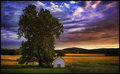
Church of the Saviourby jfritz27Comment: This shot would look so much better without the tree obscuring the building, but there's not a whole lot you could do about that short of cutting it down (which I doubt they would appreciate).
I like the tones in the building and sky. You have exposed it well enough to keep everything clear and bright, but still managed to give the impression that it's dusk / evening. |
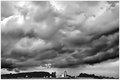
| 07/05/2009 04:34:59 AM |
Summer Stormby annigComment: Nice clouds, and interesting choice of composition, however the whole image feels a little soft, especially the buildings at the bottom center. |
 Photographer found comment helpful. Photographer found comment helpful. |
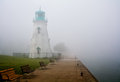
| 07/05/2009 04:33:42 AM |
Rollin' Inby cup4tmlComment: Great scene, nicely composed.
I feel the contrast on the lighthouse is a little low, I understand it's partially obscured by the fog, but it is the main subject so I would like to have seen it a little clearer. |
| 07/05/2009 04:32:35 AM |
Lipsby stupidcatComment: You've started with a great concept here and then ruined it with the processing.
Firstly the nose has been retouched to the point where it looks almost flat and without definition. After that the cheeks, especially in the lower left of the frame have lost all definition due to the retouching, and have ended up looking like they don't curve at all. It appears from this shot that the face stretches straight out of the frame and doesn't curve round!
The eyes are good, I like the detail you have there, and they look natural. The colours on the lips are great, though the left side seems to be a bit blurred. |
| Photographer found comment helpful. |
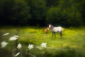
| 07/05/2009 04:24:43 AM |
Bucolicby APComment: Great scenery and a wonderful light. The composition is a tiny bit centered for my liking, a bit more open space on the right and it would be perfect. 8. |
| Photographer found comment helpful. |
| 07/05/2009 04:14:36 AM |
arcadianby Ecce_SignumComment: Don't really like the centred composition or the blurring (lensbaby?). The scene and the colours are nice, but I think I would have preferred a different setup. |
| Photographer found comment helpful. |
| 07/05/2009 04:11:39 AM |
Sailing in the twilightby Haukur JoComment: Love the fact you have caught the ship perfectly on the horizon against the red sky. It would have been nice if the water was just a touch more blue in contrast, though obviously not too much more as it would be weird with the redness of the rest of the shot. |
| Photographer found comment helpful. |
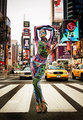
| 07/05/2009 04:08:57 AM |
Traffic Stopby roby21112Comment: This is a really interesting and unusual shot! My first reaction is how did you pull this off? Was it staged or did you and the model just walk onto the crossing and start shooting? If so how many times did you need to do it to get the right shot?
I love the fact that everything is so colourful here. Not only the model but the entire background, it's almost like she's wearing some sort of camouflage! |
| Photographer found comment helpful. |
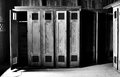
| 07/05/2009 04:05:59 AM |
Game overby quiet_observationComment: Nice B&W shot, it really captures the textures nicely.
I like the fact that only the door at the end is open the the locker is lying empty, like one of the team has had enough and quit. |
| Photographer found comment helpful. |
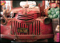
| 07/05/2009 03:57:39 AM |
Still Lifeby davisambroseComment: Funny looking old car. Great colours and a good contrast between the car and the veg leaning on it.
What I can see here makes me want to see more of the scene, though I'm guessing you took this for the "Old Cars" challenge so the focus was on the vehicle. |
| Photographer found comment helpful. |
Home -
Challenges -
Community -
League -
Photos -
Cameras -
Lenses -
Learn -
Help -
Terms of Use -
Privacy -
Top ^
DPChallenge, and website content and design, Copyright © 2001-2025 Challenging Technologies, LLC.
All digital photo copyrights belong to the photographers and may not be used without permission.
Current Server Time: 08/08/2025 10:52:19 AM EDT.