| Image |
Comment |
| 12/11/2008 08:57:22 AM |
Eggsceptionalby reephotoComment: The cooked egg on this image isn't particularly attractive, it would look a lot better with the yellow yolk up and a smooth white surface.
Also, the composition leaves the uncooked eggs in the background and it just starts to look like a normal photo of a breakfast.
I think a change of composition and a more attractive egg (which I realise is a very strange thing to say) would really help this picture. |
 Photographer found comment helpful. Photographer found comment helpful. |
| 12/11/2008 08:53:14 AM |
Ice Cube to Water with Christmas Lightsby ucanoeComment: This looks like oil on water because of the strong colours, and if you're title didn't tell me, I would never have known!
I think perhaps move back on the shot a little to give it a little perspective, and not such harsh colourful lighting, though I do like this better than all the plain water / ice submissions. |
| 12/11/2008 08:51:09 AM |
Sand and Glassby balancedfoxComment: Good idea, but the image feels very untidy. I think it would help if the sand was drier and smoother and you also have sand marks along the bottom of the glass which are a bit distracting. |
| Photographer found comment helpful. |
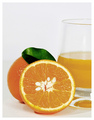
| 12/11/2008 08:49:07 AM |
Orange / Juiceby CraftyComment: The saturation on this shot seems a little overdone, which is particularly apparent in the green leaf, and the white area / seeds in the middle are all I keep focusing on. I think it might have been good if you removed the seeds, or at least some of them and perhaps a little less exposure to take the edge off teh white areas. |
| Photographer found comment helpful. |
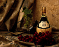
| 12/11/2008 08:46:52 AM |
Still Life with Grapes and Wineby oscarthepigComment: This is very nice and very well executed. And while this particular interpretation of the theme is very overdone I think you have pulled this shot off very well. The only thing I would like to see is a touch more light in the red grapes, and perhaps a tiny bit more exposure overall. Apart from that, love it. |
| Photographer found comment helpful. |
| 12/11/2008 08:45:17 AM |
20 years old girl after 65 years by alexgarciaComment: Good concept, but I feel the lighting is a little off. The area on the lower right of the wall just above the chair has something a bit weird going on with that cut off lighting, and once I noticed it, it's all I kept focusing on. Also, the pattern on the white wall is a little distracting. |
| Photographer found comment helpful. |
| 12/11/2008 08:42:29 AM |
Ouch this really grates on meby LutchenkoComment: This is quite a nice concept for the theme, but the angles and positioning are a little off for me. I think perhaps you need to tide the lower half up a bit, get rid of some of the smaller gratings, and maybe clean the grated stuff from the grater itself. The whole shot just feels a little messy at the moment. |
| 12/11/2008 08:40:03 AM |
Grapes in to Wineby millsaComment: I like the colours here, but it isn't instantly obvious what is being dropped into what. Purely from the theme I'm guessing it's a grape into wine.
The main splash is nice, but some of the others, especially the out of focus ones are a little distracting. Since you were using a flash for this it might have been worth while seeing how much you could bring into focus. |
| Photographer found comment helpful. |
| 12/11/2008 07:29:35 AM |
old man winterby skewsmeComment: The colours chosen here are nice, but the subject isn't particularly interesting. This is perhaps because of the large out of focus areas to the top left which only detract from the shot. |
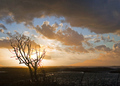
| 12/08/2008 07:44:12 AM |
Sad sunsetby Rino63Comment: This is a really nice dramatic scene. Excellent use and positioning of the tree. My only complaint is that it's a little difficult to make out what it is at the bottom third of the shot, whether it's water or icy fields. Could just be the calibration on my screen though. |
| Photographer found comment helpful. |
Home -
Challenges -
Community -
League -
Photos -
Cameras -
Lenses -
Learn -
Help -
Terms of Use -
Privacy -
Top ^
DPChallenge, and website content and design, Copyright © 2001-2025 Challenging Technologies, LLC.
All digital photo copyrights belong to the photographers and may not be used without permission.
Current Server Time: 08/01/2025 05:14:11 AM EDT.