| Image |
Comment |
| 12/31/2008 10:30:05 PM |
Readingby LuckyShotComment: Feels a little out of focus and the frame of the glasses is slightly obscuring the closest eye. The light area in the background is also a touch distracting, raising the height of the camera and looking downwards a touch more would have solved a couple of these problems. |
 Photographer found comment helpful. Photographer found comment helpful. |
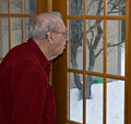
| 12/31/2008 10:25:47 PM |
88 and Facing Winterby talmyComment: Nice shot, coming from Scotland I know how tough this time of year winter can be on the elderly! With this shot I think the fill flash has separated the indoor scene from the outdoor scene and made it look more like an abstract view of the snow rather than something with real impact. |
| Photographer found comment helpful. |
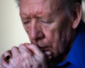
| 12/31/2008 10:21:50 PM |
Contemplating Parkinson'sby AngiomanComment: Very striking shot. There's something a little off about it though, it has a softness which doesn't quite look right. I think the softness in this image is a good approach, but for some reason here it looks like you have one picture overlaid on top of another, but very slightly offset. |
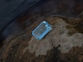
| 12/31/2008 10:18:04 PM |
La beauté la plus ancienne...by tomorrowindComment: I understand the idea here, but I feel you have failed in the composition. As a shot to simply record the item it doesn't work as the angles are wrong and the background is distracting. As taken to make it an attractive scene, the centred composition doesn't work and the water is slightly out of focus. |
| Photographer found comment helpful. |
| 12/31/2008 10:12:47 PM |
Stereotypicalby ConnorComment: This is great, it just perfectly represents Christmas day to me after all the food and drink! If it was my family I would give him 10 minutes and he would be snoring! 8 |
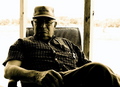
| 12/31/2008 10:07:00 PM |
business manby reezyComment: Good shot, particularly like the blown out background contrasting against the wood, which frames the subject nicely. My only complaint is that there's a little too much shadow in the mans face, perhaps a reflector to just add a touch more light while maintaining the overall look would have been good. |
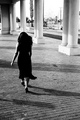
| 12/26/2008 07:44:11 PM |
Leavingby zackdezonComment: I love this shot, very striking. Might have been nice to bring out just a little more detail in the model, especially the hair, but I imagine that would have been tricky without blowing out large parts of the highlights. 8 from me, based on my immediate strong appreciation of the shot.
Edit* Had to come back to this shot and change it to 9 as it stuck in my head after seeing it. |
| Photographer found comment helpful. |
| 12/26/2008 07:37:25 PM |
|
| Photographer found comment helpful. |
| 12/26/2008 07:36:00 PM |
|
| Photographer found comment helpful. |
| 12/26/2008 07:35:05 PM |
Razor Shadowby jbabalaComment: I like the texture on the razor, but I think there's too much empty space. This could be nicer if you tighten it up a bit around the subject. |
Home -
Challenges -
Community -
League -
Photos -
Cameras -
Lenses -
Learn -
Help -
Terms of Use -
Privacy -
Top ^
DPChallenge, and website content and design, Copyright © 2001-2025 Challenging Technologies, LLC.
All digital photo copyrights belong to the photographers and may not be used without permission.
Current Server Time: 08/04/2025 11:32:28 PM EDT.