| Image |
Comment |
| 03/09/2009 09:11:52 AM |
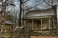
The Woolly Homestead-1882by karenkComment: This is quite a nice serene shot, with good exposure and lighting. Unfortunately I feel it is a little busy, possibly because the foreground and background colours are quite close to each other, the main subject doesn't particularly stand out at all. |
 Photographer found comment helpful. Photographer found comment helpful. |
| 03/09/2009 09:09:37 AM |
Penny For Your Thoughtsby claudius1234Comment: This is quite a nice shot, I like the colours here. Unfortunately your focus seems a little off which is detracting slightly from an otherwise good shot. |
| Photographer found comment helpful. |
| 03/09/2009 09:08:15 AM |
The Mount Washington Hotelby WoodwardComment: I think this could have been quite a nice shot, but you seem to have WAY over sharpened it. The mountain in the background looks completely fake and the whole photo looks like it has been blown up from a thumbnail image. Did you crop this from a much larger shot or something? |
| Photographer found comment helpful. |
| 03/09/2009 09:06:50 AM |
halfway thereby k4ffyComment: I see where you're going with this, but as you have pointed out yourself, it's only half way there. I do like the shot, I think it's a really interesting composition and good use of B&W but I feel obliged to knock some points off for not meeting the challenge. 4. |
| Photographer found comment helpful. |
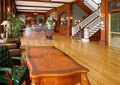
| 03/09/2009 09:04:50 AM |
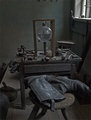
Old Shoemakerby OmniComment: I feel like this scene has so much potential yet you have somehow missed out on a great photo here. There's something about the composition which isn't quite working, perhaps it all feels a little linear and front on, maybe a change of angle would have helped, perhaps more from the left to take in a bit more of the window, and closer to the table to see some of the detail in those old tools.
Also, there's something on the wall just at the top of the shot which it looks like you've been trying to avoid, I would have cropped that off altogether or included it if it was interesting. |
| Photographer found comment helpful. |
| 03/09/2009 09:01:20 AM |
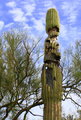
It isn't easy being oldby tjstockton66Comment: While I'm sure this is a very old cactus, I'm afraid it doesn't make for a particularly interesting photo. Shot also feels a little grainy, like it was taken on a cell phone camera or something. |
| 03/09/2009 09:00:15 AM |
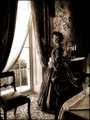
Civil War Eraby limerickComment: This is a nice reproduction of an old style scene, though I'm not sure technically if it meets the challenge, and while I definitely won't mark you down for that as I like what you've done, I'm sure others will.
Everything you have here works well, and it does feel quite authentic (apart from the sharp clear photo). The lighting is good and the details are clear, I'm not sure about the glass on the table though, feels like it's been forced into the shot as it's sitting right on the edge. If you really wanted to include the glass you could have pulled the table into the frame a little more. |
| Photographer found comment helpful. |
| 03/09/2009 08:55:42 AM |
Centennial Hauntby hahn23Comment: It took me a few seconds to notice the figure walking through the middle of the frame for some reason. Initially I just thought it was a shot of the interior of an old building with a table and green chair in the foreground (I know that's what it is but I'm just describing my initial reaction to it).
While what you've done is amusing, it's not made for a great photo, especially given that the figure is wearing denims and a white top. Perhaps a girl in a dress would have worked better and a darker atmosphere.
I'm actually giving a 4 for this because of the figure, otherwise as a photo I would have given it a 5. |
| Photographer found comment helpful. |
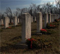
| 03/09/2009 08:51:01 AM |
Confederate Graveyardby tfarrell23Comment: There are a few things that immediately strike me as wrong with this shot. The closest headstone, which I'm thinking is the main subject here, is too centred, which has left the ones running out of the right side pretty much drawing a line across the middle of the frame. This in turn has left quite a bit of background on the left side with the headstones there again running out of the middle of the frame, almost giving you a sort of centred horizon.
I think if you had kept the angle you are viewing this at, but moved a little to the right (placing the main subject in the left third) this would have given the shot more depth and a better composition in general. |
| Photographer found comment helpful. |
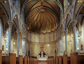
| 03/09/2009 08:44:52 AM |
Cathedral, A.D. 1893by dswannComment: This type of shot is unfortunately overdone and you've not really added anything special here which makes this particular one stand out.
Taken on it's own, it's a nice shot, well composed, feels like you are standing half way up (I don't know this building, just the impression I'm getting) and a wider more dramatic feel would have helped.
The lighting is good and even, though not always what you want in a setting like this. Some dramatic shadows help give this sort of architecture a bit of character. |
| Photographer found comment helpful. |
Home -
Challenges -
Community -
League -
Photos -
Cameras -
Lenses -
Learn -
Help -
Terms of Use -
Privacy -
Top ^
DPChallenge, and website content and design, Copyright © 2001-2025 Challenging Technologies, LLC.
All digital photo copyrights belong to the photographers and may not be used without permission.
Current Server Time: 08/06/2025 03:49:14 AM EDT.