| Image |
Comment |
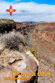
| 04/10/2009 07:38:30 PM |
Rio Grande Gorgeby chefsamComment: Not keen on the framing here, the big rock in the lower right is taking up about a quarter of the space of the entire image. Also, I don't get the logo on the top left but I'm guessing it has some sort of local significance to the place. |
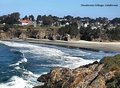
| 04/10/2009 07:34:01 PM |
Mendocino Village Post Cardby SnopawComment: This is exactly the kind of thing I would be looking for on a postcard, empty expanses of sand, blue skies! This one feels a bit cold for me though, might be the colour cast you have, but when I look at this I feel like I would be walking on the beach with a jacket on! |
| 04/10/2009 07:31:56 PM |
Ready for Flightby BarbBComment: Wonderful shot with great detail, not so sure about postcard material though, I think it might put some people off going to the place! |
 Photographer found comment helpful. Photographer found comment helpful. |
| 04/10/2009 07:31:08 PM |
Floridaby klkitchensComment: Great detail in this shot, but for a postcard it feels a bit too tight. If I was looking for a beach postcard I would be looking for long empty expanses and blue skies / blue water. |
| Photographer found comment helpful. |
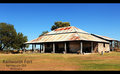
| 04/10/2009 07:29:11 PM |
Rainworth Fortby CraftyComment: Funny, I looked at the thumbnail of this and thought, looks like the Australian outback, then I clicked on it and saw the text. Guess that means you captured the feel perfectly! |
| Photographer found comment helpful. |
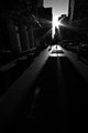
| 04/10/2009 07:22:42 PM |
8884by jdannelsComment: I love the way it appears the sun is pushing it's way through the buildings, as they lean in either direction. I can't see enough in the lower half of the shot though, I would have liked to see just a little more detail in the shadows, though not a whole lot as just now it has a great mood and too much brightening would ruin that for me. |
| Photographer found comment helpful. |
| 04/10/2009 10:17:45 AM |
chaiplakdp.jpgby IraklisComment: I see a contrast between old and new but something about it doesn't work for me. I like the look of the old building, which when you see the graffiti on the wall and the writing on the dusty windows, l looks abandoned, but I only begin to look at that after the chairs jump out at me first.
I think that's why I'm not so keen on it, because the very first thing I see is the bright orange, it stops me really getting into the rest of the scene. |
| Photographer found comment helpful. |
| 04/08/2009 10:23:03 AM |
Revvedby SEGComment: It's a nice enough shot, clear and sharp, but off center and at an angle isn't helping. You could have corrected that in Photoshop using the perspective correction tools.
What I do think is cool is the fact that you scored EXACTLY 5.000 :) |
| Photographer found comment helpful. |
| 04/07/2009 05:05:53 AM |
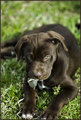
CoCoa.JPGby moondogComment: What wonderful colours, especially the eyes! He looks like he is going to be a menace! |
| Photographer found comment helpful. |
| 04/07/2009 04:59:59 AM |
Food 14 - Filled eggs and toastby hajekaComment: Nice shot, looks really appetising, which I guess is exactly what you are aiming for in food photography! I do agree on the DOF though, a little more would have been good. |
| Photographer found comment helpful. |
Home -
Challenges -
Community -
League -
Photos -
Cameras -
Lenses -
Learn -
Help -
Terms of Use -
Privacy -
Top ^
DPChallenge, and website content and design, Copyright © 2001-2025 Challenging Technologies, LLC.
All digital photo copyrights belong to the photographers and may not be used without permission.
Current Server Time: 08/07/2025 01:05:16 PM EDT.