| Image |
Comment |
| 05/27/2009 06:54:56 AM |
Babes Magnet Wunderbike by AmeedEl-GhoulComment: You've let down what could be a potentially good ad here.
I think you're exposure, which admittedly must have been tricky, has left the car a touch dark. Also, the car itself feels out of focus, I'm not entirely sure if that's the case, but the back part definitely feels like it's not as sharp as it could be.
Now the biggey, the text ruins this add. What is otherwise a nice ad with some good scenery is completely ruined by the text. If I saw that by the side of the street I definitely wouldn't want one of those!
Giving this a 5, would have been a 7 if it wasn't for the caption! |
 Photographer found comment helpful. Photographer found comment helpful. |
| 05/27/2009 06:51:09 AM |
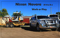
Nissian Navaraby CraftyComment: This is very good for an add, and a very well targeted one too as opposed to all the generic stuff I've been seeing so far.
The environment, the trailer, the positioning of this all scream "HEAVY DUTY OFF ROADER", which I think would do a great job appealing to a particular market segment.
My only complaints with this one are that the car feels a little bit crammed into the right side, and your border is actually cutting into it. Other than that, great shot. 9 from me. |
| Photographer found comment helpful. |
| 05/27/2009 06:47:40 AM |
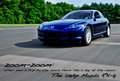
Mazda RX-8. It Moves You.by arron_christensenComment: This is a very good car ad, great exposure, good location, good framing and I love the sense of motion.
Can't flaw this one at all, hope you've included the details on how you did this one as I would like to read them.
10 from me. |
| Photographer found comment helpful. |
| 05/27/2009 06:45:43 AM |
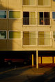
Looks good even Parkedby jaysonmcComment: I'm afraid I disagree, I can hardly see the car at all, can't make out what it is as the top half is completely black, I even turned the brightness right up on my screen!
My initial impression was that this was a shot of a building, or perhaps the person in the window at the right hand side, I only really noticed the car because I was looking for it.
Overall this doesn't work, and I definitely wouldn't expect to see this in a car add, or be prompted to buy it if it was. 3 from me. |
| 05/27/2009 06:43:07 AM |
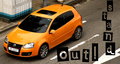
Stand Out!by witt34Comment: This is VERY car add like! The text works very well in this shot, and feels completely appropriate. The only thing letting this one down is the big white thing (no idea what it is) in the top left corner.
The colours and the overall design are great, I would expect to see this on a large billboard by the side of the road.
9 from me, took 1 off a perfect 10 for the weird white object. |
| Photographer found comment helpful. |
| 05/27/2009 06:40:12 AM |
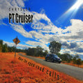
Cruising the Roadby BarbBComment: I really like the idea and the location of this one, and the way the lens flare seems to shine down on the car.
Couple of things I don't like though. The car is too far away, I would have liked the car to fill more of the frame, this feels more like an add for the location than the car.
Secondly is the text, I don't like any of it apart from the word "CHRYSLER". The white border around the "PT Cruiser" cheapens the add for me, and the sentence along the road just feels tacky. I think it might have worked in a video if the car was driving past, but I don't think it works at all in a still.
For the location and the shot itself I would have given you an 8, but for me it's let down by the text so I'm going with a 6. |
| Photographer found comment helpful. |
| 05/27/2009 06:32:57 AM |
Special Times call for Chevyby KelliComment: This was the first one up on my screen when I came to voting and what a great one to start with!
Great shot with beautiful colours! I like everything about this apart from the slight darkening across the top left hand side, and while I know that's just the pattern on the wall, it takes away from the overall picture for me (yep, call me fussy!).
I can't actually tell if the text along the front bumper is something you added in photoshop or something that's physically on the car, I'm leaning towards the latter as it's not completely straight towards the end but I might be wrong.
I think you might lose some points on this for cutting out the left and right sides, but I like it, I think it suits the style of shot!
Overall, 9 from me. |
| Photographer found comment helpful. |
| 05/25/2009 07:48:39 AM |
untitledby halopesComment: What a great unusual capture. This is just the kind of thing I go out trying to get time after time and come back with dull shots of people standing at crossroads!
The perspective and angle of this one are great, and I love the fact there are people at either end of the crossing holding similar looking umbrellas, almost like a mirror image of each other. |
| Photographer found comment helpful. |
| 05/25/2009 07:45:18 AM |
by MephistoComment: The girl in the red dress really jumps out of this one. The colours are great, possibly as a result of the fact that it is on film. There is so much to see in this shot without it being cluttered, great capture. |
| Photographer found comment helpful. |
| 05/25/2009 07:40:31 AM |
|
| Photographer found comment helpful. |
Home -
Challenges -
Community -
League -
Photos -
Cameras -
Lenses -
Learn -
Help -
Terms of Use -
Privacy -
Top ^
DPChallenge, and website content and design, Copyright © 2001-2025 Challenging Technologies, LLC.
All digital photo copyrights belong to the photographers and may not be used without permission.
Current Server Time: 08/07/2025 05:42:08 PM EDT.