| Image |
Comment |
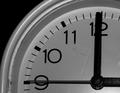
| 08/07/2003 05:39:30 AM |
The Alarm Clockby bsaluComment: Composition nice. Nice timing (No pun intended)for the right angles. Needs a little bit more contrast to much gray. I think it would be nice if the face was white. |
 Photographer found comment helpful. Photographer found comment helpful. |
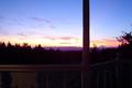
| 08/07/2003 05:36:09 AM |
House With A Viewby Ricky CleaveComment: Beautiful Sunset/Sunrise. Needs more contrast. Can't see the right angles very well. Your eyes are automatically focused on the sun so I don't know if it would make a difference. It would be nice to see a soluette of the patio. The column in the middle move over further to the right. |
| 08/07/2003 05:32:07 AM |
Cut it Closeby punkdykeComment: Interesting composition. I would have like to see more contrast. The shadows are nice. Maybe if the image was in B&W. Pretty cool image |
| Photographer found comment helpful. |
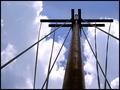
| 08/07/2003 05:30:02 AM |
Angles in the skyby dodobirdComment: Nice shot angle. Nice contrast. Everything leads you to the top of the pole, including the clouds with the blue right inbetween the pole. Beautiful |
| Photographer found comment helpful. |
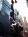
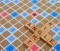
| 08/07/2003 05:27:49 AM |
Modern City Is the Application of Right Anglesby tolyanchikComment: Love the title. Great composition. I like how you have the One Way sign in the center of the photo. We all know that a city has a lot of towering buildings. The sign is just pointing towards some of them. Reflections on glass of other buildings always look nice.Only thing I don't like is the cut off light pole. |
| Photographer found comment helpful. |
| 08/07/2003 05:23:17 AM |
|
| Photographer found comment helpful. |
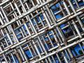
| 08/07/2003 05:03:13 AM |
90 in wireby macoxComment: I wished this photo was a bit sharper or focused in front. It would make it look more 3dish and stand out. I'm glad this image isn't in B&W, it would be difficult to see the wires in the back. Composition is very good. |
| 08/07/2003 04:55:56 AM |
Peakby 5holeComment: Wish this picture had more contrast.More lightness and darkness would have been good. Composition is very nice. |
| 08/07/2003 04:51:44 AM |
Once There Was a Birdby JPRComment: Glad you did this picture in B&W. Love the shadows on the wall. Composition reminds me of that artist that paints those geometric paintings. Kind of like the L'oreal logo. Don't remember his name. |
| 08/07/2003 04:47:11 AM |
stareby jackditchComment: I like this image a lot. It leads your eyes toward the center or ladder of the picture, then he yellow of the columns bring your eyes to the left and you automatically scan the right of the picture and see a bike. Composition is very nice. |
| Photographer found comment helpful. |
Home -
Challenges -
Community -
League -
Photos -
Cameras -
Lenses -
Learn -
Help -
Terms of Use -
Privacy -
Top ^
DPChallenge, and website content and design, Copyright © 2001-2025 Challenging Technologies, LLC.
All digital photo copyrights belong to the photographers and may not be used without permission.
Current Server Time: 08/01/2025 01:16:17 PM EDT.