| Image |
Comment |
| 10/01/2003 07:55:04 PM |
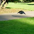
Birds Nest Tavernby ShiiizzzamComment: I've tried to comment this one twice. I like it and I don't. The sepia tone doesn't seem to "add" to this image (IMO). I sort of like the motion of the wings, but it seems like it's too strong of motion. The birds on the hay seem less than sharp, and blur into each other. (Were you drinking, too? {joke}) 7 Rob the Swash |
| 10/01/2003 07:51:24 PM |
coming homeby tomzinhoComment: Nice color, but the seagull doesn't seem super sharp (or is it just a bit too far away and not very detailed). In between silhouetted and not. Is it me, or is the ocean slanted? 7 Rob the Swash |
 Photographer found comment helpful. Photographer found comment helpful. |
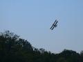
| 10/01/2003 07:49:29 PM |
Skimming the treetopsby Sherry MarchComment: Nice, but it seems on the dark side. (Is the airplane upside down, or am I just looking at this wrong?) Framing is good. Color - well, it's dark. Almost silhouetted, but I do see some yellow in the wing, so not really. 7 Rob the Swash |
| 10/01/2003 06:43:47 PM |
After the Impactby GeneralEComment: Paul, I like this one, too. Here's the rub as I see it, the DOF IS very narrow, with the focused range nearer the back (lower 1/2 seems out of focus to me). I might have liked this a bit better were the focused part more towards the middle. I think I might have gone 7 on this...I see the challenge aspect, but it might not be "enough" for general viewer. Rob the Swash |
| Photographer found comment helpful. |
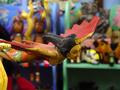
| 10/01/2003 06:36:46 PM |
Aztec Ladyby newtune3Comment: Very nice shot, good detail and color. Too bad the strings (and eyehooks) show up so strongly. The background looks like fun, but seems to pull the eye away from the subject. Framing has the subject well placed. 7 Rob the Swash |
| Photographer found comment helpful. |
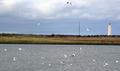
| 10/01/2003 06:34:56 PM |
Birds playingby JohannesFrankComment: Nice, pretty, but not much detail on the seagulls. I like the lighthouse, but the red rider is just plain distracting, wait for it....Framing, color all O.K, but the birds look a bit over-exposed, maybe a different white balance setting (if possible). 7 Rob the Swash |
| 10/01/2003 06:32:43 PM |
Flight CRZeroNiner Leaving Runway B, Over.by LucidLotusComment: Fun title. Motion is good, but in this case, a bit too much. (I know I'm asking for the Sun and the Moon here, but any direction but flying away....) Shooting from shadows into bright sunny is difficult at best, might want to avoid that, too. 7 Rob the Swash |
| Photographer found comment helpful. |
| 10/01/2003 06:30:38 PM |
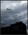
Omenby BobsterLobsterComment: With this title, the darkness and grain work very well. That said, I'm not really a fan of grain...(sorry, my bad). The birds show flight well, so challenge met, but I really like some detail. (Not for DPC) - Spot edit the building into full silhouette, seems like a good idea. 7 Rob the Swash |
| Photographer found comment helpful. |
| 10/01/2003 06:28:04 PM |
soft landingby shutterflyComment: I wanted to really, really love this shot. The forewings and front of the head are very nice. The white back seems overexposed to me and the shadows in that area add to the confusion. I'm liking the blue area at the top...may I ask how you did that? (just curious) 7 Rob the Swash |
| Photographer found comment helpful. |
| 10/01/2003 06:26:02 PM |
From Earth to Skyby ArtifactsComment: Simply grand! Great color!!! Balloon is well focused and framed. I like the foreground bushes, it works for me. 10 Rob the Swash |
| Photographer found comment helpful. |
Home -
Challenges -
Community -
League -
Photos -
Cameras -
Lenses -
Learn -
Help -
Terms of Use -
Privacy -
Top ^
DPChallenge, and website content and design, Copyright © 2001-2025 Challenging Technologies, LLC.
All digital photo copyrights belong to the photographers and may not be used without permission.
Current Server Time: 09/02/2025 11:44:23 PM EDT.