| Image |
Comment |
| 01/28/2009 01:41:36 AM |
|
 Photographer found comment helpful. Photographer found comment helpful. |
| 01/28/2009 01:40:06 AM |
|
| Photographer found comment helpful. |
| 01/27/2009 01:31:22 AM |
|
| Photographer found comment helpful. |
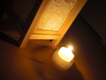
| 01/26/2009 08:42:35 PM |
Monkey'ing Aroundby jeroweComment: Seems a low place for a great image. Message edited by author 2009-01-26 20:43:40. |
| Photographer found comment helpful. |
| 01/26/2009 12:32:37 PM |
-OO- Susi -OO-by aKiwiComment: I don't think the highlighted hair at the left third adds to the image. I think dead space would be better.
Nice image otherwise. |
| Photographer found comment helpful. |
| 01/26/2009 12:30:26 PM |
|
| Photographer found comment helpful. |
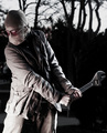
| 01/26/2009 12:28:12 PM |
Doesn't My camera look Super Hip in These?by BoriegaComment: Great idea.
2 minor points though; 1) the red/white/blue strap is distracting because it adds other colours to a relatively simple image and 2) if the image were flipped to make the wording on the camera normal it would be easier on the eye. |
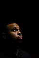
| 01/26/2009 01:49:02 AM |
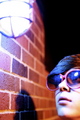
Good cop Bad copby torchcroonerComment: That's so hot.....
.....but needs to be 700px plus and you could easily lose the dead space.
I'm a little distracted by the reflection in the shades, it's almost like it is the subject. |
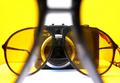
| 01/26/2009 01:45:32 AM |
dont touchby reezyComment: I like the abstract natute of this. It's quite like an 80s album cover.
Unfortunately I think the focus needs to be on the glasses to really make them stand out. |
| 01/26/2009 01:44:54 AM |
|
| Photographer found comment helpful. |
Home -
Challenges -
Community -
League -
Photos -
Cameras -
Lenses -
Learn -
Help -
Terms of Use -
Privacy -
Top ^
DPChallenge, and website content and design, Copyright © 2001-2025 Challenging Technologies, LLC.
All digital photo copyrights belong to the photographers and may not be used without permission.
Current Server Time: 08/05/2025 02:19:56 AM EDT.