| Image |
Comment |
| 02/11/2004 05:20:24 AM |
|
 Photographer found comment helpful. Photographer found comment helpful. |
| 02/11/2004 03:10:16 AM |
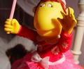
Nighty-nightby johnmComment by TooCool: With no textures in the subject it's really hard to tell where the focus is. Nicely composed and thought out, but maybe not the best subject for THIS challenge!
TF |
| Photographer found comment helpful. |
| 02/11/2004 12:41:24 AM |
|
| Photographer found comment helpful. |
| 02/10/2004 01:29:59 PM |
Nighty-nightby johnmComment by Dave Gordon: The background is definitely out of focus, but it still comes through too busy. Something simpler and in tune with the doll would have been better, IMHO. |
| Photographer found comment helpful. |
| 02/09/2004 06:33:50 PM |
Aquarius - the water carrierby johnmComment by Dibutil: From critique club.
John, actually, I was not lazy to check out your other works and can see some amazing stuff among them!
Everything is good about this image: quality, color, angle and content...
However, I did not rate this one high (+5) because it does not create any nice mood... like some lame postcards (no offence meant!). When something plane and dull is suddenly associated with high ideas and does not make fun of it really but instead makes them look plane and dull. Sorry... |
| Photographer found comment helpful. |
| 02/09/2004 01:10:13 PM |
|
| Photographer found comment helpful. |
| 02/08/2004 03:18:59 PM |
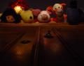
Sleep tight...by johnmComment by johnm: Originally posted by Dibutil:
From Critique Club.
I agree with all good words about this photo by other commenters. The lights on dolls' faces make the look alive and expressions are very intriguing. Everyone has own character and story.
The low score, however, may be explained by questionable composition. The dark spot on the top-right looks unnecessary. The center-bottom - I still can't get what is it - could be little lighter or the light could be distributed more evenly.
Overall nice, abstract and symbolic. Good idea and choice of the title. |
Many thanks for the comments.
The dark spot and uneven lighting were an attempt to exploit the moving light source element. I probably overdid it. No apologies for the composition though which is deliberately unusual. I don't mind my usual low average score as a few people have enjoyed it and made appreciative comments.
|
| 02/07/2004 11:31:48 PM |
Sleep tight...by johnmComment by Dibutil: From Critique Club.
I agree with all good words about this photo by other commenters. The lights on dolls' faces make the look alive and expressions are very intriguing. Everyone has own character and story.
The low score, however, may be explained by questionable composition. The dark spot on the top-right looks unnecessary. The center-bottom - I still can't get what is it - could be little lighter or the light could be distributed more evenly.
Overall nice, abstract and symbolic. Good idea and choice of the title. |
| Photographer found comment helpful. |
| 02/05/2004 07:54:58 PM |
A nice fire in the grateby johnmComment by cbeller: The "ghosts" are really unnecassary and seem to detract. Because of the focus on the "ghosted" subject, the fire is out of focus, or it appears that way. Your crop is also crooked. I would have rotated it just a tad clockwise. |
| Photographer found comment helpful. |
| 02/04/2004 08:09:12 PM |
Aquarius - the water carrierby johnmComment by johnm: Originally posted by adine:
startling color and perspective compared to others in the challenge. Good thinking ot of the box, You could do a series of these unexpected zodiac, could make a cool poster. |
Thanks. If only I had the time. |
Home -
Challenges -
Community -
League -
Photos -
Cameras -
Lenses -
Learn -
Help -
Terms of Use -
Privacy -
Top ^
DPChallenge, and website content and design, Copyright © 2001-2026 Challenging Technologies, LLC.
All digital photo copyrights belong to the photographers and may not be used without permission.
Current Server Time: 07/17/2026 05:01:56 AM EDT.