DPChallenge: A Digital Photography Contest You are not logged in. (log in or register
 
Browse Settings
Currently viewing:
Registered UserSeanachai

Show comments:

Per page:

Order:

Comments:


Comments Received by Seanachai
Pages:   ... [181] [182] [183] [184] [185] [186] [187] ... [195]
Showing 1831 - 1840 of ~1941
Image Comment
reception duet
01/06/2004 10:43:45 PM
reception duet
by Seanachai

Comment by lockjawdavis:
I love the determined look. The artwork in the back nicely complements the subject.
Photographer found comment helpful.
reception duet
01/06/2004 09:49:58 PM
reception duet
by Seanachai

Comment by Coley:
B&W works well here love the image with the picture behind...nice composition
Photographer found comment helpful.
American Jesus
01/06/2004 08:02:10 PM
Photographer found comment helpful.
reception duet
01/06/2004 07:02:29 PM
reception duet
by Seanachai

Comment by moopoo:
wow, i really like this photo....good contrast and...cool guitar....lol :)
Photographer found comment helpful.
American Jesus
01/06/2004 12:35:23 PM
American Jesus
by Seanachai

Comment by flip89:
Traditional + mickey mouse = tacky. Everything is here. Great job!
Photographer found comment helpful.
reception duet
01/05/2004 09:56:20 PM
reception duet
by Seanachai

Comment by justine:
Nice shot. Good luck in the challenge.
Photographer found comment helpful.
reception duet
01/05/2004 09:17:11 AM
reception duet
by Seanachai

Comment by admart01:
Creative action shot, really like the title. Perhaps some blurring of the fingers would tie better to the theme. Overall well done.
Photographer found comment helpful.
reception duet
01/05/2004 01:28:26 AM
reception duet
by Seanachai

Comment by dsa157:
very clever capturing the performer beisde the painting like that. well composed and well framed.
Photographer found comment helpful.
Holiday  Blues
01/04/2004 10:13:34 AM
Holiday Blues
by Seanachai

Comment by Konador:
Critique Club:

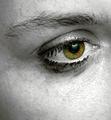
I really liked this shot for a number of reasons. The high contrast works very well to create an emotional response, and the colour in the eye draws my attention to that area, which is good. I like the way the eye is an unusual colour, because it makes it seem a bit surreal, which I like to see sometimes. I've seen a lot of plain boring eye shots but the colouring is what makes this one unique to me.

I feel that the final score of 5.4 was a bit lower than what this shot deserved, but I can also see why it got that score.

The whole shot, to me, seems ever so slightly out of focus. Personally, I think this adds to the emotion, but generally people on DPC see it as a bad thing, and vote lower because of it.


I think the tear is another good element that adds emotion, but it seems a bit flat to me. Since you added it in PS, perhaps you could have moved the highlight more into the centre, and made it appear more rounded. It's just a little thing but I think it would have helped. Since the eye seems to have a lot of makeup on, perhaps some streaks of it running down the face would enhance the crying effect and the emotion. Of course I hate to encourage the use of photoshop to this extent, but I think it would look good anyway. :)

I hope this critique has been useful, it's my first one since Jan 2003, lol.
Photographer found comment helpful.
American Jesus
01/03/2004 01:00:42 PM
American Jesus
by Seanachai

Comment by vtruan:
You got um' all covered.
Photographer found comment helpful.
Pages:   ... [181] [182] [183] [184] [185] [186] [187] ... [195]
Showing 1831 - 1840 of ~1941


Home - Challenges - Community - League - Photos - Cameras - Lenses - Learn - Help - Terms of Use - Privacy - Top ^
DPChallenge, and website content and design, Copyright © 2001-2025 Challenging Technologies, LLC.
All digital photo copyrights belong to the photographers and may not be used without permission.
Current Server Time: 09/01/2025 03:48:52 PM EDT.