DPChallenge: A Digital Photography Contest You are not logged in. (log in or register
 
Browse Settings
Currently viewing:
Registered Userkingskingdom

Show comments:

Per page:

Order:

Comments:


Comments Received by kingskingdom
Pages:   ... [63] [64] [65] [66] [67] [68] [69] ... [131]
Showing 651 - 660 of ~1307
Image Comment
Ceased To Bee
08/01/2009 03:15:45 PM
Ceased To Bee
by kingskingdom

Comment by photobytes:
Nice pun,
Photographer found comment helpful.
"London"
08/01/2009 04:39:12 AM
"London"
by kingskingdom

Comment by OmanOtter:
Nicely done. Great contrast of old and new.
Photographer found comment helpful.
Ceased To Bee
07/30/2009 09:27:52 PM
Ceased To Bee
by kingskingdom

Comment by liberty:
nice detail 7
Photographer found comment helpful.
Ceased To Bee
07/30/2009 03:38:06 PM
Ceased To Bee
by kingskingdom

Comment by Senay:
Great detail on the bee, especially the lower yellow bit. Nice choice of background colour, I liked the black backgrounds in this challenge better than the whites.
Photographer found comment helpful.
Ceased To Bee
07/30/2009 12:45:33 PM
Ceased To Bee
by kingskingdom

Comment by Jason_Cross:
Nice composition and work here.
Photographer found comment helpful.
Ceased To Bee
07/30/2009 02:59:19 AM
Ceased To Bee
by kingskingdom

Comment by Damzel:
Amazing shot!
Photographer found comment helpful.
Nikon D40X-RAY
07/29/2009 04:43:44 PM
Nikon D40X-RAY
by kingskingdom

Comment by Budya:
Greetings from the Critique Club!

I must admit that when it came up on my screen, I was shocked by all the colors. In a good way. I love the bold editing.

I think your composition is good. I also like the negative space on the right, there is enough room that neither the model nor the camera feel cramped. I really like the difference in DOF between the model and the photo on the display; it created a nice contrast between the two.

My biggest problem with the photo is that the alignment of the photo on the display is a little off and does not line up with the model (it seems a little high). I would have also liked to see more details on the camera and camera straps, so that the camera straps don't disappear into the yellow background.

You've done a great job with this photo. Feel free to pm me if you want any clarification.
Ceased To Bee
07/29/2009 12:04:53 PM
Ceased To Bee
by kingskingdom

Comment by hesitant:
good picture and title
Photographer found comment helpful.
Ceased To Bee
07/29/2009 08:53:47 AM
Ceased To Bee
by kingskingdom

Comment by ceaston01:
Nicely done
Photographer found comment helpful.
Trouble And Strife
07/28/2009 09:23:03 PM
Trouble And Strife
by kingskingdom

Comment by PGerst:
** Hello from the Critique Club **

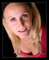
Portraiture is always difficult due to the number of technical aspects that need special attention. This photo is nicely done.

Composition
The posture is very distinct in this one. The subject is looking up, which makes me believe that she is a very confident person or a person who is always looking toward the future. At least, that is how this posture, to me, defines the subject. Which is interesting because it does not match the title.

The only issue I have is that too much of her chest is showing and tends to make her face blend due to the similar skin tones. Thus, focus is drawn slightly away from her face. I also see a little of an arm and a leg (white pants?) that also seems to draw away from the face. It is clear that this is a tough pose. If you performed a tighter crop, just below the necklace the focus to her face would be restored, however, a new problem would crop up: only one shoulder. Thus, a slight angle change to show her right shoulder and tighter crop would have really pushed this posture nicely. As I said, this was difficult, but still, nicely done.

You also chose the right amount of added color to the face. The red lipstick shade is subtle and not overbearing which helps to contrast her lips against her blond hair. The eye shadow also helps to add additional contrast to the red and blond and helps to draw focus to her eyes. More importantly, you chose a shade close to her eye color which also helps to bring them forward.

Technical
Very nice job on the lighting. You have exposed one side slightly more than the other to give enough shadow to add depth to the photo, but not too little on the other side to bring her face deep into darkness. With that said, the left side could use slightly less exposure as details in her skin texture are slightly diminished. The DOF is very good. The blouse is outside of the facial plane, which is good as it helps to isolate the face and direct attention, but not too out of focus to be a feature.

Again, an excellent photo.
Pages:   ... [63] [64] [65] [66] [67] [68] [69] ... [131]
Showing 651 - 660 of ~1307


Home - Challenges - Community - League - Photos - Cameras - Lenses - Learn - Help - Terms of Use - Privacy - Top ^
DPChallenge, and website content and design, Copyright © 2001-2025 Challenging Technologies, LLC.
All digital photo copyrights belong to the photographers and may not be used without permission.
Current Server Time: 08/12/2025 09:09:03 PM EDT.