| Image |
Comment |
| 11/30/2009 04:46:05 PM |
|
 Photographer found comment helpful. Photographer found comment helpful. |
| 11/29/2009 05:33:47 PM |
|
| 11/27/2009 11:09:19 PM |
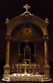
The Altarby danculwellComment by nutzito: centered compositions look much better when they are perfectly symmetrical..moving camera position one step to the left would have made this a more appealing image. |
| Photographer found comment helpful. |
| 11/26/2009 02:38:05 PM |
The Altarby danculwellComment by Ja-9: IMO I would have liked to see a super sharp capture of this with your exposure bumped up just a bit... |
| Photographer found comment helpful. |
| 11/25/2009 08:25:42 PM |
|
| Photographer found comment helpful. |
| 11/25/2009 04:01:46 AM |
|
| Photographer found comment helpful. |
| 10/29/2009 06:04:36 AM |
Stop 'n Goby danculwellComment by HarveyG: Dan, brilliant idea and very creative. I also made a few basic errors in my entry like focus, blur and highlights that aren't liked on DPC, so I put it down to school fees.
Keep them coming! Message edited by author 2009-10-29 06:05:09. |
| Photographer found comment helpful. |
| 10/27/2009 10:54:14 PM |
|
| Photographer found comment helpful. |
| 10/26/2009 11:45:43 PM |
|
| Photographer found comment helpful. |
| 10/24/2009 10:53:53 PM |
Stop 'n Goby danculwellComment by bobnospum: Cool idea. Having the covered portion be dead black would be better. I can still make out the circle as a different shade than the black background. |
| Photographer found comment helpful. |
Home -
Challenges -
Community -
League -
Photos -
Cameras -
Lenses -
Learn -
Help -
Terms of Use -
Privacy -
Top ^
DPChallenge, and website content and design, Copyright © 2001-2026 Challenging Technologies, LLC.
All digital photo copyrights belong to the photographers and may not be used without permission.
Current Server Time: 07/16/2026 12:17:44 AM EDT.