| Image |
Comment |
| 08/11/2009 11:06:39 AM |
|
 Photographer found comment helpful. Photographer found comment helpful. |
| 08/07/2009 10:36:41 PM |
|
| Photographer found comment helpful. |
| 08/06/2009 11:41:00 PM |
|
| 08/06/2009 10:05:31 PM |
|
| Photographer found comment helpful. |
| 08/06/2009 09:21:23 PM |
|
| Photographer found comment helpful. |
| 08/06/2009 01:31:11 PM |
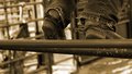
Cow Girl's Spursby danculwellComment by Ecce_Signum: Greetings from Andi via the Critique Club.
First Impression: Although the spurs and title tell me whats going on I still find the background a little distracting. I like the duo/sepia tone
Composition: The bars she is standing seem to become the main focus here and wonder how this might have looked with most of below the bars cropped out with a little more leg? That said I'm so glad she wasn't centred as the more I view this the better the composition looks.
Subject: Yup, its footwear so meets the challenge although footwear would spring to mind as the main subject if I didn't know the challenge title. The worn jeans look great, as if she has grown up in them.
Technical: I did mention I thought the background was a little busy but not sure you could have blurred it more with your lens of choice. Personally I'm growing fonder of 'blown out' areas in images.
Final thoughts: A good spot and nice detail shot of the event, you don't need to see the bulls to understand whats going on.
edited to remove the unintentional bold text (cos I'm stupid) Message edited by author 2009-08-06 19:19:33. |
| Photographer found comment helpful. |
| 08/05/2009 12:00:53 PM |
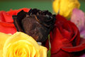
Even the Beautiful Must Dieby danculwellComment by JulietNN: CC Club here!
Nice shot. A little busy though, play around with your items when you have them on the table. The dead rose could have just had one or two of the live roses with it. At the moment it is being swamped by the others. The two blurred in the background are just out of alignment with the rest of the photograph.
Different heights of the flowers would have made this a more interesting shot, instead of them all being on the same eye level. More emphasis on the dead flower would be a good idea.
Your ISO is fairly high for having a light working too, this could account for some of the grain I am seeing.
You placed well with this shot |
| Photographer found comment helpful. |
| 08/05/2009 05:27:33 AM |
|
| Photographer found comment helpful. |
| 07/29/2009 03:49:07 PM |
|
| Photographer found comment helpful. |
| 07/29/2009 02:45:59 PM |
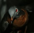
Ectopistes Migratorius (Passenger Pigeon)by danculwellComment by Budya: Greetings from the Critique Club and congratulations on your new personal best!
For a second I really thought it was a live bird! I really like how the lighting, DOF and the camera angle draw attention to the eye of the pigeon.
While the square crop works well here, I think a tighter crop might have worked a little better. I like the dark color but the light spots in the background are a somewhat distracting. Given that it was an advanced editing challenge, you could spot edit and tone them down. The grain from high ISO is also most noticeable in those areas.
I think a pass of sharpening on the head would have brought out more details and enhanced this wonderful image.
If you have any questions about this critique, please feel free to PM me. |
| Photographer found comment helpful. |
Home -
Challenges -
Community -
League -
Photos -
Cameras -
Lenses -
Learn -
Help -
Terms of Use -
Privacy -
Top ^
DPChallenge, and website content and design, Copyright © 2001-2026 Challenging Technologies, LLC.
All digital photo copyrights belong to the photographers and may not be used without permission.
Current Server Time: 07/16/2026 05:45:25 AM EDT.