| Image |
Comment |
| 06/11/2005 02:21:00 AM |
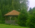
Gazebo in Springby TooCoolComment by nico_blue: since you asked for contructive (read - you know what) comments...
the soft focus effect doesnt really work here. First the effect isnt properly executed and rather than a "mystic" glow you have an OOF image, plus the overexposed top right corner isnt helping either.
However the bigger problem, at least imo, is that the picture is plain boring. A few trees and a outdoor resting place thingy (forgot what its called) shot straight on. Even the best filter in the world couldnt rescue the lacking artistic value of this shot. You should have tried various angles, maybe further back to make this more of a landscape or closer to the ground to give a different viewpoint with blades of green grass in sharp focus in the foreground, maybe having the house frame the trees or having a reflection if there was a stream behind the house.
My suggestion would be to browse some articles online dealing with composition, color theory and light. Two good starting points are //www.photozone.de/4Technique/compose/third.htm and //www.photoinf.com/
Best of luck |
 Photographer found comment helpful. Photographer found comment helpful. |
| 06/11/2005 02:18:57 AM |
Gazebo in Springby TooCoolComment by sammy_stecchino: Your framing could be better. Gazebo is the title, but a good portion of it is hidden behind a tree, and there is too much of the tree behind it in the frame, and the light in the top right does not need to be in the frame either. True, it is your artistic expression, but I would ask: what does the tree behind it add to the shot? what does the light source at the top right add to the shot? If the answers are nothing, then take them out, or work them into the frame differently. |
| Photographer found comment helpful. |
| 06/11/2005 01:58:19 AM |
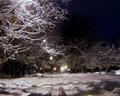
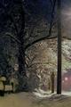
City Street at Nightby TooCoolComment by Shannon: I was beginning to comment then realized most of what I was about to say has already been said...but I will say it anyway lol. The light coming through the branches on the top is a bit overpowering, my eye keeps being drawn to that part of the image, also the shadows in the snow in the front distract from the rest of the image as well. |
| Photographer found comment helpful. |
| 06/11/2005 01:54:50 AM |
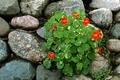
Friday-IMG_5099.jpgby TooCoolComment by Shannon: I agree with the previous poster that there really isn't anything is this shot to really hold the viewers attention. The colors are nice and the focus is good, but overall the subject is not very interesting. |
| Photographer found comment helpful. |
| 06/11/2005 01:54:20 AM |
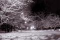
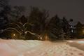
City Street at Night #2by TooCoolComment by Zoomdak: I like this one much better as well. The BW works much better, the sharpening is better, I am able to focus on it more. Minor: speckles in the upper right corner? Neat image or blur? Maybe a bit more contrast in the background elements? Nice rework though. |
| Photographer found comment helpful. |
| 06/11/2005 01:53:06 AM |
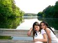
Portraits on Lakeby TooCoolComment by Shannon: This is very nice, love the crispness of the shot and the playful pose of the girls, only thing that could improve this shot would be more color or clouds in the sky, but obviously that is beyond your control. |
| Photographer found comment helpful. |
| 06/11/2005 01:51:40 AM |
City Street at Nightby TooCoolComment by Zoomdak: The glare on the top of the tree annoys me a bit, a bit off color IMO in the street. Maybe it would work better in BW (as I see you did in version #2). |
| Photographer found comment helpful. |
| 06/11/2005 01:50:10 AM |
Sidewalk in Januaryby TooCoolComment by Zoomdak: This one looks off color to me as well, the kindof yellow/brownish tint in the trees. The lighting seems a bit dull as well, maybe contrast and levels? |
| Photographer found comment helpful. |
| 06/11/2005 01:48:40 AM |
Campus Walkby TooCoolComment by Zoomdak: It must be from the lighting that the snow is off color, sky looks grainy, I like the movement of the pathway, but I with the lighting was even all the way across, so it wasn't dark on the other side (though that isn't in you're control). The two windows lit up on the right are a tad distracting as well, but they do show that there is a bit of life inside the building. But, personally, the off colorness doesn't make it very appealing to me (even if that was the original color). |
| Photographer found comment helpful. |
| 06/11/2005 01:47:19 AM |
Friday-IMG_5099.jpgby TooCoolComment by SDW: This shot is OK. But I just can not find an area with enough focus to keep my attention. I can IMO see why you would take this shot for several reasons. But the lack of detail in the subject makes the photograph seem meaningless.
I hope that my comment was not to harsh. I meant it in a good way to let you know what I see as a viewer.
BTW you some great work. Message edited by author 2005-06-11 01:48:34. |
| Photographer found comment helpful. |
Home -
Challenges -
Community -
League -
Photos -
Cameras -
Lenses -
Learn -
Help -
Terms of Use -
Privacy -
Top ^
DPChallenge, and website content and design, Copyright © 2001-2026 Challenging Technologies, LLC.
All digital photo copyrights belong to the photographers and may not be used without permission.
Current Server Time: 07/24/2026 11:28:44 AM EDT.