| Image |
Comment |
| 07/25/2005 12:50:26 AM |
|
 Photographer found comment helpful. Photographer found comment helpful. |
| 07/25/2005 12:40:00 AM |
|
| Photographer found comment helpful. |
| 07/25/2005 12:38:57 AM |
|
| Photographer found comment helpful. |
| 07/24/2005 07:32:17 PM |
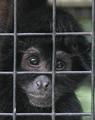
Please...by TooCoolComment by nevilleuhles: This is emotionally striking -- there's no getting around that. It makes one's heart jump out. The reflections in the eyes are gorgeous, and they add to the animal's vibrancy. Well done! |
| Photographer found comment helpful. |
| 07/24/2005 07:09:15 PM |
Please...by TooCoolComment by Geee: This photo breaks my heart and is one of the reason's I don't go to the zoo.
Congratulations for catching the emotional tone.
|
| Photographer found comment helpful. |
| 07/24/2005 04:34:54 PM |
Please...by TooCoolComment by toddhead: Great shot... if this would have been a little sharper I truly believe it could have won the blue ribbon. |
| Photographer found comment helpful. |
| 07/21/2005 12:50:30 PM |
Please...by TooCoolComment by C-Fox: Nice idea, the eyes seem a bit blurry, not sure if moved or dof issue. - 6 |
| Photographer found comment helpful. |
| 07/20/2005 10:53:20 PM |
|
| Photographer found comment helpful. |
| 07/20/2005 04:16:41 PM |
Please...by TooCoolComment by brownt: I really like this shot! Had the focus been a tad better I would have tipped this as a ribbon.
Not only does it show the aninal behind the zoo bars, it shows a sad side to it's existance. 8 |
| Photographer found comment helpful. |
| 07/20/2005 12:54:45 PM |
Please...by TooCoolComment by srbrubaker: In dealing with DPChallenge I have come to expect good photos to be a little oversharpened. So when I see this excellent photo I wonder whether its more natural look is due to accident or choice. I expect that if it were just a little sharper it would score better here - whether or not it would actually make it better. Sharpness aside, I really like the gaze of this primate. I love the way the steel fence works with the dark skin, hair and eyes. And I am grateful for the fact that the green of the background is not very saturated - whether by accident or on purpose. I find the cropping just a little week. I think there is far too much space above the eyes. And I think the vertical element on the right and the horizontal one on the bottom could be cropped out to some advantage. Despite all the postprocessing tweeks that could have been done to improve the photo, this is very strong shot. |
| Photographer found comment helpful. |
Home -
Challenges -
Community -
League -
Photos -
Cameras -
Lenses -
Learn -
Help -
Terms of Use -
Privacy -
Top ^
DPChallenge, and website content and design, Copyright © 2001-2026 Challenging Technologies, LLC.
All digital photo copyrights belong to the photographers and may not be used without permission.
Current Server Time: 07/22/2026 10:18:31 PM EDT.