| Image |
Comment |
| 12/28/2008 02:13:59 AM |
Checkmate!by MsAmbrosiaComment by jeger: Greetings from the Critique Club...
I was not able to vote on this challenge, but if I had, I probably would have given you a 5 or 6.
My first impression is that I like the colours and contrast as they are very strong. The composition feels a little busy. The three most important pieces are the two in the foreground, and clear piece in the middleground. The pieces in the background are a little distracting. Perhaps if they were smaller pieces such as rooks, they would not grab our attention so much. I think the angle of the board has room for improvement as well. Rotating the board even more might give this shot a little more drama. Overall it is an interesting shot, it just needs some more thought to take it to the next level.
If you need any clarification on any of my comments, please feel free to pm me. It might take some time for me to get back to you. |
| 12/26/2008 06:23:12 PM |
|
 Photographer found comment helpful. Photographer found comment helpful. |
| 12/26/2008 01:18:01 AM |
|
| Photographer found comment helpful. |
| 12/24/2008 11:02:10 PM |
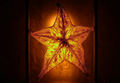
Carambola a.k.a. Starfruitby MsAmbrosiaComment by jeger: Greetings from the Critique Club...
I was not able to vote on this challenge, but if I had, I probably would have given you a 7.
Overall I think this is a great image. I love the backlighting and all the details that come through the fruit. I also like how the light creates a halo around the star. The darkness in the background also creates a nice mood. The crop you have chosen reminds me of a country flag because of the shape, as well as the 2 vertical lines. I'd love to see a version of this with a square crop. I think it would help keep my eyes from wandering away from the star. Great shot.
If you need any clarification on any of my comments, please feel free to pm me. It might take some time for me to get back to you. |
| 12/24/2008 01:41:08 PM |
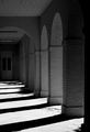
Light Geometryby MsAmbrosiaComment by tanguera: A bit cliche, and a bit too contrasty. I would like to have seen more detail on the brick columns, and less harshness on the light streams. |
| Photographer found comment helpful. |
| 12/21/2008 11:13:36 PM |
Checkmate!by MsAmbrosiaComment by pedrobop: The bokeh at the background could be better and have more light. The horse looks OOF but your idea is great, just need more tweaking. |
| Photographer found comment helpful. |
| 12/21/2008 06:45:45 PM |
|
| Photographer found comment helpful. |
| 12/21/2008 02:04:10 PM |
|
| Photographer found comment helpful. |
| 12/21/2008 12:31:42 PM |
|
| Photographer found comment helpful. |
| 12/21/2008 10:28:46 AM |
|
| Photographer found comment helpful. |
Home -
Challenges -
Community -
League -
Photos -
Cameras -
Lenses -
Learn -
Help -
Terms of Use -
Privacy -
Top ^
DPChallenge, and website content and design, Copyright © 2001-2026 Challenging Technologies, LLC.
All digital photo copyrights belong to the photographers and may not be used without permission.
Current Server Time: 07/16/2026 02:45:10 PM EDT.