| Image |
Comment |
| 07/15/2015 11:53:24 AM |
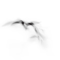
s w o o s hby Ja-9Comment by cowboy221977: Hello from the critique club...
Nice finish. I have been looking at this shot for like 30 min and I'm sorry but I just don't see anything resembling a fish. I did not vote but I probably would have been one of those DNMC voters we all hate. On to the actual picture now. The shot is good for an abstract I do like it even though I think it is a DNMC. In fact, I could see this hanging on the wall. I like the flowing movements and the colors. Nice shot. Happy shooting. |
 Photographer found comment helpful. Photographer found comment helpful. |
| 07/15/2015 09:53:19 AM |
F O R Eby Ja-9Comment by h2: Excellent for the challenge, exactly how I thought images should be composed. Lighting on the ball is a bit harsh, lowwr shot contains some distracting elements, besides that well done. Curious if this might be based on my suggestion in the thread? |
| Photographer found comment helpful. |
| 07/15/2015 09:22:56 AM |
|
| Photographer found comment helpful. |
| 07/15/2015 08:39:55 AM |
a s c e n s i o nby Ja-9Comment by cowboy221977: Hello from the critique club....
I like your use of motion blur with this. It also has a very calming / soothing feel. Overall not a bad shot. Happy shooting |
| Photographer found comment helpful. |
| 07/14/2015 10:57:22 PM |
|
| Photographer found comment helpful. |
| 07/14/2015 03:30:09 PM |
You Will Not Be Forgottenby Ja-9Comment by sidpixel: *Hello from Sid and the Critique Club*
I'm sorry to see that you didn't receive any comments, hopefully this will make up for it. In terms of the challenge brief, being a monument it obviously fulfils that.
You've chosen a pretty impressive monument for your subject and I like that you have converted it to mono with the most important parts of it standing out from the background. There are however, one or two things I am not keen on and might have done differently.
I am not happy with the overexposed sky but perhaps you gave it some +EC to get more detail into the faces? I'm not sure how close you were and what focal length you were using but looking at your exif there would have been some scope to use a larger aperture to reduce the detail in the background.
As it stands this is pretty much a record shot of a monument in other words it simply records it straight on without a lot of creative input, from this viewpoint I find the reflections in the base distracting. Given the nature of the subject I don't think you even need to include the base and I would have tried it from a position further to your left and closer in to frame them from the guns up using the flag itself as the main background. This position would also have overcome your sky problem and allowed you to get a better exposure of the faces and it would have stamped your own creative input to it.
I hope this helps, Sid |
| Photographer found comment helpful. |
| 07/13/2015 11:48:57 PM |
BIG FISHby Ja-9Comment by Neat: I like a kid whose not afraid of the water, love the PP. |
| Photographer found comment helpful. |
| 07/13/2015 11:24:13 PM |
|
| Photographer found comment helpful. |
| 07/13/2015 04:44:31 PM |
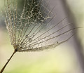
Liquid Diamondsby Ja-9Comment by cowboy221977: Hello from the critique club...
Janine very nice image. Great editing. I like the water / dew droplets. Congrats on a top 10 finish. Happy shooting |
| Photographer found comment helpful. |
| 07/13/2015 03:45:35 PM |
quietby Ja-9Comment by cowboy221977: Hello from the critique club...
Another very good shot from Janine. Well done. Good execution of this. It does feel very serene. I like the reflections in the water. Also your editing is spot on. Nicely done. Happy shooting. |
| Photographer found comment helpful. |
Home -
Challenges -
Community -
League -
Photos -
Cameras -
Lenses -
Learn -
Help -
Terms of Use -
Privacy -
Top ^
DPChallenge, and website content and design, Copyright © 2001-2026 Challenging Technologies, LLC.
All digital photo copyrights belong to the photographers and may not be used without permission.
Current Server Time: 06/19/2026 09:54:36 PM EDT.